Download
1 / 54
540 likes | 687 Views
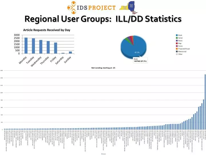
Regional User Groups: ILL/DD Statistics. What tools are available?. Usage Statistics. ILLiad Web Reports. TPAM. ILLiad Custom Search. Overview of ILLiad Web Reports. Click here for information on accessing your Web Reports. Comparison chart between ILLiad, OCLC, & TPAM.

E N D
What tools are available? Usage Statistics ILLiad Web Reports TPAM ILLiad Custom Search
Overview of ILLiad Web Reports Click here for information on accessing your Web Reports
Accessing Specific Reports Requests Received by Day Requests Sent by Day
Shows a spike during the beginning of the Fall semester This shows the dates, but not an average for each week day.
We want to find out what days of the week that we need the most staffing. We can find this out by exporting the report to Excel and converting the date into a weekday.
You can do this by using the following formula: =text(B2, “dddd”) First we will need to create a place to put this formula. Right click on Column A and click on “Insert”. Alternatively you can right clicking on Column A and press the “i” key.
Using the =text(B2, “dddd”) formula Click in Cell A2 and enter the formula: =text(B2, “dddd”) “B2” in the formula represents the date in cell B2. Hover your mouse over the small square at the bottom right corner of the selected cell. This will change your pointer into a crosshair. Click and drag the crosshair all the way down the sheet until you reach the last date.
Sorting the days of the week Hold the “Ctrl” button and press the “A” key to select all of your data. Click on “Data” in the ribbon, and then select “Sort” This window will appear. Make sure that “My data has headers” is selected. Click the down arrow from “Sort by” and select “(Column A)”. Click the OK button.
Sorting the days of the week The data will now be sorted by week day name, but the days of the week will not be in order. We need to break apart each data set for each weekday. Scroll down the spreadsheet until you reach “Monday”. Right click on the row number to the left of “Monday” and click on “Insert” or press the “i” key on your keyboard. This will create one row of space. You will need to insert a few more cells to make some extra space. A shortcut to repeat the last action in Excel is the: Key Repeat this process until you have divided all of the weekday sets.
Creating a sum for each column Click in the cell under the last number in Column C for Friday, the click on the AutoSum function under “Formulas” in the Ribbon, then press Enter. Your formula should look something like: =sum(C2:C57) Expand the formula to the other columns by using the small square at the bottom right of the selected sum cell. Click and drag this square to the right using the crosshair. Type the weekday label for the sums. Repeat for each weekday
Copying in the sums for your chart Starting with the day, highlight the sums and copy them. Use: + to copy Scroll up to the top of your spreadsheet and right-click on any cell to the right of the data. Choose:
You should now have something that looks like this: Add headers to your new data by copying and pasting the original headers 1. Highlight headings 2. Ctrl + C to copy 3. Ctrl + V to paste
You’ll notice that the heading is squished together. Move your mouse cursor in between the two columns until the cursor transforms into this shape: Now double-click to expand the column. Do this for each squished heading. Continue adding each weekday data set. Once you are finished, manually sort the data by copying and pasting each weekday set in order. You could also plan ahead and paste the weekdays in order, one by one, as you go.
Create a pie chart for your data 2 3 4 1 Highlight the weekdays and the first set of numbers 1 Click “Insert” on the Ribbon 2 Click on “Pie” for the dropdown menu 3 Click on the flat 2-D Pie 4
You should now have a chart that looks like this: The colors look great, but where are the numbers?
Adding data to your pie chart 2 3 1 To add % to the pie chart: Click on the pie chart 1 Click on “Chart Tools” (shown in green) 2 Click on the pie chart with % signs 3
Create additional pie charts for your data Click on the pie chart that is already created 1 Hold the Control button and press “C” 2 Click anywhere on the spreadsheet 3 Hold the Control button and press “V” (creates duplicate chart) 4 Click on the new chart, and in your data chart, click and drag the green box to the new title and click and drag the blue box to the new data 5
The pie chart is useful to get an overall sense of how requests are distributed for each day, but it would be better to know exactly how much is being requested and processed each day. Creating bar graphs follows the same procedures listed above
2 3 4 1 Highlight the weekdays and the first set of numbers 1 Click “Insert” on the Ribbon 2 Click on “Column” for the dropdown menu 3 Click on the flat 2-D Column 4
You should now have a chart that looks like this: Question: What am I missing on this chart?
Create additional bar graphs for your data Click on the bar graph that is already created 1 Hold the Control button and press “C” 2 Click anywhere on the spreadsheet 3 Hold the Control button and press “V” (creates duplicate chart) 4 Click on the new chart, and in your data chart, click and drag the green box to the new title and click and drag the blue box to the new data 5
It would be useful to compare the requests of Saturday and Sunday to find if it would be beneficial to having someone staffing ILL on Saturday and/or Sunday, or if the requests could wait until Monday. Lending Requests Received (Aug 2011 – Dec 2011) Saturday Sunday Monday
Now let’s look at the borrowing requests data Borrowing Requests Received (Aug 2011 – Dec 2011) Saturday Sunday Monday
Lending and Borrowing Data Together: Should SYR have staff on Sunday to take care of these requests? Lending & Borrowing Requests Lending Requests Borrowing Requests Saturday & Sunday Saturday & Sunday Saturday & Sunday Monday + Monday +
Stats Service—what’s unique For lending—will give you the entire turnaround time for loans. • Consider the performance of your shipping operations and choices. • Is that extra 3-day shipping option really paying off?
deflections • If you set up autodeflections through OCLC, track how these are performing and adjust accordingly. • If you’ve invested time in LHR deflections—is this work paying off? • Ex.—deflecting reserves items and how many cancellations this saves.
Stats • Assess reciprocity reports—is there an institution that you should contact to see if you can get a reciprocal agreement? • Assess existing reciprocal agreements for effectiveness and fairness—build the relationship and adjust your custom holdings accordingly.
Other reports from Monthly IFM reports: • Can be emailed to you. • Good way to check who is charging you who shouldn’t—and I’m always surprised by this.
Custom Searching—Why and How • Why • Target types of transactions or actions to help your ILL run smoothly. • Use ILLiad fields strategically to monitor your addresses, users, or requests and proactively clean up problems.
What can you search? Pretty much anything in the ILLiad database • User information • Lender Address fields • Transaction data • User activity • Movement between one queue to another.
How to Search Select the fields you want to search in the selected table • Lenders • Users • Transactions
Improved Operations Search—Open and Close (not finish) Find out how many times staff are opening and closing requests without finishing or routing request • Look at transactions and train staff using these transactions.
Queue escalation See how often staff are routing to extensive queues—use these transactions to train with.
Tracking how systems are working Look at transactions to see what movement would be useful to you. • Question—what ideas do you have for using this at your shop?
Using Fields for Maintenance • What do you want to monitor in ILLiad that ILLiad doesn’t have a built in maintenance system? • SU example—lender addresses—which ones do we need to check and setting up a plan to maintain the database.
Picking the right field At SYB, we used the fax field and number code to indicate when the address was last updated.
Cleaning Up Patrons • Find what patrons are expired—and exclude blocked or disavowed, or monitor by status.
There’s always a better search out there. Who has a custom search that you’re proud of or has been especially useful? • How does it help you and how can it help others?
Project Overview Chart Borrowing Library : 10 Lending Library: 13 18.1 hours for 5 Article(s)