Download
1 / 28
290 likes | 406 Views
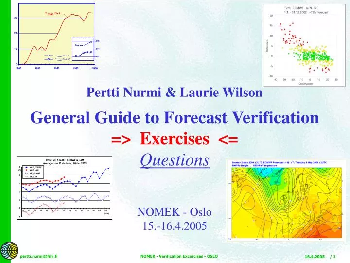
Pertti Nurmi & Laurie Wilson General Guide to Forecast Verification => Exercises <= Questions NOMEK - Oslo 15.-16.4.2005. Spot temperature scatter plot Exercise.

E N D
Pertti Nurmi & Laurie Wilson General Guide to Forecast Verification => Exercises <= Questions NOMEK - Oslo 15.-16.4.2005 NOMEK - Verification Excercises - OSLO
Spot temperature scatter plot Exercise Attached is a scatter plot of Observed vs. Forecast spot temperatures (the axes are unfortunately reverse compared to the lecture notes) and their conditional distributions. The forecasts are for +40 hours for 11 stations, and the total sample size is 701 cases. The numbers on the scatter plot represent the number of occurrences of observed and forecast temperatures for each whole degree Celsius. Questions on the scatter plot: 1. Is there a bias? Are forecast temperatures generally too high or too low? 2. How many cases involve errors > 10 oC? 3. How are observed temperatures above +10 oC handled? How are observed temperatures below -20 oC handled? 4. Does the technique ever forecast temperatures < - 20 oC? 5. Assume that temperatures < -20 oC and temperatures > + 10 oC represent extreme events for this station in winter. Hatch the false alarm area and the missed event area for these extreme temperatures. (“False alarms” refer to forecasts of extremes that were not observed and “missed events” are occurrences of extremes that were not forecast.) 6. If there were no skill in the forecast, what would the graph look like? Exercise 1: Spot Temperature Scatter Plot (a) NOMEK - Verification Excercises - OSLO
Exercise 1: Spot Temperature Scatter Plot (b) NOMEK - Verification Excercises - OSLO
Gale observed Tornado observed Gale Tornado forecast forecast S S Yes No Yes No fc fc 100 17 2 Yes 15 Yes 30 70 No 11 123 134 No 20 2680 2700 S 26 S 50 125 151 2750 2800 obs obs Exercise 2: Categorical Events Contingency Table Gale-force winds Contingency Table Exercise Attached is a contingency table of five months of categorical warnings against gale-force winds, i.e. wind speeds exceeding 14 m/s (left). Compute the specified verification statistics. For reference, corresponding “Finlay” tornado verification statistics are shown (right). Interpret the scores and compare the two. B = _____ PC = _____ POD = _____ FAR = _____ PAG = _____ F = _____ KSS = _____ TS = _____ ETS = _____ HSS = _____ OR = _____ ORSS = _____ B = 2.00 PC = 0.97 POD = 0.60 FAR = 0.70 PAG = 0.30 F = 0.03 KSS = 0.57 TS = 0.25 ETS = 0.24 HSS = 0.39 OR = 57.43 ORSS = 0.97 NOMEK - Verification Excercises - OSLO
Part 1 You have two reliability tables. They represent verification of probability forecasts of heavy precipitation ( > 10 mm in 12 hr) produced by two different methods. The verification sample is one year of data at 72 stations. Questions: 1. Interpret the table for technique A. What can be said about probability forecasts over 40%? 2. Which technique produces sharper forecasts? How is this indicated on the diagram? Exercise 3: Reliability Table (Diagram) (a) Reliability Table Exercise Part 2 You have two reliability tables, one for 0 to 6 hr POP forecasts and the other for 42 to 48 hr POP forecasts (6 hr periods). Forecasts are for 220 stations over a three month period. On each graph there are two dotted lines, representing the forecasts from two different techniques. Technique A is represented by the blue dots and Technique B by the red dots. In the upper left corner, the histograms indicate the number of times each of the 10 probability categories was predicted. Technique A is shown on the histograms by the blue bars and Technique B by the red bars. The frequencies of prediction of each probability category are also indicated by the numbers beside the points on the graphs. The horizontal line is the sample climatological frequency of occurrence of precipitation. Questions: 1. Comment on the reliability of the two techniques as indicated by both tables. What does a forecast of 85% actually mean at 0 to 6 hr and 42 to 48 hr? 2. Which technique is sharper at 0 to 6 hr? at 42 to 48 hr? How do you know? 3. The two extra plotted green points represent categorical forecasts of precipitation from a third technique. Comment on the reliability of this method for both forecast periods. 4. Which of the two probability forecast techniques produces the better forecasts in your opinion. Why? NOMEK - Verification Excercises - OSLO
Exercise 3: Reliability Table (Diagram) (b) –Part 1 A A B B NOMEK - Verification Excercises - OSLO
Exercise 3: Reliability Table (Diagram) (c) –Part 2 NOMEK - Verification Excercises - OSLO
ROCA Exercise 4: Signal Detection Theory Signal Detection Theory Exercise Attached is a graph of Relative Operating Characteristic curves for probability forecasts of wind speed greater than 10 m/s derived from the ECMWF Ensemble Prediction System. Forecasts are for the winter season for c. 250 European stations. Three ROC curves are shown, for 96 hr, 144 hr, and 240 hr forecasts, respectively. Questions relating to the ROC: 1. Is there discriminating power in the forecasts at any or all projections? Why or why not? 2. Note that two of the curves (144 hr and 240 hr) cross over. What does this mean? NOMEK - Verification Excercises - OSLO
Pertti Nurmi & Laurie Wilson General Guide to Forecast Verification => Exercises <= Answers NOMEK - Oslo 15.-16.4.2005 NOMEK - Verification Excercises - OSLO
Exercise 1: Answers NOMEK - Verification Excercises - OSLO
Exercise 1: Answer (1,2) (1) It is usually possible to see at a glance whether the bulk of points lie above or below the 45 degree line. In this case, there appears to be a slight negative bias (more points above the line). The actual bias is -0.55oC for this dataset. (2) There are 46 cases (6.6%) of the forecasts with errors greater than 10 oC. All points lying outside both diagonals drawn 10 degrees away from the 45 degree line count. Forecast too low ( negative bias ) Forecast too high ( positive bias ) NOMEK - Verification Excercises - OSLO
Exercise 1: Answer (3) (3) Observed temperatures above 10 oCare forecast too low on average; temperatures below -20oCare forecast too high on average. This example of forecasting extreme occurrences toward the mean is a characteristic of many statistical forecasts. This does not necessarily mean that the technique is incapable of forecasting extreme temperatures. NOMEK - Verification Excercises - OSLO
Exercise 1: Answer (4) (4) Yes. The lowest forecast temperature is -29 oC, lower by 3 degrees than the lowest observed temperature. There are 8 forecast cases of temperatures below -25 oC, only one observed case. -25 oC NOMEK - Verification Excercises - OSLO
Exercise 1: Answer (5) (5) All occurrences of temperature > +10 oC were missed. All except one of the occurrences < -20 oC were missed. All the forecasts of < -20 oC are false alarms except for 2 cases. Missed events False alarms False alarms Missed events NOMEK - Verification Excercises - OSLO
Exercise 1: Answer (6) (6) Visualize all temperatures forecasts toward the mean. The observation set cannot be changed, so points can be “moved” only along x-axis. A completely unskilled forecast would appear as an array of points with no discernible orientation along the 45 degree line. In this case, the orientation would be a vertical line, which may or may not be the same as the observed mean temperature. NOMEK - Verification Excercises - OSLO
Exercise 1: Answers Answers to spot temperature scatter plot Exercise 1. It is usually possible to see at a glance whether the bulk of the points lie above or below the 45 degree line. In this case, there appears to be a slight negative bias (more points above the line), meaning temperatures are forecast too low on average. When assessing bias graphically, it is necessary to estimate the cumulative distance from the line as well as the number of points on each side of the line. The actual bias is -0.55oC for this dataset. 2. There are 46 cases, or 6.6 % of the forecasts with errors greater than 10 oC. All points lying outside both diagonals drawn 10 degrees away from the 45 degree line count. 3. Observed temperatures above 10 oCare forecast too low on average, and temperatures below -20oCare forecast too high on average. This example of forecasting extreme occurrences toward the mean is a characteristic of many statistical forecasts. This does not necessarily mean that the technique is incapable of forecasting extreme temperatures. 4. Yes. The lowest forecast temperature is -29 oC, lower by 3 degrees than the lowest observed temperature. In this dataset, there are altogether 8 forecasts of temperatures below -25 oC. 5. See diagram. All occurrences of temperature > +10 oC were missed. All except one of the occurrences < -20 oC were missed. All the forecasts of < -20 oC are false alarms except for 2 cases. 6. Visualize prediction of all temperatures toward the mean. The observation set cannot be changed, so points can be “moved” only horizontally. A completely unskilled forecast would appear as an array of points with no discernible orientation along the 45 degree line. In this case, the orientation would be along a vertical line, which may or may not be the same as the observed mean temperature. Lack of skill can also be expressed by saying that the distributions of the forecasts given the observations lie on top of each other; there is no correlation between forecast and observation. NOMEK - Verification Excercises - OSLO
Gale observed Tornado observed Gale Tornado forecast forecast S S Yes No Yes No fc fc 100 17 2 Yes 15 Yes 30 70 No 11 123 134 No 20 2680 2700 S 26 S 50 125 151 2750 2800 obs obs Exercise 2: Answers Categorical Events Contingency Table B = (a+b)/(a+c) = ____ PC = (a+d)/n = ____ POD = a/(a+c) = ____ FAR = b/(a+b) = ____ PAG = a/(a+b) = ____ F = b/(b+d) = ____ KSS = POD-F = ____ TS = a/(a+b+c) = ____ ETS = (a-ar)/(a+b+c-ar) = ____ HSS = 2(ad-bc)/[(a+c)(c+d)+(a+b)(b+d)] = ____ OR = ad/bc = ____ ORSS = (OR-1)/(OR+1) = ____ 2. 00 = B 0.97 = PC 0.60 = POD 0.70 = FAR 0.30 = PAG 0.03 = F 0.57 = KSS 0.25 = TS 0.24 = ETS 0.39 = HSS 57.43 = OR 0.97 = ORSS NOMEK - Verification Excercises - OSLO
Gale observed Tornado observed Gale Tornado forecast forecast S S Yes No Yes No fc fc 100 17 2 Yes 15 Yes 30 70 No 11 123 134 No 20 2680 2700 S 26 S 50 125 151 2750 2800 obs obs Exercise 2: Answers Categorical Events Contingency Table B = (a+b)/(a+c) = 0.65 PC = (a+d)/n = 0.91 POD = a/(a+c) = 0.58 FAR = b/(a+b) = 0.12 PAG = a/(a+b) = 0.88 F = b/(b+d) = 0.02 KSS = POD-F = 0.56 TS = a/(a+b+c) = 0.54 ETS = (a-ar)/(a+b+c-ar) = 0.48 HSS = 2(ad-bc)/[(a+c)(c+d)+(a+b)(b+d)] = 0.65 OR = ad/bc = 83.86 ORSS = (OR-1)/(OR+1) = 0.98 2. 00 = B 0.97 = PC 0.60 = POD 0.70 = FAR 0.30 = PAG 0.03 = F 0.57 = KSS 0.25 = TS 0.24 = ETS 0.39 = HSS 57.43 = OR 0.97 = ORSS NOMEK - Verification Excercises - OSLO
Exercise 3: Reliability Diagram – Part 1 A B NOMEK - Verification Excercises - OSLO
Exercise 3: Reliability Diagram – Part 1 (1) The reliability curve is nearly horizontal for forecasts over 30%. Literally, this means that it practically does not matter what the forecast probability is if it is greater than 40%. Heavy precipitation will occur about 30% of the time. (2)Technique A produces sharper forecasts. This is assessed by comparing the frequencies of forecasts in the various probability ranges for the two techniques. The greater the number of forecasts near the extremes of 100% and 0%, the sharper the technique. For example, technique B never attempts a probability forecast above 50%, while technique A forecasts more than 50% 370 times. A B NOMEK - Verification Excercises - OSLO
Exercise 3: Reliability Diagram – Part 2 NOMEK - Verification Excercises - OSLO
Exercise 3: Reliability Diagram – Part 2-1 (1) Both techniques are quite reliable at both ranges. There is slight tendency to overforecast low probabilities and underforecast high probabilities at the 0-6 hr range, especially for Technique B. As the level of forecast accuracy drops with increasing forecast projection, the reliability curves tend to move toward horizontal. At 0-6 hr, a forecast of 85% means 86% for Techn. A and 80% for Techn. B. For 42 to 48hr, 85% means 85% (perfectly reliable) for Techn. A and 76% for Techn. B. NOMEK - Verification Excercises - OSLO
Exercise 3: Reliability Diagram – Part 2-2 (2) Techn. A is sharper at 0-6 hr. This is indicated by the slight tendency toward a U-shape in the sharpness histogram and greater numbers of forecasts of extreme probabilities. Techn. B is sharper at 42-48 hr. This is characteristic: Techn. A is a MOS technique, which tend to maintain reliability with increasing forecast projection while losing sharpness. Techn. B is perfect prog which typicallymaintain sharpness, but tend to lose reliability as accuracy decreases. NOMEK - Verification Excercises - OSLO
Exercise 3: Reliability Diagram – Part 2-3 (3) The two plotted points on each graph are for the GEM model. Categorical forecasts are not reliable unless they are also perfect. At 0-6 hr, the model achieves a hit rate of only 52% for its precipitation forecasts, and even less, 48% at 42-48 hr. NOMEK - Verification Excercises - OSLO
Exercise 3: Reliability Diagram – Part 2-4 (4) It is a matter of preference, and depends on the way in which the forecasts will be used. Sharper techniques may be preferred as a kind of “alert” to possible extreme conditions, even at the cost of some reliability. On the other hand, reliability is preferred for forecast systems which will not be carefully monitored. These results suggest that uncertainty can be quantified reliably using PoP, and that the PoP forecasts convey more information than categorical forecasts. NOMEK - Verification Excercises - OSLO
ROCA Exercise 4: Answers Signal Detection Theory Exercise Below is a graph of Relative Operating Characteristic curves for probability forecasts of wind speed greater than 10 m/s derived from the ECMWF EPS. Forecasts are for winter season for c. 250 European stations. Three ROC curves are shown, for 96, 144, and 240 hr forecasts. Questions relating to the ROC: 1. Is there discriminating power in the forecasts at any or all projections? Why or why not? 2. Note that two of the curves (144 hr and 240 hr) cross over. What does this mean? NOMEK - Verification Excercises - OSLO
ROCA Exercise 4: Answers Signal Detection Theory Exercise (1) Yes, at all forecast ranges: the EPS is able to distinguish cases leading to winds over 10 m/s from cases leading to winds under 10 m/s. While this may seem remarkable at first glance, the sample undoubtedly contains many situations where there is little doubt, the winds are well away from the threshold. The results surely would have been different if more demanding forecasts were demanded, e.g. identifying winds in 5 m/s categories. The ROC area is in the 0.8 range, which is high enough to consider the forecasts useful. Although the theoretical lower limit of skill is 0.5, in meteorology the signal gets pretty weak if the area is < 0.7. NOMEK - Verification Excercises - OSLO
ROCA Exercise 4: Answers Signal Detection Theory Exercise (2) The curves for 144 hr and 240 hr cross over about a third of the way from the lower left hand corner. This means that the 144 hr forecasts form a better basis for decision-making at lower ranges of probabilities (higher hit rate vs false alarm rate) while the 240 hr forecasts form a slightly better basis for decision-making at higher ranges of probability. The differences are very small and can be considered a random effect of this particular dataset. While cross overs are not a frequent occurrence, they occur sometimes and indicate interesting aspects of performance. NOMEK - Verification Excercises - OSLO