Download
1 / 14
140 likes | 220 Views
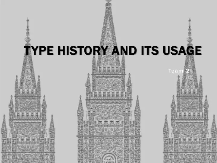
Type History and its usage. Team 2. Black Letters. Release Year: 1150 Country of Origin: Europe; Johann G utenberg Classification : Script/ Blackletter Can be referred to as : Old English, Mediaeval/Gothic, Celtic ( Textura , Schwabacher , Cursiva and Fraktur )

E N D
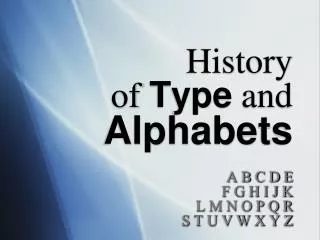
Type History and its usage Team 2
Black Letters • Release Year: 1150 • Country of Origin: Europe; Johann Gutenberg • Classification: Script/Blackletter • Can be referred to as: Old English, Mediaeval/Gothic, Celtic (Textura, Schwabacher, Cursiva and Fraktur) • Characteristics: • Strongly maintained its roots in the calligraphic scripts and organic shapes of its ancestors-in-influence for the following 500 years as it remained in strong use. • Strong space between words was required. • Dramatic thin and thick strokes, with elaborated curves
Black Letters • Purpose: It was used for the religious texts of monasteries which later on evolved. • What is it used for today? It brings to mind the medieval times and is often used in headlines, logos, signs, fantasy games, movies.
Helvetica When ? : • Created in year 1957 by Max Miedinger. Characteristics ? : • two-storied a (with curves of bowl and of stem) • narrow t and f • square-looking s • bracketed top serif of 1 • rounded off square tail of R Purpose ? : Professional look of the font that it look simply and accessible What is it used in today ? : Commercial logos (3M, BMW) , federal income tax forms(from the US government),subway signs(MTA:MetropolitanTransportation Authority) Classification ? : Sans Serif Family (type that does not have serif)
Garamond • Created: Between 1530 and 1545.(Garamond by Claude Garamond and most of the Garamond faces are most closely related to the work of a later punch-cutter, Jean Jannon.) • Characteristics: The font is easy to read and consistent. Garamond conveys a sense of solid tradition, yet still soft and attractive. Top serifs have a downwards slope • Purpose: It was during this early part of the 16th century that Garamond and his peers found that the typography industry required unique multi-talented people. This way they could produce fine books. • Used for: It is used on pamphlets typeset, novels, poems and advertisement. • Classification: Old Style ( under the category of serifs )
Futura • Year: 1927 by Paul Renner • Characteristic: Complex curves • Classification: Sans Serif • Purpose: He believe that a modern typeface should express modern models rather than be a rival of a previous design • Used today: Corporate logos, commercial products, films and advertisements
TRAJAN • Year: Designed in 1989 by Carol Twombly for Adobe. • Type of classification: Display font • Characteristics: All caps alphabet, with elegant, sweeping curves • Purpose: Conveys a feeling of importance, elegance and is very easy to read at a distance. Seen frequently in advertising and in book titles
Bondini • Year: Designed by the Italian engraver Giambattista Bodoni in 1798 • Type of classifications: Modern/Didonefont. • Characteristics of the font: Contrast between thick and thin strokes to the vertical axis combining with thin 'hairlines' resulted in an attractive, delicate font but one which could prove difficult to print. • Purpose:Often used by glossy fashion magazines. Bodoni poster-style fonts made popular in artwork produced in the Swinging Sixties are now enjoying a revival. An up-to-date example which has received world-wide exposure is the title adopted for the film production of Abba's hit musical Mamma Mia!
Century Gothic • Release Year: 1991 • Country of Origin: United States, • Classification: Sans Serif, Lineales, Geometric Sans. • Characteristics: They do not have decorative serifs. Clean and simple. Suggests new and attention awakening appeal. It has a larger height than monotype font script. The stroke in this font is also wider and more even.
Century Gothic • Purpose: • Century Gothic maintains the basic design of 20th Century but has an enlarged x-height and has been modified to ensure satisfactory output from modern digital systems. • What is it used for today? • Printing children’s story books. • Writing school books and printing materials. • Useful for headlines and general display work and for small quantities of text, particularly in advertising.
Credits • http://typophile.com/node/14496 • http://www.weagree.com/book/149-Characteristics%3A+Helvetica,+Times+New+Roman+and+Garamond.html • http://www.linotype.com/414/claudegaramond.html • http://www.pointlessart.com/education/loyalist/typeTalk/garamond/biography.html