Download
1 / 61
610 likes | 638 Views
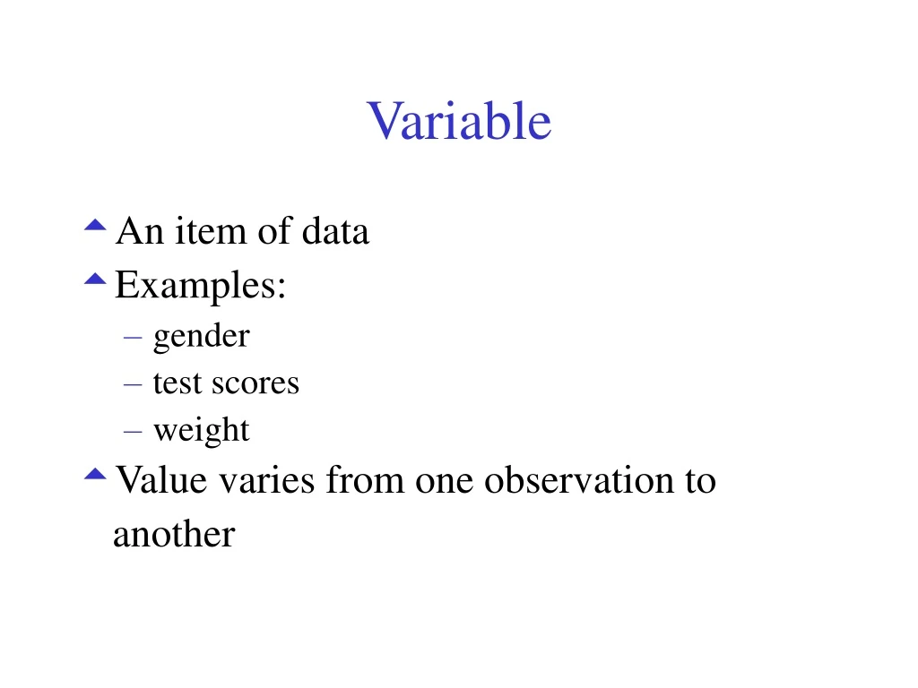
Variable. An item of data Examples: gender test scores weight Value varies from one observation to another. Types/Classifications of Variables. Qualitative Quantitative Discrete Continuous. Qualitative Data. Describes the quality Non-numerical format Counts

E N D
Variable • An item of data • Examples: • gender • test scores • weight • Value varies from one observation to another
Types/Classifications of Variables • Qualitative • Quantitative • Discrete • Continuous
Qualitative Data • Describes the quality • Non-numerical format Counts Cannot order or measure • Examples • gender • marital status • geographical region • job title….
Categorical data • Non-overlapping categories or characteristics • Examples: • Completes/Incompletes • Professions • Gender
Quantitative Data • Frequencies • Measurements
Discrete • Measurements are integers • Examples: • number of employees of a company • number of incorrect answers on a test • number of participants in a program…
Continuous • Measurements can take on any value - usually within some range • Examples: • Age • Income • Arithmetic operations such as differences and averages make sense.
Qualitatiave or Quantitative? Discrete or Continuous? • Score on a placement exam • Preferred restaurant • Dollar amount of a loan • Height • Salary • Length of time to complete a task • Number of applicants • Ethnic origin
Treatment as Ranks • Natural order • Not strictly measured • Examples: • Age group • Likert Scale data • Distinction between adjacent points on the scale is not necessarily the same
AnalysisQualitative Data • Frequency tables • Modes - most frequently occurring • Graphs: Bar Charts and Pie Charts
AnalysisQuantitative Data • Any form • Create groups or categories and generate frequency tables • All descriptive statistics
Effective Graphs: Quantitative Data • Histograms • Stem-and-Leaf plots • Dot Plots • Box plots • XY Scatter Plots (2 variables).
Analyze Ranked Data • Frequency tables • Mode, Median, Quartiles • Graphs: • Bar Charts • Dot Plots, Pie Charts • Line Charts (2 variables)
Data Example Suggest some ways you could analyze these items. • Score on a placement exam • Preferred restaurant • Dollar amount of a loan • Height • Salary • Length of time to complete a task • Number of applicants • Ethnic origin
Tables and Graphs Note Excel will create anygraph that you specify Consider the type of data before selecting your graph.
Frequency Table/Frequency Distribution Summarize data: • categorical • nominal • Continuous data - the data set has been divided into meaningful groups
Frequency Distribution Count the number of observations that fall into each category. Frequency: the number associated with each category
Relative Frequency Distribution Proportion of observations falling in a given category Report relative frequencies or percentages
Pie Charts • Circle - divided proportionately • Segment - percentage of the whole that falls into each category
Bar Charts • Bar charts - % in various categories • Vertical scale - frequencies, relative frequencies • Horizontal scale - categories • Allows comparisons
Constructing Bar Charts • All boxes should have the same width • Gaps between the boxes - no connection between • Any order. • Use to represent two categorical variables simultaneously
Graphs: MeasuredContinues Quantitative Data • Histograms • Stem and Leaf • Box plots • Line Graphs • XY Scatter Charts (2 variables)
Histograms • Frequency distributions of continuous variables • Drawn without gaps between the bars
Constructing Histograms • Non-overlapping intervals • Intervals - generally the same length • Number of values in each interval -class frequency • Relative frequencies o
XY Scatter Chart • Two variables • Variables: quantitative and continuous. • Plot pairs - rectangular coordinate system • Examine the relationship between two variables
Line Chart • Similar to the scatter chart • Values of the independent variable (shown on the horizontal axis) can be ranked values (i.e.. they do not have to be continuous variables).
Basic Principles for Constructing All Plots • Data should stand out clearly from background • The information should be clearly labeled • title • axes, bars, pie segments, etc. - include units that are needed to interpret data • scale including starting points.
Principles cont. • Source • No clutter • Minimize information or data on one graph. • Try several approaches
Describing Data • Shape of the Distribution • Symmetry • Skewness • Modality: most frequently occurring value • Unimodal or bimodal or uniform
Right Skewed Left Skewed Symmetrical
Describing Data • Centrality • Spread • Extreme values
Measures of Centrality • Mean • Median • Mode
Mean • Most common measure • Extremely large values in a data set will increase the value of the mean • Extremely low values will decrease it.
Calculating the Mean T1 T2 T3 85 85 85 90 90 90 75 35 75 90 90 110 340 300 360 Sum 85 75 90 Mean
Median • Central point . • Half of the data has a value than the median • Half of the data has a higher value than the median • Not affected by extremely large or small values
Find the Median 85 90 75 92 95 Data 75 85 90 92 95 Sorted Data Median is 90.
Find the Median 95 90 92 85 Data 85 9092 95 Sorted Data Median: (90 + 92)/2 = 91
Range • Subtract the smallest value from the largest • Report the smallest and largest values. 85 90 75 92 95 Scores Range: 75 to 95 or 20
Variance/Standard Deviation • Average variation of the data values from the mean of the values • Variance.
The Empirical Rule • Symmetrical Data • At least: 68% of the data values are within one standard deviation of the mean 90% of the data values are within two standard deviation of the mean 99% of the data values are within three standard deviations of the mean
Tchybychef’s Inequality • Skewed Data • At least: 75% of the data values are within two standard deviation of the mean. 90% of the data values are within one standard deviation of the mean.