Download
1 / 13
130 likes | 200 Views
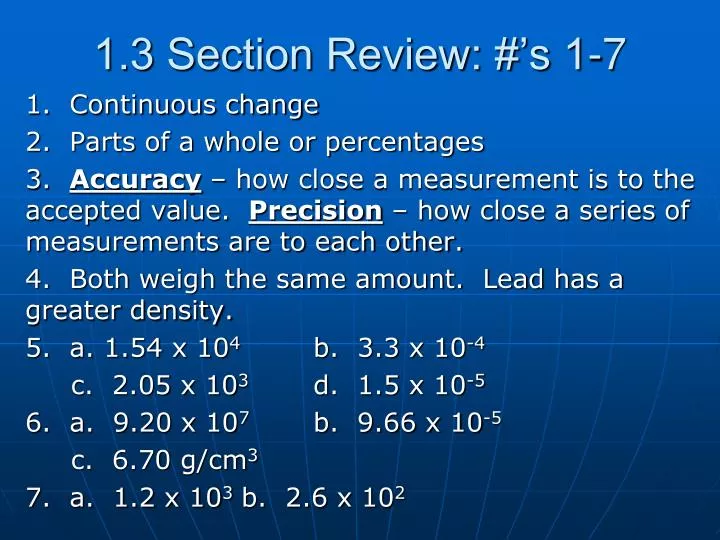
1.3 Section Review: #’s 1-7. 1. Continuous change 2. Parts of a whole or percentages 3. Accuracy – how close a measurement is to the accepted value. Precision – how close a series of measurements are to each other. 4. Both weigh the same amount. Lead has a greater density.

E N D
1.3 Section Review: #’s 1-7 1. Continuous change 2. Parts of a whole or percentages 3. Accuracy – how close a measurement is to the accepted value. Precision – how close a series of measurements are to each other. 4. Both weigh the same amount. Lead has a greater density. 5. a. 1.54 x 10⁴ b. 3.3 x 10⁻⁴ c. 2.05 x 10³ d. 1.5 x 10⁻⁵ 6. a. 9.20 x 10⁷ b. 9.66 x 10⁻⁵ c. 6.70 g/cm3 7. a. 1.2 x 10³ b. 2.6 x 10²
Physical Science 1.3 “Organizing Data” Key Concepts: Why do we organize data?
I. Presenting Scientific Data? A. Visual aid – helps us imagine what our data looks like. B. Shows what is going on. C. Compare information D. Makes it easier to understand
II. Types of Graphs A. Line Graph 1. Useful for showing continuous changes 2. Shows “connectedness” 3. Used with “time” frequently. 4. Contains dependent and independent variable
Where do we generally place the Dep. Variable and the Ind. Variable? Dependent variable Independent variable
Direct vs. Indirect Direct – As one set of values increases so does the other value. Indirect – As one set of values decrease the other value increases.
What class period has the best average and what is their average?
B. Bar Graph 1. Used to compare individual items or events 2. Shows differences between individual values.
What is the most popular temperature? 18 C What is the least popular temperature? 20 C How many rooms were tested at Western? 13 rooms
C. Circle / Pie Graph 1. Used to show different parts of a whole. (100%) 2. Great visual tool 3. Can be misleading
What needs to be included on a graph??? 1. Title 2. Labels – x and y axis 3. Legend / Key 4. Always make the graph colorful!
In-Class Assignment 1.3 A survey shows that, in your neighborhood; 75 people ride the bus; 45 drive their own cars; 25 people use a moped; and 5 people walk to school. Make three different graphs to visually display this information (put a big black X on the graph that should not be used). Remember to include title, legend, and any other important information if needed. Use colored pencils or markers.