Download
1 / 12
120 likes | 237 Views
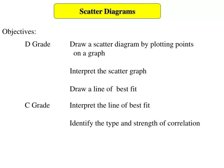
Scatter Diagrams. Objectives:. D Grade Draw a scatter diagram by plotting points on a graph Interpret the scatter graph Draw a line of best fit. C Grade Interpret the line of best fit

E N D
Scatter Diagrams Objectives: D Grade Draw a scatter diagram by plotting points on a graph Interpret the scatter graph Draw a line of best fit C Grade Interpret the line of best fit Identify the type and strength of correlation
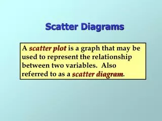
Scatter Diagrams A scatter graph is a graph using paired data that can be used to find out whether there is a relationship between two variables. paired data is two separate pieces of data referring to the same thing e.g. the age and value of a car the height and shoe size of a person the marks that a person gained in two separate tests. A variable is a piece of information that can change. e.g. test results - these can be any value, but will be a specific value for a particular person's test.
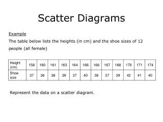
Scatter Diagrams The height and shoe size of students in a class was recorded. This information can then be plotted for each student on a graph with the height on one axis and the shoe size on the other axis each cross represents the shoe size and height of one student Height Shoe size
Scatter Diagrams 10 pupils sat both a Maths and a Physics exam, here are their scores: Plot them as a scatter graph. Generally the top set of data is used for the x values X X X X X X X X X X
Scatter Diagrams Correlation: is a measure of the relationship between two variables; correlation is measure in terms of type and strength correlation is assessed by being strong or weak strong means there is a very strong relationship such as ‘the hotter the weather the more ice creams are sold’ weak means there is no relationship between things such as ‘the colder the weather the better my exam results will be’
Scatter Diagrams Correlation on a scatter diagram no correlation weak correlation strong correlation Notice how the crosses are grouped close together along an imagined line The crosses are less closely grouped in the example of weak correlation.
Scatter Diagrams Correlation can also be described and positive or negative, Depending on the slope (gradient) of the graph positive correlation negative correlation Positive correlation means that as one item increases, so does the other. e.g. as a person’s height increases so does their armspan Negative correlation means that as one item increases, so does the other. e.g. as a car gets older its value decreases
Scatter Diagrams Example: Sketch a diagram to show a possible scatter graph for paired data for the age and value of a computer. Describe the correlation and write a sentence to describe the relationship Strong negative correlation As a computer gets older it is worth less value of computer age of computer
Scatter Diagrams p39 Worksheet Q3 The table shows the ages and arm spans of seven students in a school. Q4 The table shows the ages and second-hand values of seven cars. • Draw a scatter graph of the results • Describe the type and strength of correlation • Write a sentence explaining the relationship • between the two sets of data • Draw a scatter graph of the results • Describe the type and strength of correlation • Write a sentence explaining the relationship • between the two sets of data
Scatter Diagrams Worksheet Q5 The table shows the daily rainfall and the number Of sunbeds sold at a resort on the south coast Q8 refer to book p40 • Draw a scatter graph of the results • Describe the type and strength of correlation • Write a sentence explaining the relationship • between the two sets of data
4000 3000 Value of car (£) 2000 1000 1 5 4 3 6 2 7 11 10 9 8 Age of Car (years) Scatter Diagrams p39 Q3 68 66 64 62 60 58 56 54 52 50 Q4 X X X X Arm Span (inches) X X X X X X X X X X 10 11 12 13 14 15 16 17 18 Age (Years)
Scatter Diagrams Q8 1200 1100 1000 900 800 700 600 500 400 300 200 100 0 400 350 300 250 200 150 100 50 0 X Q5 X X X X Number of sun beds sold Calories X X X X X X X X X 1 2 3 4 5 6 7 8 9 10 11 X Amount of rainfall (mm) 10 20 30 40 50 Fat (g)