Download
1 / 4
50 likes | 70 Views
Visual representations of data are easier to understand and remembered by stakeholders. Designing effective data visuals that look interesting, and allows the reader to easily understand your points without being overwhelmed in an art.

E N D
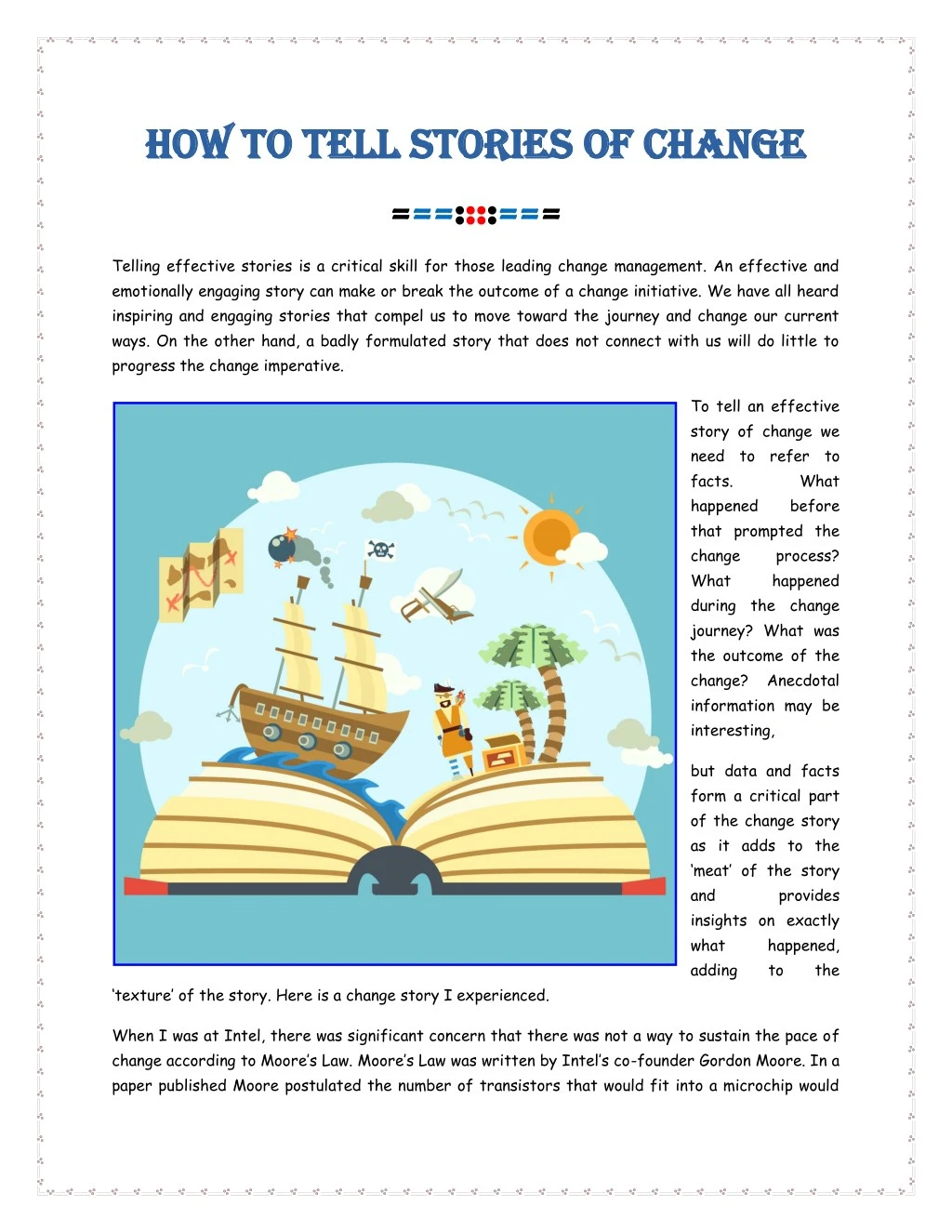
How To Tell Stories Of Change How To Tell Stories Of Change ===::::=== Telling effective stories is a critical skill for those leading change management. An effective and emotionally engaging story can make or break the outcome of a change initiative. We have all heard inspiring and engaging stories that compel us to move toward the journey and change our current ways. On the other hand, a badly formulated story that does not connect with us will do little to progress the change imperative. To tell an effective story of change we need to refer to facts. happened that prompted the change What during the change journey? What was the outcome of the change? Anecdotal information may be interesting, What before process? happened but data and facts form a critical part of the change story as it adds to the ‘meat’ of the story and insights on exactly what happened, adding provides to the ‘texture’ of the story. Here is a change story I experienced. When I was at Intel, there was significant concern that there was not a way to sustain the pace of change according to Moore’s Law. Moore’s Law was written by Intel’s co-founder Gordon Moore. In a paper published Moore postulated the number of transistors that would fit into a microchip would
double every year. Over time, the pace of change at Intel in innovating to meet this expectation (and in many ways shaping the overall computer industry) had driven the company to innovate constantly. At that time in 2004, there was concern within Intel that there may not be a way to fit in even more transistors within a chip as inserting even more would result in significant heat and energy consumption to not make it viable. For us layman, transistors are basically the ‘brains’ of the computer. The race was on to find another way to fulfill Moore’s prophecy. This is a company known for its technical prowess, building the most powerful supercomputers in the world. Therefore, there was significant motivation to continue to find ways to meet this challenge. The challenge was met and tackled when engineers came up with a way of organising and grouping transistors as a ‘core’ in a way that distributed heat balanced with energy consumption (my simplified layman translation). This started with dual-core processors followed by multi-core processors. The company rejoiced and the law was maintained! Typical story formats There are several typical story formats that are common in telling change stories (adapted from Sparkol) including: 1)The Quest – The hero sets out in search of a particular challenge, prize or reward and in the process comes across a series of challenges. There may be accomplices along the way to help the hero in the quest. Eventually, after struggles, the hero succeeds and all is well. 2)Rebirth– The main character has a significant flaw or is a bad person, and eventually is shown their flaws and through this awareness and realization redeems him/herself to transform into ‘good’. 3)Overcoming the monster– The main character sets out to defeat a monster, and through sheer will, determination and hard work the character defeats the monster Using data to tell the story A typical story for organizations undergoing significant change is … 1)Context: Industry is undergoing significant changes and with significant competition, the company needs to transform ABC to stay competitive. 2)Quantitative data: The change roadmap contains a series of changes. Looking at the data (as shown through a heatmap or other analytical reports) there are certain months where change loading peaks. Last time this load happened business performance was impacted in ABC ways.
3)Qualitative data: From previous change episodes, anecdotal feedback from employees and other frontline teams is that ABC. For example, during this is what people experienced, and as a result XXX happened. 4)The problem statement: This presents a number of risks and challenges in terms of ABC. 5)The solution: To effectively manage these risks it is recommended that ABC. However, the change story doesn’t need to be just about too much change. Other common story themes can be around … 1)Change not happening fast enough, with sufficient pace 2)Impact of customers is disjointed and not integrated, as a result leading to inadequate customer experience 3)Too many diverse sets of changes are happening (in a way that is not integrated), leading to a lack of focus and therefore lack of depth in change outcomes 4)Change clashes as a result of inadequate planning and integration, with different initiatives vying for attention change on In using data to tell the change journey there should be a balance of quantitative as well as qualitative data used. Quantitative data can include sources such as the level of impact, where, when, to whom (how many people), etc., and qualitative data can include such as employee survey results, business change readiness interviews, stakeholder feedback, etc. The combination of both qualitative and quantitative data provides the richness required to bring life to the change story. Often, change practitioners shy away from quantitative data, and as a result risk not being taken seriously by senior stakeholders and project teams. To read more about creating quantitative and strategic reports click here. Data visualization Visual representations of data are easier to understand and remembered by stakeholders. Designing effective data visuals that look interesting, and allows the reader to easily understand your points without being overwhelmed in an art. Key considerations include selecting the right graph to best represent the data you are showing (for example pie charts for percentages and line
charts for historical trends), use colours effectively to represent different data dimensions, not over-crowding the user with too much information, using the right proportions of representations so that it is easier for the user to comprehend the scale/magnitude, and using common data representation within the same graph for consistency and to avoid confusing the reader. Source: https://www.thechangecompass.com/how-to-tell-stories-of-change/ =============== About The Change Compass About The Change Compass The Change Compass is a digital, cloud-based tool. It helps organizations create a picture of change impacts on people and customers. It is also a set of best practices in managing a portfolio of changes through data. === CONTACT US CONTACT US https://www.thechangecompass.com/ admin@thechangecompass.com https://twitter.com/thechangecompas https://www.linkedin.com/company/thechangecompass