Download
1 / 9

E N D
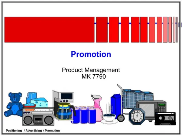
SELF PROMOTION Presentation
Theory and thoughts The idea behind my branding and my self promotional package is (as a theme) simplicity. I have changed my branding slightly from the first assignment, and I have developed it further. I have used a T-shirt as my main image in my branding, and it appears on all of my work. The T- shirt represents the fact that I can work in a multitude of different work scenarios, for example journalism, graphic design, photography ect, hence the “one size fits all” print that is present on the front of my self promotional object t-shirt.
Progression & Research I have experimented with different color schemes in my branding, at first I wanted to use different colors to highlight the diversity theme, so I started designing T-shirts, letter heads, and business cards with lots of different colors involved in the design, these are displayed on my blog. After doing more research, I decided that as a brand, I wanted to have a particular color, I decided that I could use different shades of one color, to show diversity and playfulness, however it still remains respectfully professional and gives a more organized look and feel to the whole brand identity. I researched a few different business brand identities and websites, all of which are on show on my blog. After looking around and experimenting on Photoshop, I eventually decided on blue as the theme color for my branding. Blue is a well-liked color, especially cool blue, to the eye it’s seen as a trustworthy and dependable color and also looks clean and fresh. This is exactly what I wanted, as the playful designs tied in with this reliable color was the perfect match for me in terms of finalizing my color and design.
Choices For my letterhead, after doing some research on paper and card and other funky ways of presenting, I decided I wanted to use a smooth white card, with the t-shirts, which come out of the sides of the letter (top and bottom) to be embossed, to give the letterhead some extra style. I know this would be more expensive but I think it would be worth it. I thought about using a gloss card, however I didn’t want to come across to professional. For my business card, I would use a textured card stock, in a matt finish; I think the patterns that are embedded in to this type of card would give it some authenticity, which I want to portray. I want to use matt, so people can use them to write on, which gives them more of a use to anyone that has one, the idea behind this is that it would be looked at more often, giving then more chance of getting business. I did think of the glossy card stock, however, again I didn’t want it to look too professional.