Download
1 / 11
110 likes | 563 Views
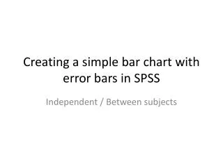
Creating a simple bar chart with error bars in SPSS. Dependent / Within subjects. D ependent data bar chart. Type data into Data view for a dependent design (each level of the IV will have a variable name)

E N D
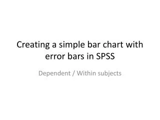
Creating a simple bar chart with error bars in SPSS Dependent / Within subjects
Dependent data bar chart Type data into Data view for a dependent design (each level of the IV will have a variable name) In this example we expose participants to two drugs over a 4 week period and measure the number of hiccups they have during a 1 week period after the drug. Drug order (A then B, and B then A) are counterbalanced. To produce a bar chart with error bars click Graphs – Chart Builder in the menu bar
Dependent data bar chart If you have not clearly defined the measurement scale of your variables then do so now before continuing, otherwise click on OK to continue to the Chart Builder
Dependent data bar chart On the Gallery tab, click and drag the ‘simple bar’ icon to the preview window
Dependent data bar chart As the variables DrugA and DrugB both contain scores (number of hiccups) you need to select BOTH, before dragging them onto the Y-Axis drop-box region Hold down Ctrl and click both variables before releasing the Ctrl button Then mouse click and drag both selected variables to the Y-Axis
Dependent data bar chart The ‘Create Summary Group’ window will pop-up informing you that it will create a chart using the Category Labels shown for the names of the bars on the X-axis and a summary of the data on the Y-axis. We will need to let SPSS know how to summarise the data for the two categories. More often than not, we want to use a MEAN for the summary. This will be the default when you click OK
Dependent data bar chart You can now see how the graph will be constructed (with the MEAN for both drugs on the Y-axis and the Group/Category on the X-axis) The summary statistic can be changed by editing the Bar 1 properties, if for example, you wanted to show the Median on the Y-axis instead
Dependent data bar chart You need to rename the X-axis from INDEX to something more meaningful (i.e. The name of the IV you have manipulated) In this example we can set the X-axis to read ‘Drug intervention’. Choose X-Axis (Bar1) from the Element Properties box (see next slide....)
Dependent data bar chart Choose X-Axis (Bar1) from the Element Properties box Type a new Axis Label If you wish, the Y-Axis can also be renamed to something better (by editing Y-Axis(Bar1)!
Dependent data bar chart Finally, to add error bars: Choose Bar1 in the Element Properties window Tick ‘Display error bars’ and choose ‘Standard error’ and set the Multiplier to show 1 SE Click OK when ready
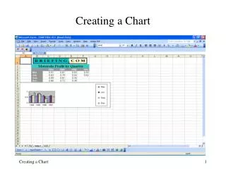
Dependent data bar chart Copy into your report remembering to add a Figure number and a caption using APA Style Figure 1. A graph showing the effectiveness of two drug treatments on number of reported hiccups