Download
1 / 7

E N D
When starting my content page, I first began by adding the image and the title into the page, so I could see where I would like to position them both. After this, I had the idea of changing the colour of my picture to black and white, I set upon doing this by clicking on, image – adjustments – black and white. Then a black and white box appeared where, I can choose the different colour percentages of my image.
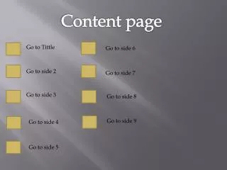
I next added a plain black background, that covers the whole back of the content. Also adding the content index with what is in the magazine. I switched between different sizes of font for this. This makes some stick out more than others. The more important articles are in a bigger font. This also adds style. I used a white font, which contrasts to the background making it more easier to read and brighter. For the title I used a light grey colour and a white shadow behind, this makes the title stand out and look more like a title in the traditional sense. I tried overall to make the content page look like a traditional music magazine content page.
I next added 3 pictures of the artist at the bottom of the content page, this makes the page look more busy, and as if there is more to look at (interesting). I decided to make a colour divide to add effect. The top left half of the page is black and white, then the bottom right part is of colour images. I used a rainbow to make the divide between the change. I found this to be the best line of divide, because it has different colours in it which, adds the effect that also the top half of the page has been drained of its colour, and the main line divide in the left over colour. This all adds to making the content page look much more interesting and overall attractive.
I added the rainbow onto the page, by using the gradient tool, which when selected at the toolbar, I then went to the top of the page and clicked on the drop down box which gave me different options of colours and gradients to choose from. At the end there is a rainbow effect which I chose. Gradient tool
I next added a heading above the images that I had just put on the page. To make the reader and customers aware that this is ‘Ritchie Orme’ and he is the main news of the magazine. I used a yellow font to stay in line with the idea of the bottom half of the page being in colour. And this also makes the article seem more important than any other the other articles on the page.
Finally I added white patches, into the black background. In the effect of highlighting the top of the main image, the text and the bottom pictures. This makes the page look brighter and more professional. Never to mention also makes the page look more busy and overall interesting.