Download
1 / 36
360 likes | 412 Views
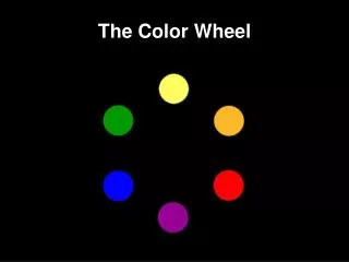
The Color Wheel. History of Color. Colors are often symbolic. Let’s talk about what role color has played in different times in history. In China…. Yellow has religious significance and is still the Imperial color today!. In Greece and Rome…. Red was believed to have protective powers.

E N D
History of Color • Colors are often symbolic. • Let’s talk about what role color has played in different times in history.
In China… • Yellow has religious significance and is still the Imperial color today!
In Greece and Rome… • Red was believed to have protective powers. • Purple was restricted to use by nobility.
The Egyptians • Adorned walls of tombs and temples with brilliant colors of blue, tangerine, and green.
In the Italian Renaissance… • Colors were vibrant reds, greens, golds and blues.
In the Rococo period… • Tastes became very feminine, colors became less vibrant.
In 18th Century England… • There was great elegance. Colors were rich, showing a strong Chinese influence in the use of red and gold.
During the Victorian era… • There was great Eclecticism known for it’s abundance of “things”. • Colors were mostly dull reds, greens, browns, and mauves.
In the Early 20th Century… • Colors were Monochromatic. There were sleek surfaces and strong contrasts with black, gray, silver, brown, beige and white.
In the 1920’s… • All-white interiors became popular which gave way to delicate pastels with bright accents.
In the 1950’s.. • Light colors were preferred. • However, American interest turned to Mexico and a shift to bright colors with bright contrasts.
And in the 1990’s… • Regal gold, blue, and red were used. Southwestern remained popular and Victorian was being revived. • Ivy league also becomes popular with forest greens and cranberry reds.
Where does color come from? • A ray of light is the source of all color. • Without light, color does not exist. • Light is broken down into colors of the spectrum. You can often see a variety of colors in a bright beam when you look at something like a rainbow.
Color • Color can alter the appearance of form and space. • Color can affect our performance abilities and change our moods.
Pigments • Pigments are substances that can be ground into fine powder and used for adding color to dyes and paints. • Pigments were originally derives from animal, mineral, and vegetable sources. • Examples: • Purple from shellfish • Red dye from the dried bodies of scale insects • To create our own color wheel, we will be mixing different pigments together to create all the colors in the color wheel.
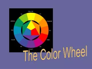
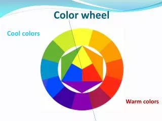
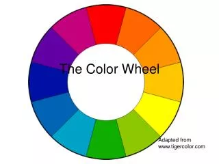
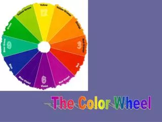
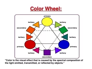
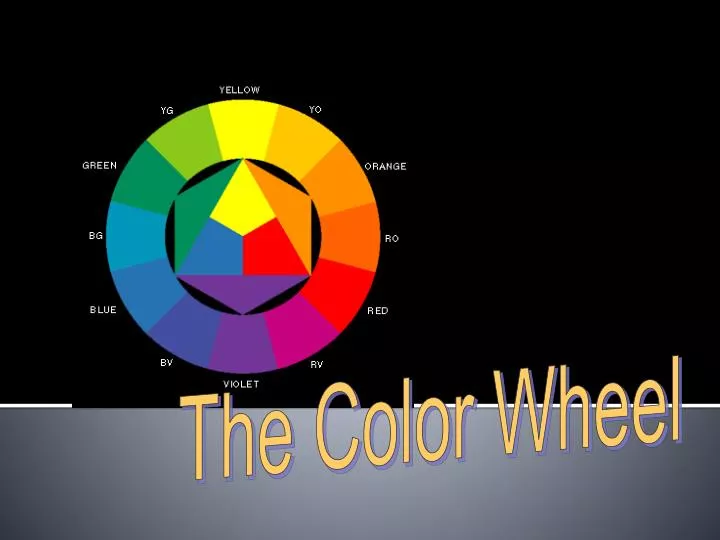
The Color Wheel • The color wheel is a basic tool we use when working with colors. • It is based on the standard color theory known as Brewster/Prang. • In addition to the traditional color wheel, there are two color systems that are useful when more detailed colors are required. • The Munsell system: • Has 5 principles hues and 5 intermediate hues. A numbering system helps designers identify the exact hue they need. • The Ostwald system: • Made from pairs of complementary colors. The color circle has twenty-four hues.
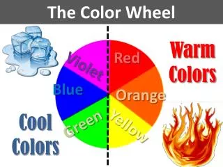
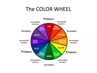
There are 12 hues in the spectrum of color. They are divided into three categories… The Color Wheel
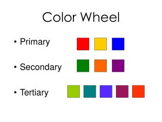
The Primary Colors • Red, Yellow, and Blue • These colors cannot be combined from mixing any colors together.
The Secondary Colors • Green, violet, and orange • Made by combining the Primary colors together.
The Tertiary Colors • Yellow-green, blue-green, blue-violet, red-violet, red-orange, yellow-orange. • Made by combining a primary and a secondary hue. • Named by the Primary color first.
Color Can….. • BE SYMBOLIC • CHANGE OUR MOODS • AFFECT OUR PERFORMANCE AND ABILITIES • ALTER THE APPEARANCE OF FORM AND SPACE
Hue-another name for color • Saturation-the intensity of a color • Value-the lightness or darkness of a color
Choosing the Right Color • Mood • What mood do you want to create • People • Think about the people who will be in the area • Style • The style may influence the color choice(s).Spanish style = rust colored walls • Items in the room • Choose an item in the room, and one of it’s colors as the main color for your room. Then choose accent colors based on your knowledge of color schemes. • Time • The amount of time that will be spent in the room • Existing Colors • Some room components can’t be changed so incorporate them. • Adjacent Rooms • Create a unified look with rooms that you can see. • Lighting • Natural light shows objects in true colors. Artificial lights make color appear blue or yellow
Using Color Correctly • Colors seem more intense when applied to large areas. Choose a color several tints lighter than the color actually desired. • Using contrasting colors draws attention. Remember, too many strong contrast values in a room can be confusing and tiring. • Choosing colors that have similar values will create a restful mood in the room. • Color schemes/harmonies look better when one color, the base color, dominates. When you use equal amounts of two or more colors, your eyes become confused and your color selection seems cluttered
The value of a hue changes the apparent size of a room. • Dark ceiling (dull) appears lower and closer and light (bright) colored walls appear further away. • If a room is small, choose colors that will make the room appear larger. (tints, low-intensity colors, and cool hues) • Lighter walls makes it appear larger • If a room is very large, choose colors that will make it look smaller. (Shades, high-intensity colors, and warm hues) • Darker walls make a room appear smaller • Bright colors convey an informal environment • Use High-intensity colors in small amounts such as accent colors in accessories or small pieces of furniture. • Black unifies when a number of colors are used.
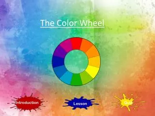
Color Wheel Assignment • Now it’s your turn to create your own color wheel! • You decide whether you want to earn full credit by completing the assignment as shown here… • Or you can earn extra credit, by creating another picture with your color wheel… • A rainbow, a tire, a flower, etc. • Make sure to label all twelve colors correctly, and label your assignment in architectural writing with your name, assignment name and period.
Color Assignments • Warm, Cool, and Neutral • Create the designs using the correct colors for each design. • Create a color wheel display of your choice • Color Wheel • Value: Tint, Tone, Shade • Intensity