Download

1 / 13
130 likes | 200 Views
Graphing Review Booklet. Graph #1. 1. What are the major differences between the lines? The blue line grows a lot more than the red. The blue line is curved, but the red is straight. Graph #1 cont. Compare and Contrast The growth between generations 2 and 4 of the two lines.

E N D
Graph #1 1. What are the major differences between the lines? The blue line grows a lot more than the red. The blue line is curved, but the red is straight.
Graph #1 cont. • Compare and Contrast • The growth between generations 2 and 4 of the two lines. They appear to grow exactly the same amount. • The growth between generations 8 and 10 of the two lines. The blue grows over five times as much as the red.
Graph #2 • What kind of population growth is represented by the graph? • This graph shows exponential population growth.
Graph #2 cont. • Why does the population level off at the top? The population levels off at the top because the area has reached its carrying capacity for that organism. • What would you expect to happen to the graph at hrs 25? 30? Why? I would expect it to look the same at hours 25 and 30 as it does at 20, because that is the greatest number of organisms that area can support.
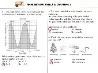
Graph #3 & #4 • Compare and contrast both graphs. • Both graphs show carrying capacity, but the first one goes way lower after it exceeds its carrying capacity. The second one goes only slightly below the carrying capacity.
Graph #3 & #4 cont. • Name the event that happens between point A and point B in both graphs. • What does the dashed line represents? The dashed line represents the carrying capacity of the population. • How do the two graphs differ once they reach the dashed line? The population drops a lot very quickly in the first one and only a little in the second one. • Why might they differ? They might differ because different limiting factors control the population. The first looks like the LF is a predator, but the second looks like the LFs are resources.
Graph #5 • Describe the rise and fall of both populations. Why do the rises and falls occur when they do? • The prey population’s peak is much higher than the predator’s. The prey’s population starts to fall as the predators’ increases because they are getting eaten, and the predators’ fall shortly afterward, because they don’t have enough to eat. With fewer predators, the prey’s rises again, which causes the predators’ to rise, because there is more food.
Graph #5 cont. • What could have caused the increase in both populations in mid-October? The mid-October increase could be due to new births. • The decrease in mid-January? The decrease in mid-January could be due to lack of food. • What could have caused the prey population to crash at the end of Dec.? Lack of resources or human actions could have caused the prey population to crash at the end of Dec., but neither are likely to be responsible, because the population bounces back immediately. • What other limiting factors could have affected these population changes? Limiting factors that could have caused these population changes include weather, availability of natural resources, and human actions.
You draw it! • Exponential growth to Carrying Capacity Population Size Time (years)
You draw it! • Exponential Growth to Carrying Capacity with Population Crash Population Size Time (years)
You draw it! • Predator-Prey Graph Population Size Time (years)
You draw it! • Linear vs. Exponential Graph Population Size Time (years)