Download
1 / 15
150 likes | 284 Views
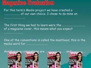
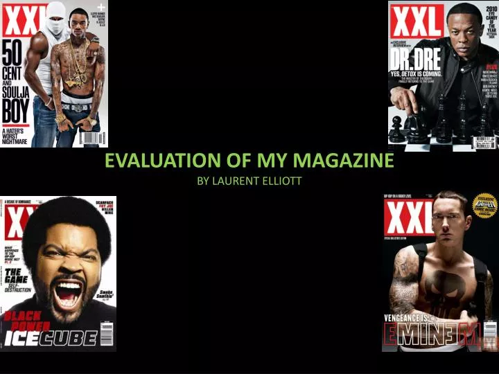
EVALUATION OF MY MAGAZINE BY LAURENT ELLIOTT. Bold masthead . In what ways does my media product use, develops or challenge forms and conventions of real media products ?. Eyebrows are in caps. Bold masthead . Cover artist overlapping mast head (magazine is well known) . Central Image

E N D
EVALUATION OF MY MAGAZINE BY LAURENT ELLIOTT
Bold masthead In what ways does my media product use, develops or challenge forms and conventions of real media products ? Eyebrows are in caps. Bold masthead Cover artist overlapping mast head (magazine is well known). Central Image Direct eye contact which would draw in the reader. Ears use 1 font and 2 different colours. Main Cover line (Larger Font) . Ears With quote White ,yellowandredtheme throughout text in magazine. Hat Pointing hat overlapping ‘50 CENT’(gives attention to his name as well as article). Barcode price and date
Did I stick with the usual conventions in my magazine? Bold masthead Eyebrows I didn’t feel a need to make them capital Ears Use of 1 font ,2 sizes , 3 colours and a quote Green ,white and black theme with a little red to show that we are breaking out of normal conventions with our magazine(used throughout) Central Image I had my cover artist stare at the camera to engage with the reader and his arms in directions I was going to put the ears in Ears Use of 1 font ,2 sizes , 3 colours and a quote as well as being tilted. Main Coverline (Bigger font) Barcode price and date
Contents analysis My Contents Page XXL contents page Bold headings Wording is around artists Artist image (not in central position)
Bold heading Standfirst Pull qoute Writing columns Central image
How does my media product represent particular social groups Artist has his eyebrows slit and a diamond earring showing he is up to date with current trends. As well as this he is wearing a trendy jacket which is currently in fashion. This artist is wearing an adidas jacket and a new era cap which is in fashion right now so males can relate to him . Also he has a blackberry in his right hand which is the must have phone at the moment.
My magazine is aimed towards young males from ages16-30.my magazine would probably be getting more of a black audience due to the fact majority of the models and artists are black .I would also say that it is obvious that my magazine is aimed at young males as most of the artists are male and the advertisements are also male. Masthead associated with breaking a sound barrier. Often associated with loud teenagers Young popular artist
What kind of media institution might distribute my media product and why? I have done some research and I think that IPC Media could be the best institution to distribute my magazine .IPC Media produces over 50 magazines, with print alone reaching a vast amount of people within the UK. They currently only release one mainstream music magazine titled NME, and this magazine is rock orientated .This means that there is space for my magazine in their industry as it will be the only one of its genre. This would widen their fan base as well as distribute my magazine. Harris publications is a is an institution who potentially could distribute my magazine but has a magazine called ‘XXL’ which is slightly similar to my magazine in the fact that they both have highlights on hip hop news but I feel as my magazine is mostly UK artist based that there might be room for my magazine in their industry. My magazine will be sold in places such as hmv or wh.smith as it is a more expensive magazine because of the quality of the magazine which appeals to middle/higher class people
Who would be the target audience for my media product? The target audience for my magazine is 16-30 Sex Men Women Age 16-20 21-25 26-30 30+ Median age Race Black White Asain other 90% 10% 48% 29% 19% 4% 25 37% 32% 20% 11%
My average reader is around 25 and is either a full time worker or a part time worker and a university student The price of my magazine suggests that it has a lot of advertisements making it cheaper but not cheap enough to attract a lower class My double page spread uses two up coming artists which would attract people pursuing a career in music as well as producers and event organisers
How did I attract/address my audience Top artist used in the eyebrow Photo manipulation I cut out my feature artist to add a black background to get rid of shadows Top stories in bold Bright colours attract readers attention
What have I learnt about technologies from the process of constructing this product? I used adobe photoshop for photo manipulation. I used it to brighten crop and colour in pictures for my magazine. I struggled with the program as it isn't very easy and it was my first time using it canon 550d was used to take the pictures for my magazine as it is a high quality camera.it taught me how to use a professional camera as well as lighting Google was my search engine which I used to get ideas, information as well as pictures of magazine covers which was very useful Wordpress was very helpful as all the work I produced was displayed on it for my work to be marked. I found it quite difficult at first to use as I have never blogged or used the website before but it became easier as I used it more .I can now blog and edit posts among other things.
I used slide share as there was some difficulty uploading some file types to my blog. It was pretty simple to use and became useful when adding documents to my blog. I used in design to make the actual magazine ,like photoshop it was hard to use but not as hard and as time passed I got used to it and became better. Using this program I learnt how to use layers ,lock the position of the picture and experiment with different fonts.
Looking back at my preliminary task ,what do I feel I have learnt in the progression from it to the full product? Skills Learnt In terms of skills I have to learnt how to manipulate photos using lighting photoshop and backgrounds. Another skill I have learnt is how to make shapes and manipulate them using InDesign. Planning With Planning I have Learnt that I need to arrange photo-shoots way before the date as mine was very last minute and meant there was no costume changes and it was rushed. Skills Developed Due to practice I have become better at a number of photo manipulation techniques such as cropping which I used to struggle with before.one way I have improved in cropping is by using smoother the line is finer and doesn’t cause pixels to be bumpy around the item. Manipulations/Representations I have learnt that using manipulation you can change a persons perception and change the representations of something, which can be a good or a bad thing.one other thing I have learnt is that by changing font colour and size ,you can make your product more presentable to a certain audience.
THE END THANKYOU FOR VEIWING MY EVALUATION