Download
1 / 29
330 likes | 393 Views
The definition of color is a component of sunshine which is separated when it'su00a0reflected off of an object. Color begins with light and therefore the colors we see are influenced by the characteristics of the sunshine source. Wavelengths of reflected light determine what color you see. Color is claimed to be three-dimensional due to itu2019s three unique aspects.u000bColor is one among the foremost important elements of photography. It affects everything from composition and visual appeal to get the vieweru2019s attention and emotions. Weu2019ve put together an guide to understanding color therapy in photography and learning the way to use it effectively.u000bu000bThe first step to integrating better color in your photography is simply train yourself to see the color. One of the keys to expanding your vision is to stop looking at the world as filled with objects and look instead for line, shape, form, pattern and coloring.<br>

E N D
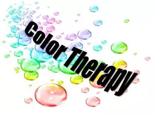
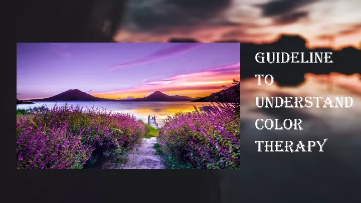
Guideline To Understand Color Therapy
Color Therapy The definition of color is a component of sunshine which is separated when it's reflected off of an object. Color begins with light and therefore the colors we see are influenced by the characteristics of the sunshine source. Wavelengths of reflected light determine what color you see. Color is claimed to be three-dimensional due to it’s three unique aspects.Color is one among the foremost important elements of photography. It affects everything from composition and visual appeal to get the viewer’s attention and emotions. We’ve put together an guide to understanding color therapy in photography and learning the way to use it effectively.The first step to integrating better color in your photography is simply train yourself to see the color. One of the keys to expanding your vision is to stop looking at the world as filled with objects and look instead for line, shape, form, pattern and coloring.
Split Complementary Colors Analogous colors Complementary colors Quadratic Colors Triadic Colors Color Theory 02 03 04 06 01 05 Monochrome colors
COLOR THEORY Different color combinations provoke different feeling and responses with some color schemes working together much better than others. By understanding how different colors work together, you’ll able to see things differently and get the most form of color around you. Here’s a basic look at some different color combination.
Analogous colors First, let’s look at analogous colors. These are the colors that are next to each other on the color wheel. An analogous color scheme can consist of anything from two colors on up to half the wheel. These colors–think blue and green–can often make for a pleasing and harmonious color combination.
Complementary colors Complementary colors are shades that are located directly across from each other on the wheel. Think: blue and yellow or orange and green. These colors are complementary because they are said to work well together. Complementary combinations can create a high-contrast and vibrant look especially when used at full saturation.
Split Complementary Colors A split complementary color scheme takes two colors that are directly opposite, and another color that’s one of the complementary colors’ analogous color. This type of combination often works extremely well, helping to balance out an otherwise high-contrast color combination.
Monochrome colors When we hear the word “monochrome,” the first thing that comes to mind is probably black and white photography. However, monochrome color schemes refer to any composition that uses only a single hue, with variations of its tones and shades. This type of image can be really impactful, as the subject tends to dominate the shot while still feeling in sync with its surroundings.
Triadic Colors Triadic colors are three colors are equally spaced out from each other on the color wheel. This color scheme is very similar to split complementary colors.
Quadratic Colors A quadratic color scheme is a combination of two complementary color harmonies on the color wheel. This grouping can also be called a double complementary scheme, because it is the combination of two complementary colors. Of course, there are many more combinations that you can use as well Depending on the type of photography you are working with, the harmony of colors you choose to work with will vary.
COLORVARIABLES Each color has a wide range of tones and shades, which transform a basic color wheel into the complete palette of the 10 million colors humans can see. Each of the unique colors on this broad palette has a specific name, tone, and shade, which are determined by the color variables of hue, saturation, and luminance respectively. These variables are commonly referred to as HSL.
Type Of Color Variables Hue Saturation Value Hue may be a name we give colors on the colour wheel (red, yellow, green, blue on). It’s basically the technical definition of color perception. Saturation is that the level of grayness present. The less saturated, the more gray a color appears. Value,is that the light and dark property of a color
There are certain camera accessories and settings you can use to gain more control over how colors appear in your images. Accessories And Tools
Polarizing filter In addition to reducing the glare of reflecting surfaces,polarizing filters increase the contrast and saturation of colors. This brings the colors much closer to what they look like in real life, minimizing the need for post-production.
RAW files RAW files save images with minimal processing and no compression, which gives you complete control over the image editing process. Nowadays, you can capture RAW files with nearly any camera, even when it comes to smart phone photography.
White balance One of the most commonly overlooked camera settings, white balance has a huge effect on color in photography. Different light sources have different temperatures, each of which casts a distinct color. By selecting the right white balance setting on your camera, you’ll ensure that your image’s hues remain true to life - or to your vision.
Get the Exposure Right In many cases, adjusting your camera’s exposure can help the colors to appear more rich and vivid. Since your camera’s built-in metering system often chooses to use a lighter exposure, if you underexpose your images, just a little you’ll often be rewarded with a deeper color.
Color in Abstract Images In abstract photography, color plays a particularly important role. As subjects and scenes become unrecognizable, the different hues of the image themselves become the subjects of the shot. Capturing abstract photographs can teach you how different colors work together to create balanced compositions, as well as the ways in which different hues serve as composition elements.
Composing with Colors When talking about photography composition rules, it’s a common mistake to focus simply on shapes, numbers, and subject positioning. However, color plays just as big of a role in your compositions as any other element in the scene. Color in photography is as powerful as physical objects, since we perceive different hues just like we do subjects. Thus colors can be used as leading lines, natural framing, negative space, patterns, and as a means to create depth.
Understand Dominant And Receding Colors In photography, the dominant colors are the warm colors, e.g. red, yellow and orange. These colors are considered dominant because they reach our eyes before the cooler colors. The cooler colors are the receding colors, e.g. blue, green and purple. The warm colors are dominant because they demand your attention first, leaving the receding colors to fade into the background more
Use Bright Colorful Backgrounds Bright colorful backgrounds make a great backdrop for your photos. If you can find a colorful wall or building then think about using this for your image. A colorful wall looks great on its own but including a person in the shot adds another dimension to the image. This is partly because the human subject gives the scene a sense of scale, but also because it adds an element of human interest, which is easier for the viewer to engage with.
There’s much to learn about color theory and taking the time to delve into the subject can be a fun study that will prove to be rewarding. At the end of the day, developing your photographic eye, gain knowledge with us in Color Therapy Workshop and discover a combination of knowledge and practice, you’ll soon become adept at telling which colors work well together, and which ones don’t and will be able to create pleasing color combinations without a second thought.