Download
1 / 11
110 likes | 166 Views
Results From Focus Group Questionnaire. Introduction.

E N D
Introduction • The purpose of conducting a questionnaire was to discover whether or not the target audience liked the overall magazine. I made sure that the people that were asked were from the target audience, as this was who the magazine was aimed at, which meant that the answers were valid. • The kind of questions that were asked were based on the overall layout of each feature, the font and colour of the magazine and the overall strengths and weakness of the magazine. The reason that these questions were asked is to find out what could of been done differently during the construction of the magazine, and if anything could be improved. • Through the use of the questionnaire the magazine would receive feedback from a specific audience, and the target audience would be able to see the finished product. Based on existing magazines, I wanted to have an magazine that would create an impact in society. The responses to the questions suggest that I have achieved this, as the magazine is unique based images that have been used. • Based on the results from the questionnaire and the feedback received from the target audience, I believe that this magazine is a success. The reason why I believe this, is because each aspect of the magazine can be related to in every day life by the target audience
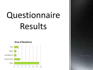
Target Audience For my music magazine, I wanted to have a target audience which is not usually focused on in the music magazine industry. For this reason I have chosen to aim my magazine at an audience of females, aged between 18-24. The reason why have chosen this specific target audience is because I believe that there is a gap for a rock music magazine which has an audience of mainly women. Through this target audience I was able to focus the magazine on what I thought would be of interest, and how to create a balance between a “girly” magazine and a rock magazine. Based on my target audience the price which I thought would be suitable for the magazine, was based on whether or not members of the target audience were employed. The results from the questionnaire show me that the majority of my target audience would not be employed, but may have a part time job. For this reason I have chosen a cheap price for the magazine, which should not detract the audience from purchasing the magazine.
Feedback for front cover The feed back that I received in relation to the layout of the front cover, was that the overall opinion from the target audience was positive. This information was gathered through the use of an questionnaire. This meant that I was able to take opinions directly from the people that were asked, allowed me to make sure that the people that were asked were from my target audience. The feedback received was that the layout of the text was connecting, as the colour scheme matched through out the front page. The use of a black text box under the strapline meant that the purple text was easier to read, but it not over take the main image. The large ‘R’ was an symbolic of the magazine and brought the attention to the title of the magazine. My target audience thought that the front cover was very eye-catching, and the that the main image in the centre was well positioned as the text was still visible. However there were aspects that did not work well with the layout of the front cover, for example the font and colour of the cover lines was not as visible as the rest of the text. This had an negative impact on the rest of the front cover, as the overall layout was taken away by the cover lines.
Feedback for Contents Page The overall feedback which was received from the questionnaire about the layout of the contents page, was positive. The target audience felt that the continued use of the ‘R’ added continuity to the magazine, and the use of two headings added variety to the contents page. The use of subheadings for each category made the magazine easier to navigate, and allowed different features to become more prominent to the reader. Another aspect which was well received by the target audience was the use of the black text boxes surrounding the main image and editors letter. The text boxes added another dimension to the contents page, and made these features stand out more on the page. The position of the main image mean that the image is what the audience first looked at, thus gaining their interest in the rest of the contents page. The final thing that had positive feedback was the continued use of the purple/black colour scheme, as this gave the magazine continuity and gave a controlled feel to the overall magazine. However there were aspects of the contents page which could of been changed or improved. The target audience felt that the editors letter was in a different formality to the rest of the magazine, which could distract from the main focus of the magazine.
Feedback for Double Page Spread The final feature which was shown to the audience in the form of an questionnaire was the double page spread. This feature received mixed feedback from the target audience, as this was the main feature of the magazine. For some people the double page feature gained positive views, as the use of the black textboxes, added to the sophisticated feel this particular feature. The text boxes also made the feature look more organised, something which the target audience had not seen in existing magazines. Another technique which was received positively was the use of a black and white image, with the continued use of purple/black font. The image gave an older feel to the feature, suggesting that the feature was for an older audience, while the colour of the font could be linked to the other features of the magazine. In contrast other members of the target audience felt that the overall layout looked cluttered, as the use of the text boxes made the overall feature look heavy on one side. However they also said that the use of colour worked well with the genre of the magazine.
Feedback of colour scheme and font style The use of colour and font type is important as it these things can give the first impression of the magazine. The feedback which was received from the target audience concerning the colour scheme was a variety. The target audience felt that the colour scheme that was used worked well for some of the features, but did not work as well as it should of done for other aspects. The overall opinion was that if the colour scheme was changed slightly for the front cover, but kept the same for the other features, the magazine would of looked more professional. However other members of the target audience felt that the colour worked well, as it was used throughout the features, giving continuity to the magazine as they knew what to expect on each feature. Another aspect of the magazine which worked well, was the font type that was used. In contrast to the colour scheme, the font type received positive feedback from most of the target audience. This was because in the opinions of the target audience, the font was kept similar through out the features of the magazine. Which meant that each of the features did not become overcrowded and were kept simple. The font was easy to read and did not detract from any of the images that were used.
Feedback for cover lines and contents page features The final thing that was asked of the target audience was to explain if the cover lines and features worked well in the cover page and contents page. The feedback which was received for the cover lines was, that they did work well for the overall magazine. This was because the target audience felt that the cover lines could be linked to different aspects of the magazine. The cover lines also meant that they were given an insight of what was to be expected of the magazine. The features that were used in the contents page also received positive feedback . The target audience said that the use of subheading made navigating the contents page easier, as it was clear what sections there were in the magazine. They also said that the features that were included in the contents page could be linked to the double page spread and the contents page. This meant that the continuity was maintained throughout the magazine, which meant that the features could be put together in terms of content.
Strengths of the magazine Based on the feedback received from the target audience, the overall magazine had many strengths which made it work well. One of the things that the target audience thought worked well, was the overall layout of each feature, as there was a similar theme throughout the magazine. This also gave the magazine a more sophisticated feel, while maintain the genre of music throughout. Meaning that the target audience did not feel intimidate of the standard of the magazine, but felt intrigued to know what would be included in the main features. Another aspect of the magazine which the target audience felt worked well was the use of women as the main focus, in the images that were used. This technique made the target audience feel as though the magazine was created especially for women. The final thing that the target audience felt worked well was the use of the black text boxes, something which is not used in existing magazines but worked well in terms of the overall layout.
Weaknesses of the magazine Based on the feedback which was received from the target audience after taking part in an questionnaire, there are some weaknesses of the magazine which have been identified. The target audience felt that the font colour, especially for the front page, could be improved as in some parts it was hard to read the font. However this may of meant that the overall colour scheme would of had to be changed to make an impact. Another area that the target audience felt could have been improved on was the main image of the front cover, as the models portrayed a distant relationship. This had an impact on the rest of the magazine, as the target audience felt as though the artists that were included did not connect with their fans. They also felt that the use of red costumes took away the theme of the magazine, which was created with the purple/black colour scheme.
Overall impact of the magazine. The overall opinion of the magazine by the target audience, was that it would appeal to them if it was published and sold in retailers. The target audience said that a women’s rock music magazine was missing, and that there was a large focus on teenage music magazines. This meant that there are no music magazines that focus on young adults, which is wrong as there are only really two type of music magazines, focusing on rock music. They also said that the idea of rock music, having a female audience comes with stereotypes from the media, thus meaning that this type of magazine is not produced. They like the idea that there is a rock magazine, with ‘girly’ aspects to it as it does not focus on male audiences or a mix of both. When asked the target audience said that they would probably read the magazine if it was published, as it was something that they had not seen before.