Download
1 / 13
130 likes | 202 Views
A foolproof guide to selecting the right image to convey your important message!. Knowing which type of graph to use in research. Overview of the Problem:. Pie Graphs. Stem-and-Leaf Plots. Map Charts. A graph tells a story…. Scatter Plots. Histograms and Bar Graphs. Line Graphs.

E N D
A foolproof guide to selecting the right image to convey your important message! Knowing which type of graph to use in research
Overview of the Problem: Pie Graphs Stem-and-Leaf Plots Map Charts A graph tells a story… Scatter Plots Histograms and Bar Graphs Line Graphs Box-and-Whisker Plots Networks Normality Plots Residual Plots Radar Charts
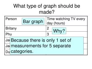
Histograms and Bar Charts How many of something do I have relative to something else? An Example: What are they good for? • Categorical comparisons • Quick understanding of relative frequency • Distribution testing • Group comparisons • <-- Example graph
Line Graphs How does a trend change over the course of some other continuous phenomenon? An Example: What are they good for? • Temporal studies • <-- Example graph • Relational studies with single quantity observations
Scatter Plots Pairing off multiple phenomena… An Example: What are they good for? • Monitoring relationships between multiple measurands in an effort to relate them • Clustering • <-- Example graph
Box-and-Whisker Plot Percentile trends and outlying observations An Example: What are they good for? • Finding percentile spreads • Identifying outliers
Networks What is related to what? An Example: What are they good for? • Identifying connections between concepts • <-- Example graph • Flow charts • Algorithms • Path identification
Pie graph Proportionality of a population An Example: What are they good for? • Distribution of a population • Percentages
Stem-and-Leaf Plots Tiered distribution An Example: What are they good for? • Finding a median or mode • Broader distributions
Radar Charts When you care about too many things… An Example: What are they good for? • Multiple comparisons over shared properties
Map Charts Where place matters… An Example: What are they good for? • Similarities/differences based on administrative units • Regional concerns
Residual Plot Do I have the right model type? An Example: What are they good for? • Determining the voracity of a model based on distribution of residual values (randomized)
Normality Plots Do I have normal data? An Example: What are they good for? • Does experimental data conform to the normal distribution • Note: you can do this for any distribution, but most common for normal distribution