Download
1 / 38
380 likes | 478 Views
Chapter 2 – Descriptive Statistics. Tabular and Graphical Presentations. Chapter Outline. Summarize Qualitative Data Frequency Distribution Bar Charts and Pie Charts Summarize Quantitative Data Frequency Distribution Histogram Cumulative Distributions Crosstabulations

E N D
Chapter 2 – Descriptive Statistics Tabular and Graphical Presentations
Chapter Outline • Summarize Qualitative Data • Frequency Distribution • Bar Charts and Pie Charts • Summarize Quantitative Data • Frequency Distribution • Histogram • Cumulative Distributions • Crosstabulations • Scatter Diagrams
A Note • An important aspect of statistics is to present the data in an informative way so as to reveal any patterns in the data (no pattern is a pattern!). • Different types of data require different summarization methods and statistical analyses.
Summarize Qualitative Data • Check out the following data. What pattern can you detect from the raw data?
Summarize Qualitative DataFrequency Distribution • The raw data in the previous table does not provide any meaningful information ( like any pattern) directly. For qualitative data, we can summarize and present the raw data with ‘Frequency Distribution’. • A frequency distribution is a tabular summary of data showing the number (frequency) of items in each nonoverlapping class. • Please refer to the Excel demonstration ( Chapter 2) on how to construct the frequency distribution for the data in table 2.1. • The outcome is shown on the next slide.
Relative Frequency • To obtain relative frequency, simply divide the frequency of each class by the total number of observations (n). For the data in Table 2.1, n equals 50. 15/50=0.3
Bar Charts and Pie Charts • A frequency distribution is often presented in a graph (a bar chart or a pie chart) to communicate information visually. • Please refer to the Excel demonstration ( Chapter 2) on how to create a bar chart and a pie chart for the frequency distribution from previous slide. Both charts indicate that the most popular network evening news is on NBC.
Summarize Quantitative Data • Check out the following data. Can you quickly decide how many classes there should be in the construction of a frequency distribution?
Summarize Quantitative DataFrequency Distribution • Different from the qualitative data in Table 2.1, the quantitative data in Table 2.2 do not indicate the number of classes straightforwardly. • Apply the following procedure to construct a frequency distribution for quantitative data. • Determine the number of non-overlapping classes; • Determine the class width; • Determine the class limits; • Count the item numbers in each class.
Summarize Quantitative DataFrequency Distribution • Step one – Determine the number of non-overlapping classes • As a guidance, you can use the ‘2 to the power of k’ rule. That is, to find the smallest integer (k) such that 2k n ( n is the sample size). Applying the rule to the data in Table 2.2, we find k = 6 since 26=64 ( n=50). Thus, we set the # of classes as 6. (Note that it is only a suggestion, not an absolute rule.) • Empirically speaking, the # of classes is between 5 and 20.
Summarize Quantitative DataFrequency Distribution • Step two – Determine the class width • Use equal class width to avoid misinterpretation • Approximately, class width = • For the data in Table 2.2, class width = (120-61)/6= 9.96. We can round it up to 10, which is a much more convenient value to work with for class width.
Summarize Quantitative DataFrequency Distribution • Step three – Determine the class limits • Class limits should be set so that each data point belongs to one and only one class, and no data point is left out. • Similar to class width, class limits can use values that are convenient to work with. • In our example, the smallest value is 61 and the class width is set as 10. So, the lowest class can be set as 61 – 70. Note that the class width is calculated as 70-61+1=10.
Summarize Quantitative DataFrequency Distribution • Step four – count the # of items in each class • For the data in Table 2.2, the frequency distribution is constructed as follows: • Please refer to the Excel demonstration ( Chapter 2) on how to construct the frequency distribution for the data in table 2.2.
Relative Frequency Example: Monthly Sales Volume of 50 Starbucks Stores 3/50=0.06
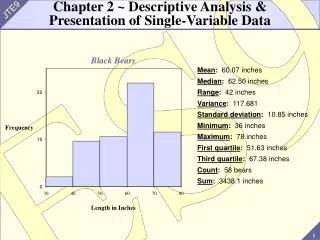
Interpretation of Frequency Distribution The frequency distribution of monthly sales volume of 50 Starbucks stores in NYC reveals that • 39 stores generated an average monthly sales in 2012 between $81,000 and $110,000. • 4% of the sample stores had an average monthly sales no more than $70,000. • 6% of the sample stores had an average monthly sales $111,000 or more.
Histogram • Like a bar chart, a histogram is a graphical presentation of frequency distribution. • The height of a rectangle ( a bar) drawn above each class interval corresponds to that class’ frequency or relative frequency. • Unlike a bar chart, a histogram has no gap between rectangles of adjacent classes. • Please refer to the Excel demonstration ( Chapter 2) on how to create a histogram for the frequency distribution of Sales volume of Starbucks stores.
Histogram Monthly Sales Volume of 50 Starbucks Stores in NYC
.35 .30 .25 .20 .15 .10 .05 0 Histogram • Skewness – the lack of symmetry. • Symmetric distribution, such as height or weight of human population. Relative Frequency
.35 .30 .25 .20 Relative Frequency .15 .10 .05 0 Histogram • Negative Skewness – a longer tail to the left. • An example: exam scores
.35 .30 .25 .20 Relative Frequency .15 .10 .05 0 Histogram • Positive Skewness – a longer tail to the right. • An example: home values
Cumulative Distributions • Cumulative frequency distribution – shows the # of items with values less than or equal to the upper limit of each class. • Cumulative relative frequency distribution – shows the proportion (percentage) of items with values less than or equal to the upper limit of each class.
Cumulative Distributions Monthly sales volume of 50 Starbucks stores 2+6+11=19 19/50=0.38
Crosstabulations and Scatter Diagrams • So far, we have studies the methods of summarizing the data of one variable at a time. • In business, it is important to understand the relationships among different variables. For instance, the relationship between sales volume and expenditure on advertisement. • Crosstabulations and scatter diagrams are two methods of descriptive statistics, which are used to summarize the data to reveal the relationship of two variables.
Crosstabulations • A crosstabulation is a tabular summary of data for two variables. • The two variables can be either qualitative or quantitative or one of each. • The left and top margin labels show the classes for the two variables.
Crosstabulations • Example: Finger Lakes Homes The number of Finger Lakes homes sold for each style and price for the past two years is shown below. categorical variable quantitative variable Home Style Price Range Colonial Log Split A-Frame Total 18 6 19 12 55 45 < $200,000 > $200,000 12 14 16 3 30 20 35 15 Total 100
Crosstabulations • Example: Finger Lakes Homes Insights Gained from Preceding Crosstabulation • The greatest number of homes (19) in the sample • are a split-level style and priced at less than • $200,000. • Only three homes in the sample are an A-Frame • style and priced at $200,000 or more.
Crosstabulation Insights Gained from Preceding Crosstabulation Example: Finger Lakes Homes • The greatest number of homes (19) in the sample • are a split-level style and priced at less than • $200,000. • Only three homes in the sample are an A-Frame • style and priced at $200,000 or more.
Crosstabulations Frequency distribution for the price range variable Example: Finger Lakes Homes Home Style Price Range Colonial Log Split A-Frame Total 18 6 19 12 55 45 < $200,000 > $200,000 12 14 16 3 30 20 35 15 Total 100 Frequency distribution for the home style variable
Crosstabulations: Simpson’s Paradox • Data in two or more crosstabulations are often aggregated to produce a summary crosstabulation. • We must be careful in drawing conclusions about the • relationship between the two variables in the • aggregated crosstabulation. • In some cases the conclusions based upon an • aggregated crosstabulation can be completely • reversed if we look at the unaggregated data. The • reversal of conclusions based on aggregate and • unaggregated data is called Simpson’s paradox.
Scatter Diagrams • A scatter diagram is a graphical presentation of the relationship between two quantitative variables. • One variable is shown on the horizontal axis and the other variable is shown on the vertical axis. • The general pattern of the plotted points suggests the overall relationship between the variables. • A trendline provides a linear approximation of the relationship.
Scatter Diagrams • A Positive Relationship y x
Scatter Diagrams • A Negative Relationship y x
Scatter Diagrams • No Relationship y x
Scatter Diagrams • An example Is there a relationship between gas prices and stock prices? • For the variable – gas price, let us use the data of the U.S. retail gas price; • For the variable – stock prices, let us use the data of the S&P 500 Index ( ticker symbol – SPY); • Weekly data for both variables. The data are shown in the next slide.
Scatter Diagrams • The relationship between gas prices and stock prices
Scatter Diagrams The relationship between gas prices and stock prices • The plots in the previous scatter diagram indicate a positive relationship between U.S. retail gas price and the value of SPY. • The relationship is sketchy. When gas price is high, the S&P 500 Index tend to be high. • We need to be cautious in drawing conclusion from a scatter diagram. In the example, there are only 10 data points. Much more data are required to rigorously examine the relationship between gas price and stock prices.