Download
1 / 15
150 likes | 309 Views
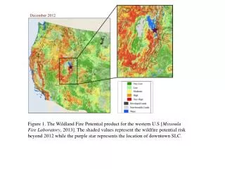
Figure 1. The Wildland Fire Potential product for the western U.S [ Missoula Fire Laboratory , 2013]. The shaded values represent the wildfire potential risk beyond 2012 while the purple star represents the location of downtown SLC.

E N D
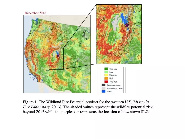
Figure 1. The WildlandFire Potential product for the western U.S [Missoula Fire Laboratory, 2013]. The shaded values represent the wildfire potential risk beyond 2012 while the purple star represents the location of downtown SLC.
Figure 2. The WRF domain used for this study with surface and upper-air observations used for our WRF run comparisons. The horizontal grid spacing is 12-km for D01, 4-km for D02 and 1.333 km for D03.
TABLE 1: Overview of the WRF configurations tested for the WRF simulations centered over Salt Lake City. All of these simulations used the RRTMG longwave and shortwave radiation schemes, NOAH land-surface model, and had a similar domain with 41 vertical levels. Also included is the averaged RMSE and model BIAS (model – obs) for all upper-air and surface observations for the u- and v-wind components and temperature.
Figure 3. Comparisons between the averaged 0000 UTC upper-air observations and modeled potential temperature profiles for KSLC during the month of July 2007 can be seen in the top panels (a and b) while the average for the 1200 UTC potential temperature profiles are shown in the lower panels (c and d). The potential temperature profile in (a and c) used the MYJ PBL scheme while the right panels used the YSU PBL scheme (b and d).
Figure 4. The sensitivity of the WRF-STILT simulations for the model total, wildfire contributed, anthropogenic contributed, and background CO concentrations arriving at SLC for August 15th 2012.
Figure 5. Total wildfire emissions for the 2007 (a) and 2012 (b) western U.S. wildfire season as derived from the WFEI. The star points to the location of SLC.
Figure 6. The top panels (a and b) shows STILT simulated and observed CO concentrations for SLC for August and September 2007. The black line is model total while the orange, red, and green lines are contributions from anthropogenic and fire emissions, and the background CO. The blue line is the observed CO concentrations at SLC. The lower panels (c and d) shows STILT simulated and observed CO2 concentrations for the SLC for August and September 2007. The black line is the model total while the orange, red and green lines present the source contributions. The error statistics here were calculated using the modeled and observed changes in CO2 plus the background.
Figure 7. Frequency of 3-hourly wildfire contributions to SLC CO concentrations for the 2007 (a) and 2012 (b) western U.S. wildfire seasons. Wildfire contributions >=5 ppb are included in the lowest bin.
Figure 8. The panel on the left (a) shows the instantaneous 3-hourly STILT averaged footprints for the 2007 wildfire season. The right panel (b) shows the instantaneous 3-hourly total wildfire CO contributions for air arriving in SLC.
Figure 9. The top panel shows the western U.S. wildfire contributions regions. The yellow area represents Utah, the green area represents Idaho, the blue area represents the Pacific Northwest, the red area represents California and Nevada, the gray area represents the Southwestern U.S., and the purple area represents the Eastern Rockies. Figure (b) and (c) determines the total wildfire contributions towards CO concentrations in SLC by region for the 2007 (b) and (c) 2012 western U.S. wildfire season.
Figure 10. The top panel shows (a) modeled wildfire CO contributions for 2012 western U.S. wildfire season. The two lowest panels (B and C) show STILT simulated and observed CO concentrations for SLC zoomed in on August and September 2012. The black line is model total while the orange, red, and dark green lines are contributions from anthropogenic and fire emissions, and the background CO, respectively. The blue line is the observed CO concentrations in SLC.
Figure 11. The same maps as in Fig. 6 but for the 2012 western U.S. wildfire season.
Figure 12. Modeled and observed daily-averaged PM2.5 concentrations are shown in the top panel for the SLC (a). Measured values of total carbon and speciated potassium ion concentrations are shown in the in the bottom panel (b). PM2.5, total organic carbon, and speciated K were obtained from DAQ. The shaded areas marks time periods with increased wildfire contributions and concentrations.
Figure 13. The image of the left is a MODIS scan from TERRA polar-orbiting satellite on August 18th 2012 at 1905 UTC (a). The image on the right shows aerosol optical depth from the same satellite and time as Fig. 12a (b). The star points to the location of SLC.
Figure 14. The plot in the upper left panel (a) shows wildfire emissions for August 7th 2012 while the upper right panel (b) shows the WRF-STILT footprint for the same time. The lower left panel shows the wildfire contribution for CO mass concentrations arriving at SLC on for August 7th 2012 at 1200 UTC. The last panel on the lower right shows WRF-STILT particles the pass over the Pinyon wildfire at each 2 minute time step. The blue line represents the top of the PBL while the yellow shading represents the surface influence volume while the red shaded area represents the elevated surface influence volume. The red flame on the bottom shows the original wildfire emission height while the top flame