Download
1 / 36
360 likes | 514 Views
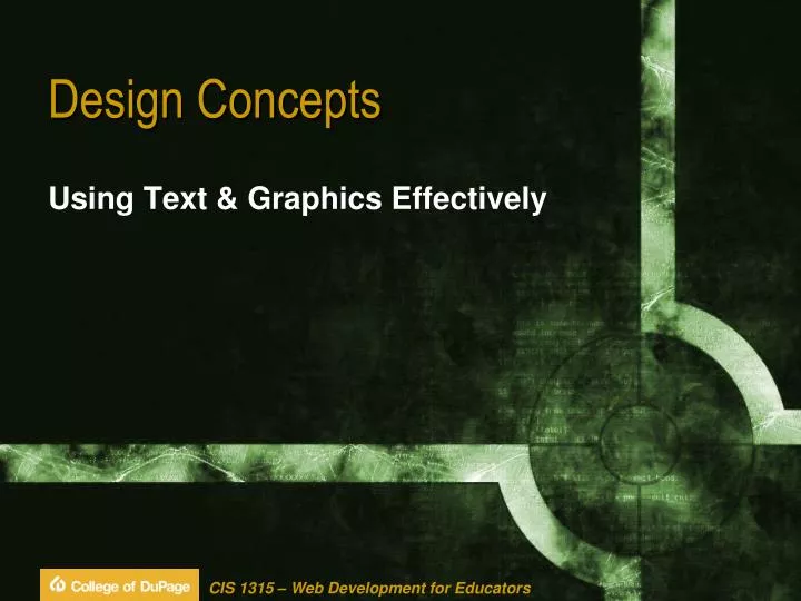
Design Concepts. Using Text & Graphics Effectively. Underlying Principles of Design. Subjective Communication Visual Appeal Objective Utility Engagement. Underlying Principles of Design. Communication User Interaction First Seconds Site Must Clearly Communicate Why it is Useful

E N D
Design Concepts Using Text & Graphics Effectively
Underlying Principles of Design • Subjective • Communication • Visual Appeal • Objective • Utility • Engagement
Underlying Principles of Design • Communication • User Interaction • First Seconds • Site Must Clearly Communicate Why it is Useful • 10 Seconds • Convince User Site can be Navigated Easily • 1 Minute • Content is of Real Interest & Value
Underlying Principles of Design • Communication • Clarity • Logical Organization • Opening Content that can be Scanned v. Read • Concisely Stated, Without Extraneous Material • Benefit to User • Clear v. Obscure • Error Free • Spelling & Grammar • Accurate & Current • Link Rot, Link Quality, & Link Descriptions
Underlying Principles of Design • Communication • Legibility • High Contrast • Color • Text Size • Typeface • Density • Use Headings & Lists • Images • Meaningful Relationship to Content • White Space
Underlying Principles of Design • Communication • Readability • Understanding • Familiar Terms & Phrases • Language • Vivid • Active • Personable
Underlying Principles of Design • Visual Appeal • Richness • Uncluttered • White Space • Balance • Images Complement Content & Each Other • Images • High Quality
Underlying Principles of Design • Visual Appeal • Style • Suitable for Purpose • Convey Mood or Tone • Formal/Informal, Youthful/Mature, Playful/Serious • Stylistic Elements Fit Together • Color Combinations • Typefaces • Images
Underlying Principles of Design • Visual Appeal • Unity • Organization • Consistency & Repetition • Color, Navigational Elements, Logo • Makes Each Page Appear to be Part of the Whole • Creates a Sense of Order • Immediately Obvious Which Elements Relate to Each Other
Underlying Principles of Design • Utility • Intuitive Interface • Easy to Use • Clear as to How to Perform Tasks • Predictable • Lack of Frustration • Successful Accomplishment of Tasks
Underlying Principles of Design • Utility • Navigability • Clearly Identified Links • Describes Link Destination • Should NOT Have to Backtrack to Home • Where You Are, Where You Can Go, Where You’ve Been • Logical Organization of Content
Underlying Principles of Design • Utility • Value • What is Benefit for User? • Remember Site • Return Visitors
Underlying Principles of Design • Engagement • User Awareness • Types of Visitors Site Hopes to Engage • Anticipate What Users Want & Expect • Clearly Recognize Benefits
Underlying Principles of Design • Engagement • User-Centered Purpose • Does the Site Have a Purpose? • Knowledge • Decision Support • Accomplishing Tasks • Interconnectedness • Enjoyment • Is Purpose Immediately Apparent?
Underlying Principles of Design • Engagement • Interpersonal Rapport • Visitors Feel • Comfort • Trust • Understanding • Duration • Return to Site?
Heading (Sans Serif) v. Body (Serif) Lorem Ipsum Lorem ipsum dolor sit amet, consectetuer adipiscing elit. Nunc placerat ante in libero. Vivamus sed enim. Nunc malesuada. Sed facilisis. Pellentesque et odio. Cras tortor. Etiam consequat diam at ligula. Sed vestibulum diam sed pede. In hendrerit nulla et justo. Donec ullamcorper mattis pede. Donec lectus pede, aliquet et, nonummy eu, sagittis sit amet, est. Nam faucibus nulla nec nulla. Praesent porttitor ultricies eros. Nam mauris. Proin augue libero, convallis non, hendrerit sed, condimentum at, magna. In convallis, ligula ac interdum adipiscing, lorem leo ultrices dolor, id tincidunt odio dolor at nibh. Aliquam nisl ante, vestibulum sed, ultricies a, ullamcorper id, turpis. Pellentesque quam lacus, dapibus vitae, interdum at, viverra non, orci. Suspendisse orci neque, mattis venenatis, semper at, lobortis at, mauris. Nunc convallis, quam non scelerisque rutrum, elit nunc euismod neque, ac euismod risus augue quis turpis.
Heading / Body Size Contrast Lorem Ipsum Lorem ipsum dolor sit amet, consectetuer adipiscing elit. Nunc placerat ante in libero. Vivamus sed enim. Nunc malesuada. Sed facilisis. Pellentesque et odio. Cras tortor. Etiam consequat diam at ligula. Sed vestibulum diam sed pede. In hendrerit nulla et justo. Donec ullamcorper mattis pede. Donec lectus pede, aliquet et, nonummy eu, sagittis sit amet, est. Nam faucibus nulla nec nulla. Lorem Ipsum Lorem ipsum dolor sit amet, consectetuer adipiscing elit. Nunc placerat ante in libero. Vivamus sed enim. Nunc malesuada. Sed facilisis. Pellentesque et odio. Cras tortor. Etiam consequat diam at ligula.Sed vestibulum diam sed pede. In hendrerit nulla et justo. Donec ullamcorper mattis pede. Donec lectus pede, aliquet et, nonummy eu, sagittis sit amet, est. Nam faucibus nulla nec nulla.
Headings (Fewer & Larger) Lorem Ipsum Lorem ipsum dolor sit amet, consectetuer adipiscing elit. Nunc placerat ante in libero. Vivamus sed enim. Nunc malesuada. Sed facilisis. Pellentesque et odio. Cras tortor. Etiam consequat diam at ligula. Sed vestibulum diam sed pede. In hendrerit nulla et justo. Donec ullamcorper mattis pede. Donec lectus pede, aliquet et, nonummy eu, sagittis sit amet, est. Nam faucibus nulla nec nulla. Lorem Ipsum Dolor Sit Amet Lorem ipsum dolor sit amet, consectetuer adipiscing elit. Nunc placerat ante in libero. Vivamus sed enim. Nunc malesuada. Sed facilisis. Pellentesque et odio. Cras tortor. Etiam consequat diam at ligula.Sed vestibulum diam sed pede. In hendrerit nulla et justo. Donec ullamcorper mattis pede. Donec lectus pede, aliquet et, nonummy eu, sagittis sit amet, est.
Subheads As Named Anchors Lorem Ipsum Lorem ipsum dolor sit amet, consectetuer adipiscing elit. Nunc placerat ante in libero. Vivamus sed enim. Nunc malesuada. Sed facilisis. Pellentesque et odio. Cras tortor. Etiam consequat diam at ligula. Sed vestibulum diam sed pede. In hendrerit nulla et justo. Donec ullamcorper mattis pede. Donec lectus pede, aliquet et, nonummy eu, sagittis sit amet, est. Dolor Sit Amet Nam faucibus nulla nec nulla. Praesent porttitor ultricies eros. Nam mauris. Proin augue libero, convallis non, hendrerit sed, condimentum at, magna. In convallis, ligula ac interdum adipiscing, lorem leo ultrices dolor, id tincidunt odio dolor at nibh. Aliquam nisl ante, vestibulum sed, ultricies a, ullamcorper id, turpis. Pellentesque quam lacus, dapibus vitae, interdum at, viverra non, orci. Suspendisse orci neque, mattis venenatis, semper at, lobortis at, mauris.
Leading Lorem ipsum Lorem ipsum dolor sit amet, consectetuer adipiscing elit. Nunc placerat ante in libero. Vivamus sed enim. Nunc malesuada. Sed facilisis. Pellentesque et odio. Cras tortor. Etiam consequat diam at ligula. Sed vestibulum diam sed pede. In hendrerit nulla et justo. Donec ullamcorper mattis pede. Donec lectus pede, aliquet et, nonummy eu, sagittis sit amet, est. Lorem ipsum Lorem ipsum dolor sit amet, consectetuer adipiscing elit. Nunc placerat ante in libero. Vivamus sed enim. Nunc malesuada. Sed facilisis. Pellentesque et odio. Cras tortor. Etiam consequat diam at ligula. Sed vestibulum diam sed pede. In hendrerit nulla et justo. Donec ullamcorper mattis pede. Donec lectus pede, aliquet et, nonummy eu, sagittis sit amet, est. http://www.typetester.org/
White Space • Space Between Visual Elements • The Part of the Design that “Isn't" There • Just as Important as the Elements that are There
White Space Testing Wichita State University 2006
Graphic Placement Lorem ipsum dolor sit amet, consectetuer adipiscing elit. Nunc placerat ante in libero. Vivamus sed enim. Nunc malesuada. Sed facilisis. Pellentesque et odio. Cras tortor. Etiam consequat diam at ligula. Sed vestibulum diam sed pede. In hendrerit nulla et justo. Donec ullamcorper mattis pede. Donec lectus pede, aliquet et, nonummy eu, sagittis sit amet, est.
Layout (Conservative / Dynamic) Well-defined, rectangular areas on the page Warm greens accompanied by cool blues Balance intimacy with professionalism Overlapping panels Imagery evokes customer service & technology Entertain the eye & communicate innovation
Balance (Symmetrical / Asymmetrical ) • Provide Sense of / Lack of Equilibrium • Create Tension & Visual Weight • Use of Approximate Horizontal Symmetry • Imagery Incorporates Good Amount of White • Graphic Text is Thin & Unobtrusive • Elements Blend into Background • Not Dominant in Any One Place • Subtle Greens Used Sparingly
Diagonal Balance • Upper Left to Lower Right • POA (Primary Optical Area) to TA (Terminal Anchor) • Natural Eye Movement • Use Color to Draw Attention • Guides the Eye • Creates Focal Area LOGO LOGO Button
Dominance • Emphasis & Visual Weight in a Composition • Where the Eye is First Led to When Looking at a Design • Right-most Column is Dominant • Largest Area of Color • Uses Big, Reversed Text for Major Headings • Center Column is Subdominant • Uses Less Color & Smaller Text in Less Space • Left-most Column is Subordinate
Color • Eye’s Response to Wavelengths of Radiation • Hue, Value, Saturation • All Hues Brought Down to a Mid-range Value • Surrounded by Red & Orange • Plays Off of Natural Complements • Very Warm, Very Rich Set of Tones • Feel Full & Vibrant
Three Levels of Emotional Design • Visceral • Appearance • “Hardwired” • Behavioral • Usability • Reflective • Branding
Branding • Signifies Goods/Services • Name • Slogan • Logo • Something That Won’t Come Off in the Wash
Branding • Functional — Objective, Logical, Practical • Communicate • Recognition & Recall • Differentiate • Emotional — Subjective, Emotive, Creative • Personality • Add Value • Attractive
Branding • General • Leo Burnett • Nike v. Adidas • Logitech • Michelin v. Firestone • FedEx
Branding • Web Principles • Consistency • Logo • Tagline • Navigation • Color Scheme
Branding • Web Principles • Characters • Simple Stylistic Trend • Permeates Site to Thematically Unite It • Element of Logo • Used Next to Header Text • Used as Bullet Marker