Download
1 / 21
210 likes | 362 Views
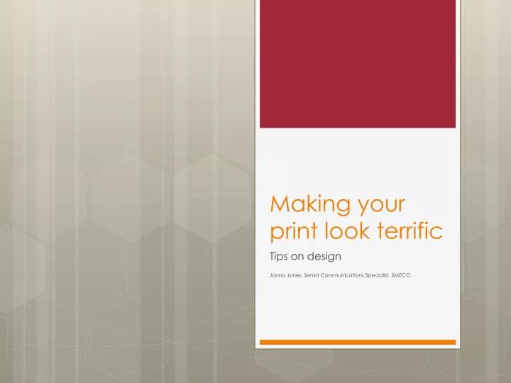
Making your print look terrific. Tips on design Jonna Jones, Senior Communications Specialist, SMECO. Key elements in layout. White Space is your friend. Use grids to provide balance and a useful framework for design. Avoid trapped copy.

E N D
Making your print look terrific Tips on design Jonna Jones, Senior Communications Specialist, SMECO
Key elements in layout • White Space is your friend. • Use grids to provide balance and a useful framework for design. • Avoid trapped copy. • Remember the K.I.S.S. principle… keep it simple, stupid. • Makesure the overall look is consistent.
What is white space? • White spaces are the areas of your piece left open that allow the design to breathe. • It is the empty space between and around your design elements and layout. • Space around graphics and images • Margins and gutters • Space between columns • Space between lines of type • By increasing the amount of white space, a design can become more elegant and more legible. It can also help your audience differentiate where content starts and stops. good bad
Grids are good Use grids to provide balance and symmetry in your design. Know the rules so you can break them effectively. Sample of a design over a five-column grid.
Use color to communicate • Color should be part of your design, but it shouldn’t BE your design. • Color creates the mood of your piece. • Don’t pick colors based on personal preferences, choose them to communicate the message most effectively. • Different cultures assign different meanings to color, it’s important to understand who your target audience is and how they attach meaning to color. • Make sure you don’t lose function or form with your choices.
Use color to communicate • Utilize the color wheel to create pleasing color palettes • Monochromatic: color scheme with different tones of the same color. • Analogous: color scheme with colors that are adjacent to each other on the color wheel. • Complementary:color schemes using colors that are opposite each other on the color wheel. • Triadic: color scheme using three colors equally spaced around the color wheel. • Split Complementary:color scheme that is created by choosing one color and then two more colors that are adjacent to the complementary of the initial color. Basically, this is a combination of a complementary and analogous color scheme. • Neutral:color schemes that include only colors not found on the color wheel (various tones of brown and gray) • Accented Neutral: a neutral color scheme with one or more splashes of color found on the color wheel.
Use color to communicate • Warm Colors:warm colors are red, orange, and yellow. Warm colors are more often associated with passion, energy, impulsiveness, happiness, coziness, and comfort. They draw attention and have the advantage of being inviting and harmonious. • Red: is emotionally intense. It is associated with energy, war, danger, strength, power, determination, action, confidence, courage, vitality, passion, desire, and love. It can enhance metabolism, increase respiration, and raise blood pressure. Red has a high visibility and advances to the foreground. It is often used for buttons in order to get people to take impulsive action. • Yellow: attracts attention, though it can also be distracting when overused. Yellow is associated with joy, happiness, wisdom, and intellectual energy. It stimulates mental activity and generates muscle energy. Yellow produces a warming effect, arouses cheerfulness and is often used to evoke pleasant feelings. Shades of yellow can become dingy, lessening the pleasing effect. • Orange: combines the energy of red with the happiness of yellow. It’s not as aggressive as red and calls to mind healthy food (citrus). Orange is associated with joy, sunshine, the tropics, enthusiasm, happiness, fascination, creativity, determination, attraction, success, encouragement, stimulation, and strength. It can increase appetite and evokes thoughts of fall and harvest.
Use color to communicate • Cool Colors: cool colors are green, blue, and violet. Cool colors are more often associated with calm, trust, and professionalism. The are also associated with sadness and melancholy. The have the advantage of being professional and harmonious, but can also turn people off by the coolness they radiate. • Green: is the color of nature. It symbolizes growth, hope, freshness, and fertility. Green is associated with healing, stability, endurance, harmony, safety. life, and well being. It can sometimes signify a lack of experience and is often used to indicate the safety of drugs and medical products in advertising. • Blue: is the color of the sky and the sea. It has the opposite effect of red and slows metabolism, breathing, and heart rate. It’s seen as a masculine color. Blue is associated with trust, loyalty, wisdom, intelligence, expertise, confidence, stability and depth. It creates a calming effect, suppresses appetite and has been considered to be beneficial to both body and mind. Blue is often used for corporate sites given the previously mentioned associations. • Purple: combines the stability of blue and the energy of red. It conveys wealth and extravagance and is seen as the color or royalty. It symbolizes power, nobility, luxury, and ambition. Purple is associated with wisdom, dignity, independence, creativity, mystery, and magic. Light purple is seen as feminine and purple is a popular color with children. Purple occurs less frequently in nature and some may consider it artificial.
Use color to communicate • White: is associated with light, goodness, innocence, purity, virginity. It usually has positive connotations and is seen as clean and safe. • Black: is associated with power, elegance, formality, death, evil, and mystery. It denotes strength and authority, is seen as formal and elegant, and brings forth feelings of fear and the unknown. • Gray: is the color of sorrow, detachment, and isolation. It connotes responsibility and conservative practicality. It’s a neutral color and creates a non-invasive feeling. It’s associated with security, maturity, and dependability. It can be used to reduce the intense energy of another color and to emphasize a willingness to comply. Some people who prefer gray many be seen as the lone wolf type or narrow-minded. • Brown: is the color of the earth and tends to blend into the background. It’s associated with material things, order, and convention. It’s connection to the earth gives it stability. Brown can convey a solid and wholesome feeling.
Appropriate font use • Limit Your fonts. The fonts you select should be consistent with the look and feel of the piece. Do not use too many different fonts in one design, I prefer two fonts per design, but definitely keep it under four. • Do not use display fonts as text fonts. • Limit the use of artistic fonts to headings and subheads. The body copy should be basic and readable. • Avoid Comic Sans Font. • Don't change the font in mid sentence unless you have a very good reason. • Typically, use sans serif for online, serif for print. • Monospace for typewriter and code.
Save the widows and orphans • Widows and orphans are a single word or a short phrase at the beginning or end of a paragraph at the top or bottom of a column. • They look out of place and affect readability. • If you have a subhead, make sure to have 2–3 lines of text following it.
Use quality art • Photos should be high resolution, and in an appropriate format. • Do not use rights-protected work without permission to use it.
Common punctuation and style mistakes to avoid • Dates: always use Arabic numbers without th, st, nd • November 10, 2011 not November 10th, 2011. • Use the appropriate dashes: • Em dash — (alt-0151): an em dash is used to show a break in thought or a shift of tone. • En dash – (alt-0150): the en dash means “through.” A common use is to indicate inclusive dates and numbers: July 9–August 17; pp. 37–59. • Don’t start a sentence or headline with a numeral, spell out numbers under 10.
References • Pantone universe: www.pantoneuniverse.com/ • COLOURlovers: www.colourlovers.com/ • Associate Press Stylebook
Sample one: original Based on the information provided here, what do you think works and doesn’t work?
Sample two: original Based on the information provided here, what do you think works and doesn’t work?
Sample two: revised Bulleted list of what I changed and why
Sample three: original Based on the information provided here, what do you think works and doesn’t work?
Sample three: revised Fonts do not work well together and do not enhance the message Plain, no flow Info does not pop Location information not together, people should not have to search for the information they need
Sample four: original Based on the information provided here, what do you think works and doesn’t work?
Sample four: revised Headline font doesn’t match the message Body font is hard to read Art is distorted No hierarchy of the elements—no flow Your message should speak for itself, no exclamation marks…