Download
1 / 20
220 likes | 522 Views
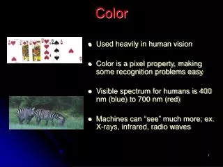
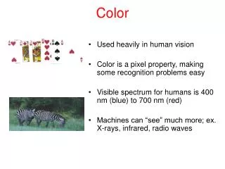
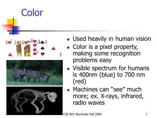
Color. Hue : the name of a color Warm hues : advancing, focusing, stimulating. Ex. Red , yellow , and related hues. Cool hues : receding, releasing. Ex. Blue and related hues. Neutral hues : Ex. White, gray , black Static hues : hues between warm and cool. Ex. Green and violet.

E N D
Hue : the name of a color • Warm hues : advancing, focusing, stimulating. Ex. Red, yellow, and related hues. • Cool hues : receding, releasing. Ex. Blue and related hues. • Neutral hues : Ex. White, gray, black • Static hues : hues between warm and cool. Ex. Green and violet
Value : the relative lightness or darkness of a hue. • Tint - light value (hue + white). Light values are stimulating, advancing, light in weight, and seem larger than they are. • Shade - dark value (hue + black). Dark values are releasing, receding, heavy in weight, and seem smaller than they are. • High visibility hues -yellow and related hues. • Low visibility hues - violet and related hues.
Tints - adding white to a pure hue: Shades - adding black to a pure hue: Tones - adding gray to a pure hue:
Intensity : relative brightness or dullness of a hue. • Tone- a hue mixed or grayed to reduce its intensity. • Strong color - high degree of intensity, light value, warm, highly visible.
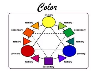
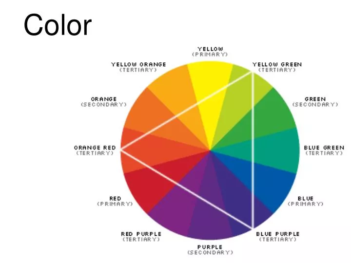
Related color schemes • Monochromatic - a combination of values and/or intensities of a single hue. • Ex. Pink snapdragons, light pink carnations, dark pink roses. • Analogous - a combination of 3 or more hues adjoining on color wheel. • Different values and intensities may be used. • Ex. Darker yellow children’s rain boots, orange marigolds, brown of a basket ball.
Unrelated color scheme • Complementary - a combination of 2 hues directly opposite on color wheel • Ex. Red and green. May be interpreted broadly to include any red with any green. More of 1 hue should be used than the other. Values and/or intensities of 2 hues should be different. • Split Complementary - a combination of 1 key hue with the 2 hues that adjoin its direct complement. Ex. Yellow with blue-violet and red-violet.
Triad - A combination of 3 hues equally spaced about color circle. • Ex. Red, yellow, blue. One hue should dominate in quantity; use smaller quantities of other 2 hues. Tints and shades and various intensities may be used. • Contrast - a combination of a tint with one or more hues that are of strong intensity or dark value. Ex. White with red or blue. • Polychromatic - a combination of 4+ hues that do not comprise any analogous scheme. • One color should dominate, and the scheme should be generally warm or cool.
Complementary color schemeColors that are opposite each other on the color wheel are considered to be complementary colors (example: red and green). The high contrast of complementary colors creates a vibrant look especially when used at full saturation. This color scheme must be managed well so it is not jarring. Complementary color schemes are tricky to use in large doses, but work well when you want something to stand out. Complementary colors are really bad for text.
Analogous color schemeAnalogous color schemes use colors that are next to each other on the color wheel. They usually match well and create serene and comfortable designs. Analogous color schemes are often found in nature and are harmonious and pleasing to the eye. Make sure you have enough contrast when choosing an analogous color scheme. Choose one color to dominate, a second to support. The third color is used (along with black, white or gray) as an accent.
Triadic color scheme A triadic color scheme uses colors that are evenly spaced around the color wheel. Triadic color schemes tend to be quite vibrant, even if you use pale or unsaturated versions of your hues. To use a triadic harmony successfully, the colors should be carefully balanced - let one color dominate and use the two others for accent.
Split-Complementary color scheme The split-complementary color scheme is a variation of the complementary color scheme. In addition to the base color, it uses the two colors adjacent to its complement. This color scheme has the same strong visual contrast as the complementary color scheme, but has less tension. The split-complimentary color scheme is often a good choice for beginners, because it is difficult to mess up.
Rectangle (tetradic) color scheme The rectangle or tetradic color scheme uses four colors arranged into two complementary pairs. This rich color scheme offers plenty of possibilities for variation. Tetradic color schemes works best if you let one color be dominant. You should also pay attention to the balance between warm and cool colors in your design.
Square color scheme The square color scheme is similar to the rectangle, but with all four colors spaced evenly around the color circle. Square color schemes works best if you let one color be dominant. You should also pay attention to the balance between warm and cool colors in your design.
Optical Mixing Two color in close proximity will mix to create a third color in your eye.