Download
1 / 53
550 likes | 1.5k Views
Assumption of linearity. Assumption of linearity Strategy for solving problems Producing outputs for evaluating linearity Assumption of linearity script Sample Problems. Assumption of linearity.

E N D
Assumption of linearity Assumption of linearity Strategy for solving problems Producing outputs for evaluating linearity Assumption of linearity script Sample Problems
Assumption of linearity • The statistics that we will study this semester generally assume that the relationship between variables is linear, or they perform better if the relationships are linear. • If a relationship is nonlinear, the statistics which assume it is linear will underestimate the strength of the relationship, or fail to detect the existence of a relationship.
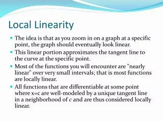
Linearity • Linearity means that the amount of change, or rate of change, between scores on two variables is constant for the entire range of scores for the variables. • There are relationships are not linear. • The relationship between learning and time may not be linear. Learning a new subject shows rapid gains at first, then the pace slows down over time. This is often referred to a a learning curve. • Population growth may not be linear. The pattern often shows growth at increasing rates over time.
Population growth in Texas The increase in population for the ten years from 1860 to 1870 is relatively small compared to the increase in the population for the ten years from 1960 to 1970. A difference of 214,364. A difference of 1,617,053.
Evaluating linearity • There are both graphical and statistical methods for evaluating linearity. • Graphical methods include the examination of scatter plots, often overlaid with a trend line. While commonly recommended, this strategy is difficult to interpret. • Statistical methods include diagnostic hypothesis tests for linearity, a rule of thumb that says a relationship is linear if the difference between the linear correlation coefficient (r) and the nonlinear correlation coefficient (eta) is small, and examining patterns of correlation coefficients.
Interpreting scatter plots The advice for interpreting linearity is often phrased as looking for a cigar-shaped band, which is very evident in this plot.
Interpreting scatter plots Sometimes, a scatter plot shows a clearly nonlinear pattern that requires transformation, like the one shown in the scatter plot.
Scatter plots that are difficult to interpret The correlations for both of these relationships are low. The linearity of the relationship on the right can be improved with a transformation; the plot on the left cannot. However, this is not necessarily obvious from the scatter plots.
Using correlation matrices Creating a correlation matrix for the dependent variable and the original and transformed variations of the independent variable provides us with a pattern that is easier to interpret. The information that we need is in the first column of the matrix which shows the correlation and significance for the dependent variable and all forms of the independent variable.
The pattern of correlations for no relationship The correlation between the two variables is very weak and statistically non-significant. If we viewed this as a hypothesis test for the significance of r, we would conclude that there is no relationship between these variables. Moreover, none of significance tests for the correlations with the transformed dependent variable are statistically significant. There is no relationship between these variables; it is not a problem with non-linearity.
Correlation pattern suggesting transformation The correlation between the two variables is very weak and statistically non-significant. If we viewed this as a hypothesis test for the significance of r, we would conclude that there is no relationship between these variables. However, the probability associated with the larger correlation for the square transformation is statistically significant, suggesting that this is a transformation we might want to use in our analysis.
Transformations • When a relationship is not linear, we can transform one or both variables to achieve a relationship that is linear. • Four common transformations to induce linearity are: the logarithmic transformation, the square root transformation, the inverse transformation and the square transformation. • All of these transformations produce a new variable that is mathematically equivalent to the original variable, but expressed in different measurement units, e.g. logarithmic units instead of decimal units.
When transformations do not work • When none of the transformations induces linearity in a relationship, our statistical analysis will underestimate the presence and strength of the relationship, i.e. we lose power to detect relationship and estimated values of the dependent variable based on our analysis may be biased or systematically incorrect. • We do have the option of changing the way the information in the variables are represented, e.g. substitute several dichotomous variables for a single metric variable. This bypasses the assumption of linearity while still attempting to incorporate the information about the relationship in the analysis.
Strategy for solving problems - 1 • Our strategy for determining whether or not a relationship is linear will be based on significance tests for the Pearson r correlation coefficient and tests of partial correlations between transformed variables and the dependent variable, controlling for the correlation between the independent variable and the dependent variable. • If the correlation coefficient between an independent variable and a dependent variable is statistically significant (its probability is less than or equal to a specified level of significance), we will conclude that the relationship is linear.
Strategy for solving problems - 2 • If linearity cannot be supported for the untransformed independent and dependent variables, we will examine the transformations for the variables. • If any of the transformations for the independent or dependent variable are statistically significant when the untransformed relationship is not statistically significant, we will conclude that the problem is non-linearity, and can be remedied by substituting the transformed variable in the analysis. • If neither the untransformed variable nor any of the transformations are statistically significant, we will conclude that there is no relationship between the variables. We do not conclude that the relationship is not linear.
Strategy for solving problems - 3 • Even when relationship with the original independent variable is linear, the analysis might still be enhanced by the inclusion of a transformed version of the independent variable to the analysis, e.g. including the square of the independent variable in a regression. • If the partial correlation for a transformation is statistically significant controlling for the relationship between the original independent and depending variables, we will suggest that the transformed variable be included in the analysis, in addition to the original form of the variables. In effect, we are adding the relationship of the transformation to the linear relationship between the independent and dependent variable.
Creating the scatter plot The most commonly recommended strategy for evaluating linearity is visual examination of a scatter plot. To obtain a scatter plot in SPSS, select the Scatter… command from the Graphs menu.
Selecting the type of scatter plot First, click on thumbnail sketch of a simple scatter plot to highlight it. Second, click on the Define button to specify the variables to be included in the scatter plot.
Selecting the variables First, move the dependent variable netime to the Y Axis text box. Third, click on the OK button to complete the specifications for the scatter plot. Second, move the independent variable tvhours to the X axis text box. If a problem statement mentions a relationship between two variables without clearly indicating which is the independent variable and which is the dependent variable, the first mentioned variable is taken to the be independent variable.
The scatter plot The scatter plot is produced in the SPSS output viewer. The points in a scatter plot are considered linear if they form a cigar-shaped elliptical band. The pattern in this scatter plot is not really clear.
Adding a trend line To try to determine if the relationship is linear, we can add a trend line to the chart. To add a trend line to the chart, we need to open the chart for editing. To open the chart for editing, double click on it.
The scatter plot in the SPSS Chart Editor The chart that we double clicked on is opened for editing in the SPSS Chart Editor. The blue border around the plot area indicates that the plot area is selected. The icon for adding a trend or fit line to the chart is disabled, so we cannot select it.
Enabling the Add fit line icon To activate the Add fit line icon, click on one of the points. When the points are selected, they are bordered in blue. When the points are selected, their Properties dialog opens. We could use this dialog to change the marker, color, etc.
Requesting the fit line With the points selected, click on the Add fit line icon.
The fit line and r² The linear trend or fit line is added to the chart and the Properties dialog for the fit line is opened. By default, the trend line is linear, and the value for R Square is included in the chart. The value of r² (0.046) suggests that the relationship is weak.
Changing the shape of the fit line We can try a trend line with a curved shape to see if it does a better job of fitting the data. To change the trend line, First, click on the Quadratic in the Fit Method panel. This will fit a trend line that include a square term in the equation (x²). Second, click on the apply button to change the trend line.
The quadratic fit line and r² The value of r² (0.159) falls at the top of the weak range, indicating a stronger relationship that the one represented by the linear fit line. This result hints that a squared transformation of the independent variable may be needed. The fit line curves to reduce the discrepancies between the line and the data points.
Changing the color of the fit line Click the line panel to select a color. Select a color which you want to change. Click on the Apply button, then the color of the trend line will change.
Computing the transformations There are four transformations that we can use to achieve or improve linearity. The compute dialogs for these four transformations for linearity are shown.
Creating the scatter plot matrix To create the scatter plot matrix, select the Scatter… command in the Graphs menu.
Selecting type of scatterplot First, click on the Matrix thumbnail sketch to indicate which type of scatterplot we want. Second, click on the Define button to select the variables for the scatterplot.
Specifications for scatterplot matrix First, move the dependent variable, the independent variable and all of the transformations to the Matrix Variables list box. Second, click on the OK button to produce the scatterplot.
The scatter plot matrix The scatter plot matrix shows a thumbnail sketch of scatter plots for each independent variable or transformation with the dependent variable. The scatter plot matrix may suggest which transformations might be useful.
Creating the correlation matrix To create the correlation matrix, select the Correlate | Bivariate… command in the Analyze menu.
Specifications for correlation matrix First, move the dependent variable, the independent variable and all of the transformations to the Variables list box. Second, click on the OK button to produce the correlation matrix.
The correlation matrix and the original problem The output from the script can be used to answer the problem question. The significance of the correlation coefficient between the untransformed variables (0.079) is not significant, suggesting either that the relationship is non-linear relationship (if one of the transformations is significant) or weak (if all of the correlations are not significant). The correlation between the dependent variable and the square transformation (0.006) is less than the level of significance. The relationship between hours watching TV and time spent on the Internet is not linear, and the transformed variable should be substituted for hours watching TV.
Problem 1 - Answer The answer is false because the relationship is not-linear, and the transformation should be substituted for the independent variable, not added to the analysis.
The script for testing assumption of linearity The SPSS script can be used to test the assumption of linearity. First, move the dependent and independent variables to the list boxes. Second, mark the Assumption of linearity option button. Third, accept or mark the transformation to be included in the analysis. Fourth, click on the OK button to produce the output.
The scatter plot matrix produced by the script The scatter plot matrix provides a thumbnail sketch of each of the relationships. While we will base our answers on the correlation matrix, the scatter plot matrix should provide visual confirmation of our conclusions.
The correlation matrix produced by the script The answers to this problem is based on the correlation matrix. With a non-significant relationship between the untransformed independent variable and the dependent variable, combined with a significant relationship with a transformed variable, we conclude that the relationship is not linear.
Partial correlations produced by the script Had we concluded that the relationship between the independent and dependent variable been judged to be linear, we would have asked the question of whether or not the analysis could be improved by the addition of a transformed variable. We answer this second question by examining the statistical significance of the partial correlations, controlling for the linear relationship between the dependent and independent variable.
The correlation matrix The probability associated with the correlation coefficient between "number of hours worked in the past week" and "total hours spent on the Internet" (0.486) is greater than the level of significance, suggesting either that the relationship is non-linear relationship (if one of the transformations is significant) or weak (if all of the correlations are not significant). The lack of statistical significance for all of the transformations suggests that there is a weak relationship between "number of hours worked in the past week" and "total hours spent on the Internet", and the lack of relationship is not attributable to non-linearity.
Problem 2 - Answer Without any evidence that there is a non-linear relationship, the answer to the question is true. There is a weak or very weak linear relationship.
The correlation matrix The correlation between "highest year of school completed" and "occupational prestige score" was statistically significant (r=.495, p<0.001). A linear relationship exists between these variables.
The partial correlation matrix - 1 Controlling for "highest year of school completed", the partial correlation for several of the transformations indicated a statistically significant relationship to "occupational prestige score": the logarithmic transformation (r=-0.254, p<0.001); the square root transformation (r=-0.257, p<0.001); the inverse transformation (r=-0.232, p<0.001); and the square transformation (r=0.246, p<0.001).
The partial correlation matrix - 2 The partial correlation of 0.2463 between the square of "highest year of school completed" [SQEDUC=EDUC²] and "occupational prestige score" [prestg80] controlling for "highest year of school completed" [educ] was higher than the other partial correlations, and should be included in the analysis.
Problem 3 - Answer The relationship between the independent and dependent variables is linear, and the square transformation supports a statistically significant addition to the relationship. The answer to the question is true.