Download
1 / 7
130 likes | 222 Views
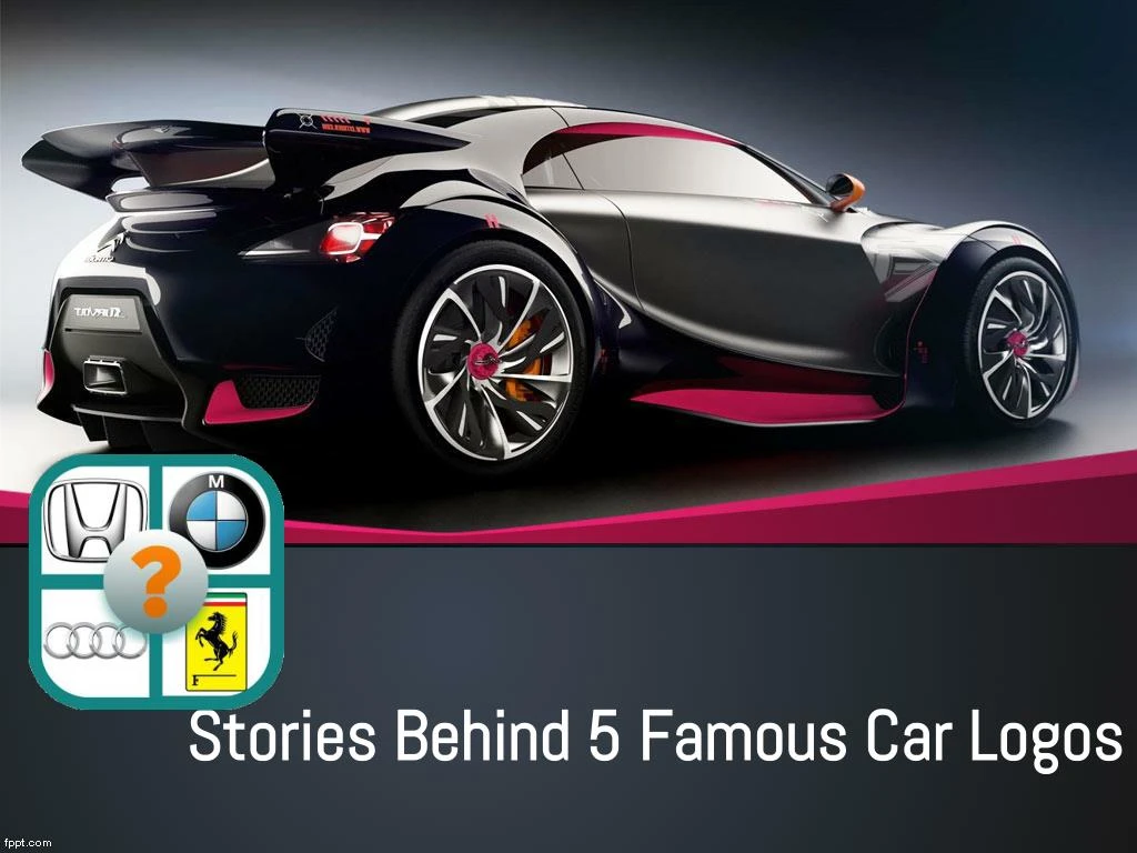
Find the Stories Behind 5 Famous Car Logos

E N D
No, that’s not a weird cowboy hat on the front of that Camry. In 1989, to mark the company’s 50th anniversary, Toyota redesigned its logo, incorporating three overlapping ovals, with the inner two forming a stylized T and a steering wheel, as well as representing how the “customers' expectations [horizontal] and car manufacturer's ideal [vertical] are firmly interlocked to form the letter T," according to the company. The outermost oval represents the world embracing Toyota.
Like many automobile manufacturers, Audi consolidated multiple companies into a single business during the 20th century. An early logo shows the four original company names (Audi, DKW, Horch and Wanderer) each within their own ring. The text disappeared, but the interlocking rings have remained.
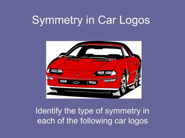
Accounts differ on what inspired Chevrolet and General Motors co-founder William C. Durant to help him create the car company’s famous bowtie logo. Some say Durant had a dream stirred by a wallpaper design from a French hotel; or, according to his daughter, it was a random design he sketched on a tablecloth. Other origin stories say it was "borrowed" from a newspaper advertisement
The mythical red griffin crowned in gold represents the Swedish province of Scania, or Skane, the original location of Swedish car and truck manufacturer AB Skania-Vabis, which merged with Saab Automobile in 1969. The griffin symbol was not used on Saab vehicles until 1984. After GM bought Saab in 2000, they redesigned the logo, and under some form of agreement both companies used the griffin, even though the trademark stayed with Scania.
The Italian company was headed by three brothers, but it was a fourth Maserati brother, artist Mario, who created the company logo. He designed a trident based on the statue of the Roman god Neptune in the Piazza Maggiore in Bologna, and added red and blue to acknowledge that city.
Feeling Confident About All Car Logos?Take on our Car Logo Quiz and Challenge your self to see if you are the master