Download
1 / 12
120 likes | 239 Views
Lesson 2.2 Principles of Designing with Type. PHOTOSHOP Down & Dirty Tricks Tour. Principles of Designing with Type. Weight Scale Letter spacing Contrasting form.

E N D
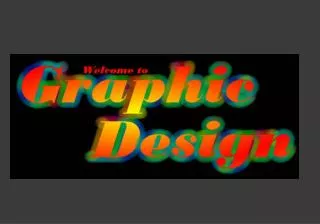
Lesson 2.2 Principles of Designing with Type PHOTOSHOPDown & Dirty Tricks Tour
Principles of Designing with Type • Weight • Scale • Letter spacing • Contrasting form
We’re going to start with one of the “oldest tricks in the book” (so to speak), & we use this trick when combining 2+ fonts to create logos, nameplates, etc.—it’s the design concept of “contrast” • Graphic designers use contrast as 1 of the key building blocks of page layout & design & type design is . . . well . . . Design! • We use the same concepts, we just apply them to type
Weight • Varying the weight of your fonts is an easy way to create instant contrast • For example, use a very thick typeface with a very thin one • In fact, if you want an almost guarantee that a combination will work, use 2 fonts, with vastly different weights, from the same type family • Like matching Futura Light or Medium with Futura Extra Bold • It’s a can’t miss mixture!
Example: www.kelbystudio.com/portfolio • Website: what’s important is where you are on the site—in this case, the Portfolio page, so that’s the word you want in bold—it’s more important • Tip: when it comes to type, the heavier the weight the more important the message
This tip also carries over to laying out a page, like in a brochure, newsletter, magazine, etc. • The headline is the most important thing on the page, so it would get the heaviest weight of the typeface you’re using • Ex: if you’re using Helvetica, then you might choose Helvetica Black • Then the subhead below that, would get a lesser weight, like Helvetica Bold • Then for your body, you’d use Helvetica Regular • Another great example is from Hummer ads to see how effectively they have used contrasting weights
FRONTGATE OUTFITTING AMERICA’S FINEST HOMES Scale • Here’s another way to create contrast with your type: big with little • Ex: the logo for home accessory catalog company Frontgate who has a simple but effective look using 1 large word, with a line of very small text below it • This is a simple technique—mixing scale where 1 word is huge & the other word is much smaller—yet very effective (& very popular)
Letter Spacing • Another popular method for creating contrast is to use letter spacing to visually separate 2 blocks of text • Ex: the Westin Hotel chain • The word Westin appears in large type, & the subhead appears in smaller type, which provides the 1st level of contrast, but what really makes their logo work is the wide letterspacing (tracking) between the letters in their tagline (over 400 tracking, as shown here)
That extra space between the letters is a trick we use to add elegance—the more space between letters, the more luxurious the logo appears • Combine the 2– a tightly tracked name, with a loosely tracked subhead or tagline--& it creates great contrast & gives us added elegance
To increase the letterspacing (adding more space between letters), highlight the text, then hold Alt & • To decrease the letterspacing (tighten the space between letters), highlight the text, then hold Alt &
Contrasting Form • Need another idea for creating contrast? • How about form? • Mixing 1 word with all uppercase letters, with another word (or phrase) in all lowercase—or vice versa
Ex: how about trying 1 word being roman, the next word being italic (or vice versa like the example shown here), using Garamond Condensed for the italic, & Helvetica Black for the roman type? designnews