Download
1 / 52
520 likes | 641 Views
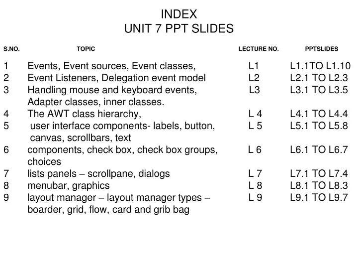
INDEX UNIT 7 PPT SLIDES. S.NO. TOPIC LECTURE NO. PPTSLIDES Events, Event sources, Event classes, L1 L1.1TO L1.10 Event Listeners, Delegation event model L2 L2.1 TO L2.3

E N D
INDEX UNIT 7 PPT SLIDES S.NO. TOPIC LECTURE NO. PPTSLIDES • Events, Event sources, Event classes, L1 L1.1TO L1.10 • Event Listeners, Delegation event model L2 L2.1 TO L2.3 • Handling mouse and keyboard events, L3 L3.1 TO L3.5 Adapter classes, inner classes. 4 The AWT class hierarchy, L 4 L4.1 TO L4.4 5 user interface components- labels, button, L 5 L5.1 TO L5.8 canvas, scrollbars, text • components, check box, check box groups, L 6 L6.1 TO L6.7 choices 7 lists panels – scrollpane, dialogs L 7 L7.1 TO L7.4 8 menubar, graphics L 8 L8.1 TO L8.3 9 layout manager – layout manager types – L 9 L9.1 TO L9.7 boarder, grid, flow, card and grib bag
Event handling • For the user to interact with a GUI, the underlying operating system must support event handling. 1) operating systems constantly monitor events such as keystrokes, mouse clicks, voice command, etc. 2) operating systems sort out these events and report them to the appropriate application programs 3) each application program then decides what to do in response to these events L 1.1
Events • An event is an object that describes a state change in a source. • It can be generated as a consequence of a person interacting with the elements in a graphical user interface. • Some of the activities that cause events to be generated are pressing a button, entering a character via the keyboard, selecting an item in a list, and clicking the mouse. L 1.2
Events may also occur that are not directly caused by interactions with a user interface. • For example, an event may be generated when a timer expires, a counter exceeds a value, a software or hardware failure occurs, or an operation is completed. • Events can be defined as needed and appropriate by application. L 1.3
Event sources • A source is an object that generates an event. • This occurs when the internal state of that object changes in some way. • Sources may generate more than one type of event. • A source must register listeners in order for the listeners to receive notifications about a specific type of event. • Each type of event has its own registration method. • General form is: public void addTypeListener(TypeListener el) Here, Type is the name of the event and el is a reference to the event listener. • For example, 1. The method that registers a keyboard event listener is called addKeyListener(). 2. The method that registers a mouse motion listener is called addMouseMotionListener( ). L 1.4
When an event occurs, all registered listeners are notified and receive a copy of the event object. This is known as multicasting the event. • In all cases, notifications are sent only to listeners that register to receive them. • Some sources may allow only one listener to register. The general form is: public void addTypeListener(TypeListener el) throws java.util.TooManyListenersException Here Type is the name of the event and el is a reference to the event listener. • When such an event occurs, the registered listener is notified. This is known as unicasting the event. L 1.5
A source must also provide a method that allows a listener to unregister an interest in a specific type of event. • The general form is: public void removeTypeListener(TypeListener el) Here, Type is the name of the event and el is a reference to the event listener. • For example, to remove a keyboard listener, you would call removeKeyListener( ). • The methods that add or remove listeners are provided by the source that generates events. • For example, the Component class provides methods to add and remove keyboard and mouse event listeners. L 1.6
Event classes • The Event classes that represent events are at the core of Java's event handling mechanism. • Super class of the Java event class hierarchy is EventObject, which is in java.util. for all events. • Constructor is : EventObject(Object src) Here, src is the object that generates this event. • EventObject contains two methods: getSource( ) and toString( ). • 1. The getSource( ) method returns the source of the event. General form is : Object getSource( ) • 2. The toString( ) returns the string equivalent of the event. L 1.7
EventObject is a superclass of all events. • AWTEvent is a superclass of all AWT events that are handled by the delegation event model. • The package java.awt.event defines several types of events that are generated by various user interface elements. L 1.8
Event Classes in java.awt.event • ActionEvent: Generated when a button is pressed, a list item is double clicked, or a menu item is selected. • AdjustmentEvent: Generated when a scroll bar is manipulated. • ComponentEvent: Generated when a component is hidden, moved, resized, or becomes visible. • ContainerEvent: Generated when a component is added to or removed from a container. • FocusEvent: Generated when a component gains or loses keyboard focus. L 1.9
InputEvent: Abstract super class for all component input event classes. • ItemEvent: Generated when a check box or list item is clicked; also • occurs when a choice selection is made or a checkable menu item is selected or deselected. • KeyEvent: Generated when input is received from the keyboard. • MouseEvent: Generated when the mouse is dragged, moved, clicked, pressed, or released; also generated when the mouse enters or exits a component. • TextEvent: Generated when the value of a text area or text field is changed. • WindowEvent: Generated when a window is activated, closed, deactivated, deiconified, iconified, opened, or quit. L 1.10
Event Listeners • A listener is an object that is notified when an event occurs. • Event has two major requirements. • It must have been registered with one or more sources to receive notifications about specific types of events. 2. It must implement methods to receive and process these notifications. • The methods that receive and process events are defined in a set of interfaces found in java.awt.event. • For example, the MouseMotionListener interface defines two methods to receive notifications when the mouse is dragged or moved. • Any object may receive and process one or both of these events if it provides an implementation of this interface. L 2.1
Delegation event model • The modern approach to handling events is based on the delegation event model, which defines standard and consistent mechanisms to generate and process events. • Its concept is quite simple: a source generates an event and sends it to one or more listeners. • In this scheme, the listener simply waits until it receives an event. • Once received, the listener processes the event and then returns. • The advantage of this design is that the application logic that processes events is cleanly separated from the user interface logic that generates those events. • A user interface element is able to "delegate“ the processing of an event to a separate piece of code. L 2.2
In the delegation event model, listeners must register with a source in order to receive an event notification. This provides an important benefit: notifications are sent only to listeners that want to receive them. • This is a more efficient way to handle events than the design used by the old Java 1.0 approach. Previously, an event was propagated up the containment hierarchy until it was handled by a component. • This required components to receive events that they did not process, and it wasted valuable time.The delegation event model eliminates this overhead. Note • Java also allows you to process events without using the delegation event model. • This can be done by extending an AWT component. L 2.3
Handling mouse events • mouse events can be handled by implementing the MouseListener and the MouseMotionListener interfaces. • MouseListener Interface defines five methods. The general forms of these methods are: • void mouseClicked(MouseEvent me) • void mouseEntered(MouseEvent me) • void mouseExited(MouseEvent me) • void mousePressed(MouseEvent me) • void mouseReleased(MouseEvent me) • MouseMotionListener Interface. This interface defines two methods. Their general forms are : • void mouseDragged(MouseEvent me) • void mouseMoved(MouseEvent me) L 3.1
Handling keyboard events • Keyboard events, can be handled by implementing the KeyListener interface. • KeyListner interface defines three methods. The general forms of these methods are : • void keyPressed(KeyEvent ke) • void keyReleased(KeyEvent ke) • void keyTyped(KeyEvent ke) • To implement keyboard events implementation to the above methods is needed. L 3.2
Adapter classes • Java provides a special feature, called an adapter class, that can simplify the creation of event handlers. • An adapter class provides an empty implementation of all methods in an event listener interface. • Adapter classes are useful when you want to receive and process only some of the events that are handled by a particular event listener interface. • You can define a new class to act as an event listener by extending one of the adapter classes and implementing only those events in which you are interested. L 3.3
adapter classes in java.awt.event are. Adapter ClassListener Interface ComponentAdapter ComponentListener ContainerAdapter ContainerListener FocusAdapter FocusListener KeyAdapter KeyListener MouseAdapter MouseListener MouseMotionAdapter MouseMotionListener WindowAdapter WindowListener L 3.4
Inner classes • Inner classes, which allow one class to be defined within another. • An inner class is a non-static nested class. It has access to all of the variables and methods of its outer class and may refer to them directly in the same way that other non-static members of the outer class do. • An inner class is fully within the scope of its enclosing class. • an inner class has access to all of the members of its enclosing class, but the reverse is not true. • Members of the inner class are known only within the scope of the inner class and may not be used by the outer class L 3.5
The AWT class hierarchy • The AWT classes are contained in the java.awt package. It is one of Java's largest packages. some of the AWT classes. • AWT Classes • AWTEvent:Encapsulates AWT events. • AWTEventMulticaster: Dispatches events to multiple listeners. • BorderLayout: The border layout manager. Border layouts use five components: North, South, East, West, and Center. • Button: Creates a push button control. • Canvas: A blank, semantics-free window. • CardLayout: The card layout manager. Card layouts emulate index cards. Only the one on top is showing. L 4.1
Checkbox: Creates a check box control. • CheckboxGroup: Creates a group of check box controls. • CheckboxMenuItem: Creates an on/off menu item. • Choice: Creates a pop-up list. • Color: Manages colors in a portable, platform-independent fashion. • Component: An abstract super class for various AWT components. • Container: A subclass of Component that can hold other components. • Cursor: Encapsulates a bitmapped cursor. • Dialog: Creates a dialog window. • Dimension: Specifies the dimensions of an object. The width is stored in width, and the height is stored in height. • Event: Encapsulates events. • EventQueue: Queues events. • FileDialog: Creates a window from which a file can be selected. • FlowLayout: The flow layout manager. Flow layout positions components left to right, top to bottom. L 4.2
Font: Encapsulates a type font. • FontMetrics: Encapsulates various information related to a font. This information helps you display text in a window. • Frame: Creates a standard window that has a title bar, resize corners, and a menu bar. • Graphics: Encapsulates the graphics context. This context is used by various output methods to display output in a window. • GraphicsDevice: Describes a graphics device such as a screen or printer. • GraphicsEnvironment: Describes the collection of available Font and GraphicsDevice objects. • GridBagConstraints: Defines various constraints relating to the GridBagLayout class. • GridBagLayout: The grid bag layout manager. Grid bag layout displays components subject to the constraints specified by GridBagConstraints. • GridLayout: The grid layout manager. Grid layout displays components i n a two-dimensional grid. L 4.3
Scrollbar: Creates a scroll bar control. • ScrollPane: A container that provides horizontal and/or vertical scrollbars for another component. • SystemColor: Contains the colors of GUI widgets such as windows, scrollbars, text, and others. • TextArea: Creates a multiline edit control. • TextComponent: A super class for TextArea and TextField. • TextField: Creates a single-line edit control. • Toolkit: Abstract class implemented by the AWT. • Window: Creates a window with no frame, no menu bar, and no title. L 4.4
user interface components • Labels: Creates a label that displays a string. • A label is an object of type Label, and it contains a string, which it displays. • Labels are passive controls that do not support any interaction with the user. • Label defines the following constructors: • Label( ) • Label(String str) • Label(String str, int how) • The first version creates a blank label. • The second version creates a label that contains the string specified by str. This string is left-justified. • The third version creates a label that contains the string specified by str using the alignment specified by how. The value of how must be one of these three constants: Label.LEFT, Label.RIGHT, or Label.CENTER. L 5.1
Set or change the text in a label is done by using the setText( ) method. • Obtain the current label by calling getText( ). • These methods are shown here: void setText(String str) String getText( ) • For setText( ), str specifies the new label. For getText( ), the current label is returned. • To set the alignment of the string within the label by calling setAlignment( ). • To obtain the current alignment, call getAlignment( ). • The methods are as follows: void setAlignment(int how) int getAlignment( ) Label creation: Label one = new Label("One"); L 5.2
button • The most widely used control is the push button. • A push button is a component that contains a label and that generates an event when it is pressed. • Push buttons are objects of type Button. Button defines these two constructors: Button( ) Button(String str) • The first version creates an empty button. The second creates a button that contains str as a label. • After a button has been created, you can set its label by calling setLabel( ). • You can retrieve its label by calling getLabel( ). • These methods are as follows: void setLabel(String str) String getLabel( ) Here, str becomes the new label for the button. Button creation: Button yes = new Button("Yes"); L 5.3
canvas • It is not part of the hierarchy for applet or frame windows • Canvas encapsulates a blank window upon which you can draw. • Canvas creation: Canvas c = new Canvas(); Image test = c.createImage(200, 100); • This creates an instance of Canvas and then calls the createImage( ) method to actually make an Image object. At this point, the image is blank. L 5.4
scrollbars • Scrollbar generates adjustment events when the scroll bar is manipulated. • Scrollbar creates a scroll bar control. • Scroll bars are used to select continuous values between a specified minimum and maximum. • Scroll bars may be oriented horizontally or vertically. • A scroll bar is actually a composite of several individual parts. • Each end has an arrow that you can click to move the current value of the scroll bar one unit in the direction of the arrow. • The current value of the scroll bar relative to its minimum and maximum values is indicated by the slider box (or thumb) for the scroll bar. • The slider box can be dragged by the user to a new position. The scroll bar will then reflect this value. L 5.5
Scrollbar defines the following constructors: Scrollbar( ) Scrollbar(int style) Scrollbar(int style, int initialValue, int thumbSize, int min, int max) • The first form creates a vertical scroll bar. • The second and third forms allow you to specify the orientation of the scroll bar. If style is Scrollbar.VERTICAL, a vertical scroll bar is created. If style is Scrollbar.HORIZONTAL, the scroll bar is horizontal. • In the third form of the constructor, the initial value of the scroll bar is passed in initialValue. • The number of units represented by the height of the thumb is passed in thumbSize. • The minimum and maximum values for the scroll bar are specified by min and max. • vertSB = new Scrollbar(Scrollbar.VERTICAL, 0, 1, 0, height); • horzSB = new Scrollbar(Scrollbar.HORIZONTAL, 0, 1, 0, width); L 5.6
text • Text is created by Using a TextField class • The TextField class implements a single-line text-entry area, usually called an edit • control. • Text fields allow the user to enter strings and to edit the text using the arrow • keys, cut and paste keys, and mouse selections. • TextField is a subclass of TextComponent. TextField defines the following constructors: TextField( ) TextField(int numChars) TextField(String str) TextField(String str, int numChars) L 5.7
The first version creates a default text field. • The second form creates a text field that is numChars characters wide. • The third form initializes the text field with the string contained in str. • The fourth form initializes a text field and sets its width. • TextField (and its superclass TextComponent) provides several methods that allow you to utilize a text field. • To obtain the string currently contained in the text field, call getText(). • To set the text, call setText( ). These methods are as follows: String getText( ) void setText(String str) Here, str is the new string. L 5.8
components • At the top of the AWT hierarchy is the Component class. • Component is an abstract class that encapsulates all of the attributes of a visual component. • All user interface elements that are displayed on the screen and that interact with the user are subclasses of Component. • It defines public methods that are responsible for managing events, such as mouse and keyboard input, positioning and sizing the window, and repainting. • A Component object is responsible for remembering the current foreground and background colors and the currently selected text font. L 6.1
To add components Component add(Component compObj) Here, compObj is an instance of the control that you want to add. A reference to compObj is returned. Once a control has been added, it will automatically be visible whenever its parent window is displayed. • To remove a control from a window when the control is no longer needed call remove( ). • This method is also defined by Container. It has this general form: void remove(Component obj) Here, obj is a reference to the control you want to remove. You can remove all controls by calling removeAll( ). L 6.2
check box, • A check box is a control that is used to turn an option on or off. It consists of a small box that can either contain a check mark or not. • There is a label associated with each check box that describes what option the box represents. • You can change the state of a check box by clicking on it. • Check boxes can be used individually or as part of a group. • Checkboxes are objects of the Checkbox class. L 6.3
Checkbox supports these constructors: • Checkbox( ) • Checkbox(String str) • Checkbox(String str, boolean on) • Checkbox(String str, boolean on, CheckboxGroup cbGroup) • Checkbox(String str, CheckboxGroup cbGroup, boolean on) • The first form creates a check box whose label is initially blank. The state of the check box is unchecked. • The second form creates a check box whose label is specified by str. The state of the check box is unchecked. • The third form allows you to set the initial state of the check box. If on is true, the check box is initially checked; otherwise, it is cleared. • The fourth and fifth forms create a check box whose label is specified by str and whose group is specified by cbGroup. If this check box is not part of a group, then cbGroup must be null. (Check box groups are described in the next section.) The value of on determines the initial state of the check box. L 6.4
To retrieve the current state of a check box, call getState( ). • To set its state, call setState( ). • To obtain the current label associated with a check box by calling getLabel( ). • To set the label, call setLabel( ). • These methods are as follows: boolean getState( ) void setState(boolean on) String getLabel( ) void setLabel(String str) Here, if on is true, the box is checked. If it is false, the box is cleared. Checkbox creation: CheckBox Win98 = new Checkbox("Windows 98", null, true); L 6.5
check box groups • It is possible to create a set of mutually exclusive check boxes in which one and only one check box in the group can be checked at any one time. • These check boxes are oftenccalled radio buttons. • To create a set of mutually exclusive check boxes, you must first define the group to which they will belong and then specify that group when you construct the check boxes. • Check box groups are objects of type CheckboxGroup. Only the default constructor is defined, which creates an empty group. • To determine which check box in a group is currently selected by calling getSelectedCheckbox( ). • To set a check box by calling setSelectedCheckbox( ). • These methods are as follows: Checkbox getSelectedCheckbox( ) void setSelectedCheckbox(Checkbox which) Here, which is the check box that you want to be selected. The previously selected checkbox will be turned off. • CheckboxGroup cbg = new CheckboxGroup(); • Win98 = new Checkbox("Windows 98", cbg, true); • winNT = new Checkbox("Windows NT", cbg, false); L 6.6
choices • The Choice class is used to create a pop-up list of items from which the user may choose. • A Choice control is a form of menu. • Choice only defines the default constructor, which creates an empty list. • To add a selection to the list, call addItem( ) or add( ). void addItem(String name) void add(String name) • Here, name is the name of the item being added. • Items are added to the list in the order to determine which item is currently selected, you may call either getSelectedItem( ) or getSelectedIndex( ). String getSelectedItem( ) int getSelectedIndex( ) L 6.7
lists • The List class provides a compact, multiple-choice, scrolling selection list. • List object can be constructed to show any number of choices in the visible window. • It can also be created to allow multiple selections. List provides these constructors: List( ) List(int numRows) List(int numRows, boolean multipleSelect) • To add a selection to the list, call add( ). It has the following two forms: void add(String name) void add(String name, int index) • Ex: List os = new List(4, true); L 7.1
panels • The Panel class is a concrete subclass of Container. • It doesn't add any new methods; it simply implements Container. • A Panel may be thought of as a recursively nestable, concrete screen component. Panel is the superclass for Applet. • When screen output is directed to an applet, it is drawn on the surface of a Panel object. • Panel is a window that does not contain a title bar, menu bar, or border. • Components can be added to a Panel object by its add( ) method (inherited from Container). Once these components have been added, you can position and resize them manually using the setLocation( ), setSize( ), or setBounds( ) methods defined by Component. • Ex: Panel osCards = new Panel(); CardLayout cardLO = new CardLayout(); osCards.setLayout(cardLO); L 7.2
scrollpane • A scroll pane is a component that presents a rectangular area in which a component may be viewed. • Horizontal and/or vertical scroll bars may be provided if necessary. • constants are defined by the ScrollPaneConstants interface. • HORIZONTAL_SCROLLBAR_ALWAYS • HORIZONTAL_SCROLLBAR_AS_NEEDED • VERTICAL_SCROLLBAR_ALWAYS • VERTICAL_SCROLLBAR_AS_NEEDED L 7.3
dialogs • Dialog class creates a dialog window. • constructors are : Dialog(Frame parentWindow, boolean mode) Dialog(Frame parentWindow, String title, boolean mode) • The dialog box allows you to choose a method that should be invoked when the button is clicked. • Ex: Font f = new Font("Dialog", Font.PLAIN, 12); L 7.4
menubar • MenuBar class creates a menu bar. • A top-level window can have a menu bar associated with it. A menu bar displays a list of top-level menu choices. Each choice is associated with a drop-down menu. • To create a menu bar, first create an instance of MenuBar. • This class only defines the default constructor. Next, create instances of Menu that will define the selections displayed on the bar. • Following are the constructors for Menu: Menu( ) Menu(String optionName) Menu(String optionName, boolean removable) L 8.1
Once you have created a menu item, you must add the item to a Menu object by using MenuItem add(MenuItem item) • Here, item is the item being added. Items are added to a menu in the order in which the calls to add( ) take place. • Once you have added all items to a Menu object, you can add that object to the menu bar by using this version of add( ) defined by MenuBar: • Menu add(Menu menu) L 8.2
Graphics • The AWT supports a rich assortment of graphics methods. • All graphics are drawn relative to a window. • A graphics context is encapsulated by the Graphics class • It is passed to an applet when one of its various methods, such as paint( ) or update( ), is called. • It is returned by the getGraphics( ) method of Component. • The Graphics class defines a number of drawing functions. Each shape can be drawn edge-only or filled. • Objects are drawn and filled in the currently selected graphics color, which is black by default. • When a graphics object is drawn that exceeds the dimensions of the window, output is automatically clipped • Ex: Public void paint(Graphics g) { G.drawString(“welcome”,20,20); } L 8.3
Layout manager • A layout manager automatically arranges your controls within a window by using some type of algorithm. • it is very tedious to manually lay out a large number of components and sometimes the width and height information is not yet available when you need to arrange some control, because the native toolkit components haven't been realized. • Each Container object has a layout manager associated with it. • A layout manager is an instance of any class that implements the LayoutManager interface. • The layout manager is set by the setLayout( ) method. If no call to setLayout( ) is made, then the default layout manager is used. • Whenever a container is resized (or sized for the first time), the layout manager is used to position each of the components within it. L 9.1
Layout manager types Layout manager class defines the following types of layout managers • Boarder Layout • Grid Layout • Flow Layout • Card Layout • GridBag Layout L 9.2
Boarder layout • The BorderLayout class implements a common layout style for top-level windows. It has four narrow, fixed-width components at the edges and one large area in the center. • The four sides are referred to as north, south, east, and west. The middle area is called the center. • The constructors defined by BorderLayout: BorderLayout( ) BorderLayout(int horz, int vert) • BorderLayout defines the following constants that specify the regions: BorderLayout.CENTER B orderLayout.SOUTH BorderLayout.EAST B orderLayout.WEST BorderLayout.NORTH • Components can be added by void add(Component compObj, Object region); L 9.3
Grid layout • GridLayout lays out components in a two-dimensional grid. When you instantiate a • GridLayout, you define the number of rows and columns. The constructors are GridLayout( ) GridLayout(int numRows, int numColumns ) GridLayout(int numRows, int numColumns, int horz, int vert) • The first form creates a single-column grid layout. • The second form creates a grid layout • with the specified number of rows and columns. • The third form allows you to specify the horizontal and vertical space left between components in horz and vert, respectively. • Either numRows or numColumns can be zero. Specifying numRows as zero allows for unlimited-length columns. Specifying numColumns as zero allows for unlimited-lengthrows. L 9.4
Flow layout • FlowLayout is the default layout manager. • Components are laid out from the upper-left corner, left to right and top to bottom. When no more components fit on a line, the next one appears on the next line. A small space is left between each component, above and below, as well as left and right. • The constructors are FlowLayout( ) FlowLayout(int how) FlowLayout(int how, int horz, int vert) • The first form creates the default layout, which centers components and leaves five pixels of space between each component. • The second form allows to specify how each line is aligned. Valid values for are: FlowLayout.LEFT FlowLayout.CENTER FlowLayout.RIGHT These values specify left, center, and right alignment, respectively. • The third form allows to specify the horizontal and vertical space left between components in horz and vert, respectively L 9.5