Download
1 / 9
90 likes | 158 Views
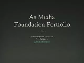
Foundation Portfolio Evaluation. I intend to cover the following criteria: Forms & Conventions Institutions & potential distribution Audience Technologies Progression. Forms & Conventions.

E N D
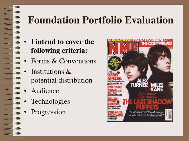
Foundation Portfolio Evaluation • I intend to cover the following criteria: • Forms & Conventions • Institutions & potential distribution • Audience • Technologies • Progression
Forms & Conventions Image: My mid-shot image of Turner and Kane bleeds to the edge of the page. The two are almost symmetrical, connoting their different aspects of musical ability. They’re positioned above the fold, signifying their importance. Text types: The white block stencil text is instantly attention-grabbing and fits with the background colour. The red text connotes passion and danger and there’s cohesion between the red colours across the page. I got this idea from looking at the colours used in Empire magazine.
Forms & Conventions 2 Brand: The bands listed fit with my magazine’s tradition of promoting big British bands. The text is almost like a scroll across the top of the page. Problem with margins though. Text: The quote from Alex Turner acts as a callout to hook the reader in. The colour connotations of peace and purity contrast with the red. I’m really happy with the way the white looks on the black background.
Forms & Conventions 3 Brand identity: My magazine is called NME which stands for New Musical Express. It will promote the latest in British music – text reflects this – makes a statement. I got the idea for using an acronym from reading different magazine titles online. Column inch: This promotes the secondary features that aren’t important enough to take centre-fold. The text-types follow standard conventions by alternating bold, capitalised red text for the heading, and smaller, lower-case text for more detailed or rhetorical text.
Representation • Alex Turner and Miles Kane are the two figures that represent NME’s readership. Their iconic positioning across the majority of the cover signifies their importance; they’re represented as brooding, almost Romantic geniuses whose creativity cannot be limited to a single page. Their figures bleed to the edge, and the dark mise-en-scene is edgy and appears unknown.
Institutions • If my magazine were to be published and distributed to industry standard, I believe it would be by a company like IPC Media. IPC Media is owned by Time Inc, the publishing division of Time Warner Inc. I believe that my NME magazine’s values and ideology are closely entwined with IPC’s Ignite! brand. The brand promises to invent new genres, and my NME brand aims to be the most iconic music magazine in the world, covering both breakthrough and established acts. IPC’s Ignite! brand is currently best known for its distribution of Nuts and Loaded magazines. Nuts is the UK’s biggest selling men’s weekly magazine and combines sexy women with gritty stories and entertainment features. Similarly, Loaded is the original male lifestyle magazine and in 1994 became a new genre of magazine “for men who should know better.”
Audience • I believe that my NME magazine targets 2 specific audiences. • Primary Audience: Reasonably affluent young people with a disposable income that allows them to not only afford the magazine (£3.90) but also access features (purchase latest albums / gig tickets etc). Likely to be males and females aged between 19-27 – social groups B – C1: Middle to lower middle class professionals or administrative workers. • Secondary Audience: A younger demographic, generally students. This demographic are likely to have more time to engage with key features, but have a less disposable income. This demographic are extremely important for brand loyalty – if they can be targeted now at social group E, then when they graduate to a higher social group they will still be buying NME magazine.
Addressing the Audience • Primary Audience: • A price that denotes quality • New genres and breakthrough acts are covered • Exclusive features such as The Last Shadow Puppets’ first major interview • Studio news relating to new Franz Ferdinand and The Courteeners albums – opportunity to buy them • Secondary Audience: • Pricing – special student subscription price to build brand loyalty • The SXSW feature – allows audience to ‘get ahead’ of peers by listening to 12 new bands free of charge online
What You’ve Learnt About Technologies How have your PhotoShop skills developed? What skills in particular have improved? Photography: How proficient were you beforehand? Consider lighting / framing / shots used / mise-en-scene Blogging: What blogging / web design experience did you have before beginning the portfolio? Other bits & pieces: Scanning, Publisher, Scribd, Scribus? Looking Back to the Preliminary Task I can’t tell you what you’ve learnt, but here’s some pointers… How to target a specific audience How to follow / subvert forms and conventions Planning / Time Management Professional presentation of work The Final Two Bullet Points!