Download
1 / 44
450 likes | 597 Views
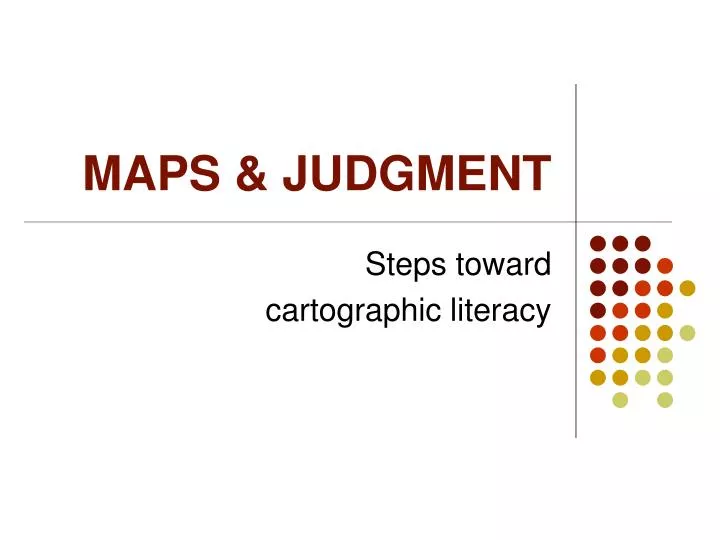
MAPS & JUDGMENT. Steps toward cartographic literacy. Projections. Every map employs some kind of projection to transform spherical surface to flat surface Choice of projection reflects priorities of cartographer in regard to preserving one of the following (or compromising between all)

E N D
MAPS & JUDGMENT Steps toward cartographic literacy
Projections • Every map employs some kind of projection to transform spherical surface to flat surface • Choice of projection reflects priorities of cartographer in regard to preserving one of the following (or compromising between all) • Area • Distance • Direction • Shape • Read the Introductory section in your atlas (this is required reading!)
Mercator projection Why did my plane from Paris go so far out of the way to get to Chicago?
Mollweide Projection Maybe it didn’t go too far out of the way…
Azimuthal projection (north pole) That explains it! Remember that every projection is a distortion. How is this projection distorted?
Judgment is inevitable when making maps • All maps involve decision-making process • There is no “natural” way to draw a map • Maps are not reflections of reality but selections of reality • Maps can be analyzed and critiqued just like literature to determine what the cartographer believed and thought about the world, and his/her values, beliefs, objectives, etc. (J.B. Harley, John Pickles, etc.)
Medieval “T&O” map What common words in the English language reflect this tradition of mapping? • Orientation • Oriented
Thematic Maps • Thematic maps represent one or two variables (population, ethnicity, income, language, religion, etc.) in map form • The “language” of thematic maps is quite varied, and involves the use of color, shape, pattern, light and dark, etc. • Thematic maps serve two main purposes: • Analysis of data • Presentation of data
Map with pie chart callouts What are the strengths and weaknesses of this cartographic language?
Choropleth map What are the strengths and weaknesses of a choropleth map?
Cartogram and choropleth A cartogram is a boundary map in which the areas are distorted systematically: every partition’s area shows its value for a particular variable
Isoline map of population Why use an isoline map for population rather than a choropleth map?
Choropleth maps From A to Z
Choropleth maps • Tremendously common and useful • Use some existing system of boundaries (countries, states, counties, voting districts, etc.) • Group data into 2 or more levels or classes using slicing values • Show spatial variation of one or two variables at a time by using color, shades of grey and/or patterns
How can such different looking maps show the same variable? • Cartographic reasons • Different slicing values • Different levels of spatial aggregation • Geographical reasons • Uneven distribution of minorities at the state scale as well as at the national scale • Concentration of minorities in cities, particularly in northern states
Different ways of “slicing” data • The Data {42, 50, 55, 57, 61, 77, 79, 97} • Equal interval • Three classes based on range 40 to 100 • {42, 50, 55, 57} {61, 77, 79} {97} • Quantile • Quartiles (lowest 1/4 of observations, next 1/4, …) • {42, 50} {55, 57} {61, 77} {79, 97}
Different ways of “slicing” data • Natural breaks • {428505552574616772791897} • {42} {50, 55, 57, 61} {77, 79} {97} • Standard deviations • Mean = 64.75, Std. Dev. = 15.977 • {42} {50, 55, 57, 61} {77, 79} {97}
Which map would be preferred by each of the following users? • The ACLU • The KKK • A geographer studying the relationship between ethnicity and poverty • A spokesman for the Georgia branch of a charitable assistance association targeting minorities
Not very useful this way • Generally it helps to re-order the data
quartiles: what is 52 ÷ 4 ? What if you wanted to use quintiles?
Problems with choropleth maps • Make it easy to slant data to suit the cartographer’s purpose (by adjusting the slicing values) • Create the illusion of rapid breaks whereas data varies continuously and gradually in the real world • Allow small areas (like major cities) to overwhelm the data of large regions (like states)
Mapping inequality in Africa • Mapping economic inequality • Variable used: GINI index
GINI index measures economic inequality in a society 100% = completely unequal 0% = completely equal
Can you identify the classification schemes? Equal Interval 28-37.99 38-47.99 48-57.99 58-67.99 68-77.99 Quantiles (Quartiles) 32 entries ÷ 4 = 8 4 groups of 8
Can you identify an observation that “jumps” two classifications?
Can you think of a scenario with: • Two different map users (think in terms of organizations and professionals) • Opposite judgments of what is the “best” map for their purposes? South Africa South Africa
What would you guess… ? Source: Wikimedia commons
Process Maps How can you map a process?
Map with pie chart callouts To see the process (growing American dominance in the movie theater) you have to visually compare each pair of pies
Expansion of the EU To see the process (expansion of the EU) you have to know what color comes first, second, third, etc.
Religious diffusion To see the process (religious diffusion) you must follow the arrows
Mei-Po Kwan To see the process (human movement) you must follow the time-space path from the bottom of the lower blue line to the top of the upper blue line
Charles Joseph Minard’s map of the disastrous Napoleonic campaign in Russia (1812)
Questions • Why use an isoline map instead of a choropleth map? • Why use a choropleth map instead of an isoline map? • What kind of map is unbiased? • What kind of map reflects the interests, intent, and biases of the mapmaker? • What are some problems with choropleth maps? • What are some processes that people have managed to map? • What are some cartographic ways of showing change through time?