Download
1 / 35
920 likes | 2.26k Views
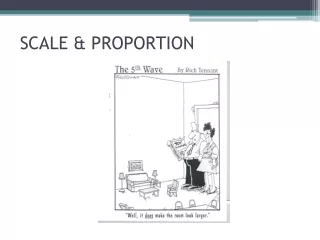
Scale and Proportion. SCALE & PROPORTION. Scale relates to the size of a design in relation to the height and width of the area in which it is placed. Proportion relates to the parts of the object and how one part relates to another. PROPORTION.

E N D
SCALE & PROPORTION • Scale relates to the size of a design in relation to the height and width of the area in which it is placed. • Proportion relates to the parts of the object and how one part relates to another.
PROPORTION • The Golden Mean – the division of a line or form so that the smaller portion has the same ratio to the larger as the larger has to the whole. • Effective Ratios are 2:3, 3:5, 5:8, 4:7, etc. • Square is the least pleasing shape. • Rectangles are more pleasing, especially with a ratio of 2:3.
PROPORTION • The creative use of color, texture, pattern, and furniture arrangement can create illusions of properly proportioned space.
SCALE & PROPORTIONToo Big, Too Small, Just Right • This chairs massive scale diminishes everything around it.
Too Small. • The chairs light palate accentuates its skinny scale.
Just Right. • This club chair matches the scale of the sofa.
Too Big. • Coffee table is over-scaled for the sofa.
Too Small. • Table not only looks out of proportion, it functions poorly as well.
Just Right. • The table is substantial enough to anchor the furniture grouping, yet it leaves room for traffic flow around both ends.
Too Tall. • Used as an end table, this wood pedestal towers over the sofa, making the sofa appear small and the pairing awkward.
Too Short. • The lamp would need to be fully stretched to offer good illumination from this low point.
Just Right. • The perfect pairing, visually and physically, is a tabletop that is a couple of inches shorter than the sofa arm.
Too Big. • The large-scale motif and strong colors of this floral wallpaper overpower the petite powder room as well as the fixtures and furniture in it.
Too Small. • The pattern is so small and pale that it almost disappears.
Just Right. • The narrow contrasting stripes provide the ideal balance for the clean-lined pedestal sink and oversize pine mirror.
Too Big. • This rug covers too much of the floor beyond the conversation area to define it as a discrete space.
Too Small. • Instead of creating intimacy, the rug only increases the appearance of isolation.
Just Right. • Choose an area rug that’s about as long and wide as the furnishings in the space.
Too Little. • Too much space between objects makes the candlesticks and the too-small frame look lonely, the bare wall yawning above.
Too Much. • There’s no time to pause to consider any single object, since they are all stepping on one another’s toes in a jostle for space.
Just Right. • The weight now shifted to the left side, fewer items are needed there for balance.
Too Big. • There’s no breathing room in this are-to-sofa match.
Too Little. • This picture is tall enough, roughly matching the height of the sofa. But it ends up looking leggy and lost because it’s too skinny in proportion to the sofa’s width.
Just Right. • To size a single picture, choose one that’s nearly the same height as the sofa and between half and two-thirds its width.
Too Big. • This tall lamp towers above the nearby sofa and chair. It is also several inches taller than the table it rests on, throwing the balance off there as well.
Too Small. • This lamp is overwhelmed by the high-back sofa and stocky chair that surround it.
Just Right. • For the best fit, an end-table lamp should be tall enough to clear the top of the sofa with a little room to spare, yet not so tall that it dwarfs the table it rests on.
Too Big. • This 5-foot-wide double pendant chandelier overpowers the table.
Too Small. • The fixture is too small to adequately light the table.
Just Right. • In general, a chandelier’s width or diameter should be at least 2 feet narrower than the table length.
Grab a book • Read page 428-432 • Answer questions 1 and 2 on page 443 on a lined sheet of paper. This will be turned in at the end of this unit.
Proportion/Scale • Using furniture and accessories pictures you cut out from Interior Design magazines, make a room that is OUT of proportion/scale. • Any type of room will work. • The more OUT of proportion the better! • Must use a minimum of 15 items. • Please don’t cut up perfectly good room photos that could be used for portfolio assignments. • Write a paragraph explaining what is out of proportion and why it is an example. Worth 10 points You may work in small groups