Download
1 / 3
30 likes | 31 Views
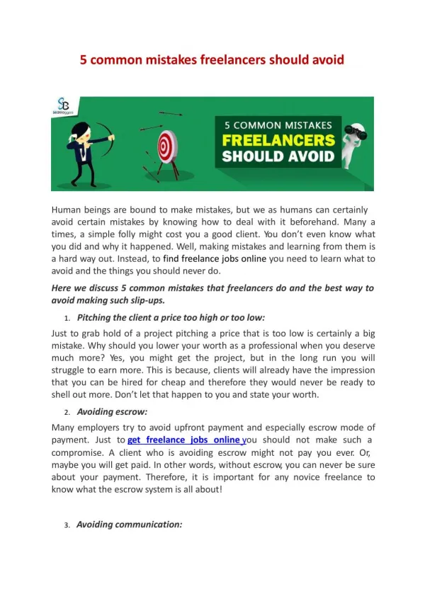
Common UX Design Mistakes you should<br>Keep Away<br>The best UX must provide better design, well rich content, and power full<br>features. Let us discuss common mistakes to be overcome by a UX designer<br>during the process of development.<br>

E N D
Common UX Design Mistakes you should Keep Away Common UX Design Mistakes you should Keep Away The best UX must provide better design, well rich content, and power full features. Let us discuss common mistakes to be overcome by a UX designer during the process of development. Most Common Mistakes: 1. Approach to design It may be a first and foremost cause to be taken into consideration by the designers. The responsive design is important for every application as it may web or mobile. If your application fails to meet the responsive design it may lack behind from others. Your application design mute meets all criteria of your users and according to the screen size. 2. Spacing and padding If everything comes well if you make less care about the padding and spacing it may not become an impressive UX/UI. As the spacing and padding play a vital role in the organization and making a clear look at your application. A small mistake in your padding and spacing makes the designer to look UN- organised or may even chance of changing your designer. 3. Fonts & its style The fonts are a building block of your app every app needs font. It makes a source for communication the uses and your application. As there are different sizes of the font available in different styles. The size of your font is a criterion to be considered according to the changes in screen size. As your font must be true to the screen size i.e. as your screen size increases the font may change according to it to make the users see it without difficulty. The font style is another important criterion to be considered in a strict manner. Your font style must be clear in look, unique in its style, rich in its Application. It may be a good idea to pre-check your font and its style.
4.Icons The icons play a vital role in the UX design. The uses of the icon are to represents the meaning of the content in a small symbol. There are some fundamental concepts in the using in of icons to make it well representative. The coherent look corner radius line width is to be considered in a professional way to make the good iconography. Every modern app uses this iconography starting from a social media app to larger e-Com apps. So the most common mistakes may be involved in the poor icon, ununiformed wide and radiuses, etc. 5.Visibility Visibility is one of the major factors to be considered as most of the common mistakes that are been evolved hear. As visibility depends upon various factors stating from Colour of selection to Contrast of the application. A small mistake make poor visibility, as a reduction, in contrast, may reduce the visibility of the users. Once the app is developed with poor visibility it may not be able to get user attraction. Always contrasted images get well-matched with darker colour text. The common mistakes involve the selection of unmatched colures, dull background, etc. 6.Adding Lot of contents As it gets user attraction you must provide bullet points, followed by the link for full text. As it makes users get what they want. Try to avoid bulking something on a single page as it may feel discomfort for the users. There are some common mistakes such as providing bullet points only not the link for full text and gathering too much information from users on a single page i.e. as on sign up page etc. Conclusion To make the UX more adaptive and flexible it is must have a creative, above discussed mistake-free one. Every user likes to have a crystal clear UX, as a UX designer in sataware technology we consider the users and pre-check for the following some common mistake discussed above.