Download
1 / 6
0 likes | 4 Views
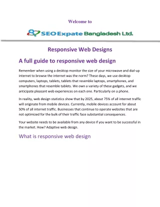
The advent of the internet has significantly transformed the way we interact with the world, particularly in <br>the last couple of decades. As our digital landscape continues to evolve, the need for websites to adapt to <br>the myriad of devices and screen sizes is ever more critical. Responsive web design has emerged as the <br>solution to this challenge, ensuring a seamless and consistent user experience across a diverse range of <br>devices. In this comprehensive guide, we will explore the evolution, principles, advantages, and future of <br>responsive web design.

E N D
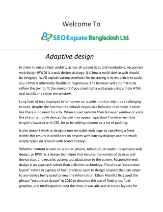
Welcome To Introduction | SEO Expate Bangladesh Ltd. The advent of the internet has significantly transformed the way we interact with the world, particularly in the last couple of decades. As our digital landscape continues to evolve, the need for websites to adapt to the myriad of devices and screen sizes is ever more critical. Responsive web design has emerged as the solution to this challenge, ensuring a seamless and consistent user experience across a diverse range of devices. In this comprehensive guide, we will explore the evolution, principles, advantages, and future of responsive web design. Chapter 1 The Birth of Responsive Web Design Before responsive web design became the industry standard, websites were primarily designed with fixed dimensions, often tailored to a specific screen size. This approach resulted in an inconsistent and frustrating user experience as user’s accessed websites from various devices. As smartphones and tablets gained prominence, the need for adaptable web design became apparent. Ethan Marcotte, a web designer and developer, is widely credited with coining the term "responsive web design" in his 2010 article published on A List Apart. His vision was to create web designs that responded to the user's environment, adjusting layout and content to fit the screen size, whether on a desktop, tablet, or mobile device. Marcotte's concept laid the foundation for a fundamental shift in web design principles.
Chapter 2 The Principles of Responsive Web Design Responsive web design is guided by several key principles that make it effective in adapting to various screen sizes and devices: Fluid Grid Layouts: One of the fundamental principles of responsive web design is the use of fluid grid layouts. Instead of fixed pixel-based measurements, designers use relative units like percentages and ems to create flexible grids. This allows content to expand or contract based on the user's screen size. Flexible Images and Media: Images and media elements are essential components of a website, and they should adapt to different screen sizes as well. Responsive web design employs CSS techniques to ensure that images and videos resize and reposition to maintain their proportions and clarity. Media Queries: Media queries are CSS rules that allow designers to apply specific styles based on the characteristics of the user's device, such as screen width, height, or orientation. This customization ensures that the layout and content are optimized for the device. Content Prioritization to enhance the user experience, responsive design often involves content prioritization. This means that the most critical content is prominently displayed, while less important elements can be hidden or moved to a secondary position for smaller screens. Mobile-First Approach: A mobile-first approach is a fundamental concept in responsive web design. Designers start with mobile layouts and progressively enhance them for larger screens. This approach ensures that the site performs well on smaller devices and avoids excessive bloat on larger screens. Testing and Optimization: Responsive design isn't a "set and forget" process. It requires continuous testing and optimization across various devices and screen sizes to ensure a consistently excellent user experience.
Chapter 3 The Advantages of Responsive Web Design Responsive web design offers several advantages for both web developers and users: Improved User Experience: Responsive websites adapt to the user's device, providing a consistent and user-friendly experience. This ensures that visitors can access and navigate the site easily, regardless of the device they use. Cost-Effective: Responsive design reduces the need for creating multiple versions of a website for different devices. This cost-effective approach streamlines web development and maintenance. Enhanced SEO: Search engines favor responsive websites, as they provide a consistent URL and HTML across all devices. This improves the site's search engine rankings and visibility. Wider Audience Reach: With responsive design, your website is accessible to a broader audience. You won't miss out on potential visitors who use various devices to access the internet. Future-Proofing: Responsive web design is forward-thinking. It adapts to new devices and screen sizes without requiring extensive redesigns or redevelopments. Faster Page Loading: Responsive websites load faster on mobile devices, improving the user experience and reducing bounce rates. Analytics and Reporting: Having a single responsive website simplifies the monitoring and analysis of user behavior, as all data is consolidated in one place.
Chapter 4 Challenges in Responsive Web Design While responsive web design offers numerous benefits, it also presents challenges that designers and developers must overcome: Complex Design Decisions: Designing for multiple screen sizes and orientations can be complex. Designers need to make critical decisions about what content to display and how to lay it out effectively. Performance Optimization: Responsive websites must perform well on all devices, including those with limited processing power or slow internet connections. Optimizing performance is crucial to maintaining a positive user experience. Navigation Design: Creating intuitive navigation that works across various screen sizes is a challenge. Designers need to ensure that menus and links are accessible and user-friendly on both small and large screens. Testing Across Devices: Testing a responsive website across different devices, browsers, and screen sizes is time-consuming and requires a diverse set of testing tools and methodologies.
Chapter 5 The Future of Responsive Web Design As the web continues to evolve, responsive web design remains vital, but it's not without adaptation to new technologies and trends: Web Performance Optimization: As mobile device usage continues to rise, web performance becomes increasingly critical. Techniques like lazy loading, image optimization, and efficient coding will be essential for responsive design. Progressive Web Apps (PWAs): Progressive Web Apps combine the best of the web and mobile apps, offering fast loading, offline capabilities, and push notifications. PWAs provide an enhanced user experience and will play a more significant role in responsive web design. Voice Search and AI: Voice search is becoming a standard feature on many devices. Responsive designs will need to account for voice search queries, potentially leading to changes in content structure and SEO strategies. Augmented and Virtual Reality: The integration of augmented reality (AR) and virtual reality (VR) into web design will require responsive approaches to accommodate immersive experiences on a variety of devices. Advanced CSS Grids and Flex box: Web layout technologies, like CSS Grids and Flex box, will continue to evolve, offering more powerful tools for designers to create responsive layouts with ease. Improved Accessibility: Designers will need to prioritize web accessibility by making sure their designs work well for people with disabilities. This includes creating responsive designs that are accessible through screen readers and other assistive technologies.
Chapter 6 Conclusion Responsive web design is a fundamental aspect of modern web development, driven by the diverse array of devices that users employ to access the internet. It has revolutionized the web by providing an adaptable and user-centric approach to design. However, as technology continues to advance, responsive web design must evolve to meet the changing needs of users and devices. The principles of responsive design, such as fluid grids, flexible images, and media queries, will remain at its core. However, responsive web designers will need to stay current with emerging technologies and trends, ensuring that their designs provide an optimal user experience across new devices and platforms. In conclusion, responsive web design is not just a trend; it's a philosophy and a framework that will continue to shape the future of web development, ensuring that websites are accessible and engaging for all users, regardless of their chosen devices or screen sizes. For More Details Website: www.seoexpatebd.com Email: info@seoexpatebd.com WhatsApp: +8801404013363 Address: Head Office, Shajahanpur Kagjipara, Majhira, Shajahanpur 5801, Bogura, Banlgladesh. Thank You Thank You