Download
1 / 10
100 likes | 185 Views
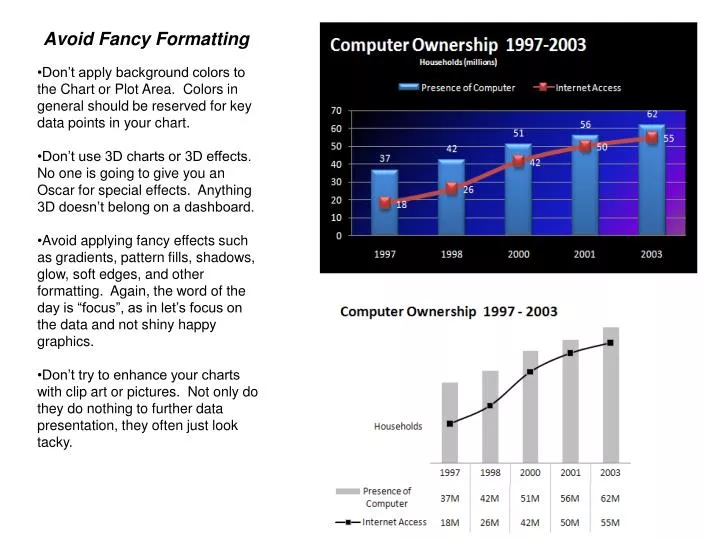
Avoid Fancy Formatting. Don’t apply background colors to the Chart or Plot Area. Colors in general should be reserved for key data points in your chart. Don’t use 3D charts or 3D effects. No one is going to give you an Oscar for special effects. Anything 3D doesn’t belong on a dashboard.

E N D
Avoid Fancy Formatting • Don’t apply background colors to the Chart or Plot Area. Colors in general should be reserved for key data points in your chart. • Don’t use 3D charts or 3D effects. No one is going to give you an Oscar for special effects. Anything 3D doesn’t belong on a dashboard. • Avoid applying fancy effects such as gradients, pattern fills, shadows, glow, soft edges, and other formatting. Again, the word of the day is “focus”, as in let’s focus on the data and not shiny happy graphics. • Don’t try to enhance your charts with clip art or pictures. Not only do they do nothing to further data presentation, they often just look tacky.
Skip the Unnecessary Chart Junk • Remove Gridlines • Remove Borders • Skip the Trend Lines • Avoid Data Label Overload • Don’t Show a Legend if you Don’t have to • Remove Axes that Don’t Provide Value
Format Large numbers where possible When plotting very large numbers on a chart, you should consider formatting the values so that they are truncated for easy reading. For instance, in this chart, I’ve formatted the values to be displayed as 10M and 17M instead of the hard-to-read 10,475,000 and 16,906,714.
Use Data Tables instead of Data Labels • A data table allows you to see the data values for each plotted data point, without for overcrowding the chart itself. • Although it is true that data tables increase the space your charts take up on your dashboard, they respond well to formatting and can be made to meld nicely into your charts. • Data tables come in particularly handy if your clients are constantly asking to see the detailed information behind your charts.
Make Effective Use of Chart Titles You can use chart titles to add an extra layer of information, presenting analysis derived from the data presented in the chart.
Sort your data before Charting • Unless there is an obvious natural order such as age or time, it’s generally good practice to sort your data when charting. By sorting, I mean sort the source data that feeds your chart in Ascending or Descending order by data value.
Limit the use of Pie charts • Pie Charts typically take up more space than their cousins the line and bar charts. • Pie charts can’t clearly represent more than two or three data categories. Bar Charts are an ideal alternative to Pie Charts
Don’t be afraid to parse data into separate charts Be aware that a single chart can lose its effectiveness if you try to plot too much data into it In situations like this, step back and try to boil down what exactly the chart needs to do. What is the ultimate purpose of the chart?
Maintain Appropriate Aspect Ratios A skewed aspect ratio can distort your charts, exaggerating the trend in charts that are too tall, and flattening the trend in charts that are too wide. Generally speaking, the most appropriate aspect ratio for a chart is one where the width of the chart is about twice as long as the height is tall. For example, 1” tall by 2” wide is an appropriate ratio. 1.5” tall by 3” wide is also appropriate.
Don’t be afraid to not use a chart! You typically use a chart when there is some benefit to visually seeing, trends, relationships, or comparisons. Ask yourself if there is a benefit to seeing your data in chart form. If the data is relayed better in a table, then that’s how it should be presented.