Download
1 / 46
510 likes | 758 Views
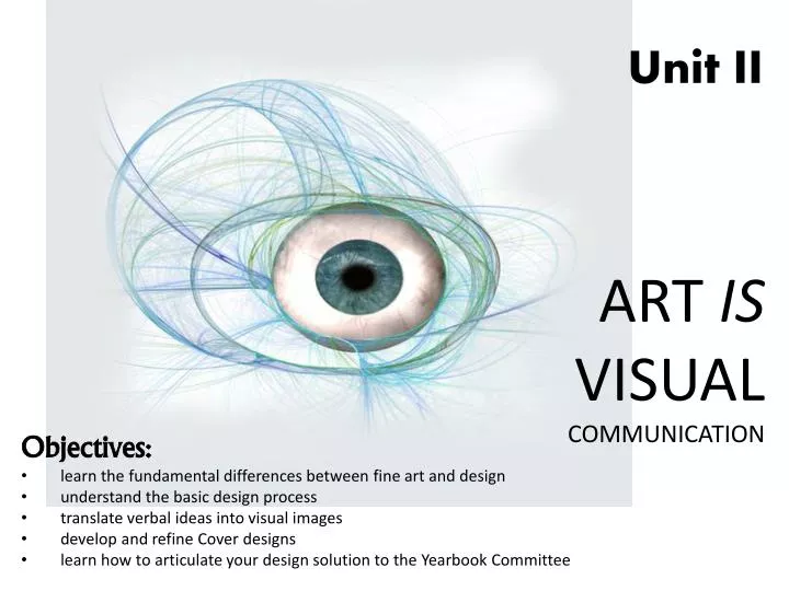
Unit II. ART IS VISUAL COMMUNICATION. Objectives: learn the fundamental differences between fine art and design understand the basic design process translate verbal ideas into visual images develop and refine Cover designs

E N D
Unit II ART IS VISUAL COMMUNICATION Objectives: • learn the fundamental differences between fine art and design • understand the basic design process • translate verbal ideas into visual images • develop and refine Cover designs • learn how to articulate your design solution to the Yearbook Committee
graphic design: the practice or profession of creating or developing print or electronic forms of visual information for areas such as publications, advertisement, packaging or websites. graphic design enhances transfer of knowledge and visual messages. Next: Design Fundamentals
Golden Rules of Design: • Design is a service. It is work. Design to address clients (yearbook club) and target groups (yearbook consumers). • Be creative, look for new solutions and ways of thinking. • Find clear and universal design, stick to visual constants so viewers are quick to identify, and recognize. • Keep it short and simple: reduce and simplify to achieve an efficient effect. • Design comprehensively (attention to fine details), credibly(as a highly-talented art student) and appropriately (achieving high standards in regard to project requirements).
This graphic design project involves the presentation of TEXT and IMAGES to your audience in a well- developed LAYOUT created by YOU, the graphic designer.
The Audience A Graphic Designer designs for not only personal satisfaction and enjoyment, but for his/her AUDIENCE….Your audience is…. • the ENTIRE school District! Students Faculty Staff Family Members Community Members
Presentation Agenda • The basic Structure of Design • The basic Elements • Laws of interaction between visual elements • Your Project • Examples
The • BASIC STRUCTURE • of • GRAPHIC DESIGN Fundamentals of Design
The basic structure of graphic design consists of three basic elements: Dot Line Area
-the smallest element of graphic design. Designing with dots or points can create a wide variety of visual effects. There are various associations that can be made with positioning a single dot in different areas of a page. DOT • Single point in a center of an area can convey a sense of calm and stability to the viewer
But if you shift the point towards the edge of the paper it becomes tensionand mystery
Repetition can create textures and make stimulating and vivid effects through combining of different sizes.
Line – the arrangement of dots with a constant distance between them. “Every linear expression derives from a point set in motion” – AndrianFrutiger. Line is much more dynamic in character than a dot. The simplest form of a line is a straight line ( ______ ). Vertical line makes an active, light effect
Diagonal lines can be read as ascending (bottom left to top right) or descending (top left to bottom right): Lines can be bent, curved, connected and intersected, etc. thus bringing various suggestions of motion and creating different dynamics for a design:
Lines can be REAL (like on the previous pages) or IMPLIED…meaning that the mind fills the gap between the dots.
Area – is an enclosed, two-dimensional figure enclosed by a homogeneous surface that is usually presented in two dimensions and formally limited by one or several linear segments. Such as circle, ellipse, square, rectangle, triangle. Circle has no end-point and thus a symbol of infinity. It conveys less tension than any other areas and is not pulling in any direction. It’s static, balanced and harmonious. The eye is always drawn to the center. Ellipse – more dynamic than circle. If placed upright it suggests movement upwards, but also instability. Placed horizontally it becomes more static and repose.
Square – a rectangle whose sides are parallel, the same length. When the square is on one of its sides – the perception is of calm, stability, functionality. When turned on its point, it becomes more dynamic and playful and unstable.
Rectangle – is a four-sided figure with right angles; the lengths of rectangles must differ clearly to not be confused with square. It can be placed vertically or horizontally. Almost all paper formats are rectangular. It is more active than a square. When set horizontally it is more stable, secure, heavy, supporting, etc. When placed vertically – suggests more lightness, movement, activity and narrowness. When set on one of its points it tends to break composition apart and bring in a feeling of instability and tension.
Triangle – has the strongest directional component of all. When used in design or composition, it is always dynamic, with most acute angle as focal point and lesser angled base as a ground of composition/information. A triangle is used most widely in portraiture paintings. Focal point
Basic Elements of Design • Layout • Imagery • Color • Typography
Page Layout In addition to the basic foundations, you will need to consider layout for an effective composition. Rule of Thirds • Composition Grids- Precise locations of text and imagery • Guidelines- precise location & measurements of text • Click here for more in-depth information about Rule of Thirds
Color Color Theory • Color Schemes and Color Harmony Color Psychology
Complementary Colors Red and Green, Blue and Orange, Purple and Yellow — located directly across from each other on the color wheel. Complementary colors rarely look good when used together because, when used together, they become extremely vibrant and have heavy contrast, especially if they are of the same value. Complementary colors are useful when you want to make something stand out. However, complementary colors are really bad for text. green and red are complementary colors of same value. used together not only do they create contrast, but also vibrating boundaries – when color vibration occurs along the boundary separating contrasting hues of equal value.
complementary color scheme; because of high contrast is often used to suggest action and energy (hence a lot of sports teams have this scheme for their uniforms.)
*Analogous Red and Orange, Blue and Green, etc. – located right next to each other on the color wheel. They usually match extremely well, but they also create almost no contrast. They’re good for very serene, peaceful designs and artwork where you want viewers to feel comfortable. blue and green are analogous colors. when used together they produce much more calming effect than complementary colors. (also, notice how the green in this example reads much lighter than green in previous example due to simultaneous contrast - where appearance of the same color is affected by the appearance of other colors surrounding it).
*Triad uses colors that are evenly spaced around the color wheel. Triadic color harmonies tend to be quite vibrant, even if you use pale or unsaturated versions of your hues. To use a triadic harmony successfully, the colors should be carefully balanced – let one color dominate and use the two others for accent.
*Split-Complementary a variation of the complementary color scheme. In addition to the base color, it uses the two colors adjacent to its complement. This color scheme has the same strong visual contrast as the complementary color scheme, but has less tension. The split-complimentary color scheme is often a good choice for beginners, because it is difficult to mess up.
Color Meanings Color is a part of our visual field. Color can be used as a tool to organize space. We assign color codes to file folders, traffic signs, and holidays. Consider the power of color symbolism. In different contexts and different cultures a specific hue may carry a different meaning. Color is closely associated with mood. Reflect on the connections between a particular hue and its respective value and saturation and the viewer’s interpretation of its symbolic role in the image. Colors can have positive or negative attributes. Warm colors: fire, sunlight, blood, greater luminosity Cool colors: ice, cold, darkness RED:excitement, emotion, ardent love, valor, passion, fever, cruelty, wrath, sin, (scarlet letter, red heart) YELLOW:light, gold, church, sickness, treason, cowardliness, (however, in China yellow is an imperial color) GREEN:organic matter, fruitfulness, growth, contentment, tranquility, hope, sadness, decay, youth, springtime, jealousy, spirituality (blue-green) ORANGE: radiance, festivities, warmth, intimacy, caution VIOLET:mystery, oppression, menace, terror, seduction, darkness, pietry, supersition, death, royalty BLUE: truth, divinity, eternity, loyalty, constancy, calm, shyness, death, coldness WHITE: light, triumph, innocence, purity, joy, divine power, regeneration, ghost, spirit, sickness, pallor, (symbol of death in some cultures like Japan) BLACK: quiet, rest, strength, weight, richness, seclusion, absence of light, powers of darkness, mourning, death, loss of innocence
The use of text as a visual element and to get information across to the viewer. Typography
In publishing, text often is the most important element. The goal is to create consistency with enough visual contrast for viewers to distinguish between the levels of hierarchy, or to determine level of importance amongst the presented information. For example, a consistent treatment of headlines makes for an easy recognition of typographic organization.
INTERACTIONS BETWEEN VISUAL ELEMENTS • Contrast • Orientation and position • Graphic Shapes and Linear Elements • Depth, Dimension and Perspective • Space • Repetition http://cios233.community.uaf.edu/design-theory-lectures/interaction-of-visual-elements/
Contrast visual differences and juxtaposed (or side by side) elements. Visual contrast between the elements makes them identifiable and comprehensible to the viewer. In design, big and small elements, black and white text, squares and circles, can all create contrast in design. Contrast helps different design elements stand out. Is there enough contrast between your text (size and color) and background (color and pattern) to keep text readable? Is everything all the same size even when some elements are more important than others? Stark contrast between the picture and a black background of a page with text
Orientation & Position also foster contrast and distinctive hierarchy by commanding attention to a shifted positioning *for example, diagonal positioning of the text against predominantly horizontal distribution of the rest of the elements on the page. - Positioning we aren’t expecting makes us do a double take…
Depth, Dimension and Perspective – the use of perspective shifts the two-dimensional space into a three-dimensional representation and thus creates depth ….because elements positioned in a perspective recede or move out towards the viewer ).
Color creates visual interest and emphasizes a specific elements of the design, content. It can be added to graphic shapes, linear elements, imagery, and typography. It can be used to create rich backgrounds or be used to emphasize areas of the design that need attention.
Space provides visual contrast and contributes to an effective ordering system. The empty compositional space brings the visual elements alive. Space is present in all compositions. It provides visual channel and direction for the eye. -Visual elements can be grouped together with very limited space in-between to create a grouping and a focal point. -The extra space around visual elements creates a point of isolation, thus emphasizing that element. -Be careful with space because too much of it and too equal on all sides makes the composition static; too much space does not activate space and the elements placed into it tend to fade to a background *Designs that try to cram too much text and graphics onto the page are uncomfortable and may be impossible to read. White space can give your design breathing room. Do you have enough space between columns of text? Does text run into frames or graphics? Do you have a generous margin? You can also have too much white space if items float on the page without any anchor. http://cios233.community.uaf.edu/design-theory-lectures/interaction-of-visual-elements/
Repetition & Consistency - Repetition used to emphasize the subject. Used with slight variation and creatively, repetition can be an invaluable tool in establishing the hierarchy and highlighting the message - consistent use of type and graphics styles within a document shows a reader helps them navigate your designs and layouts safely. Are major and minor text consistent in size, style, or placement? Have you used a consistent illustration style throughout?
Yearbook Cover Requirements • Primary Text (must include location and year) • Secondary Text (saying or quote related to subject) • Creative visual Imagery • Mixed media
http://dx.cooperhewitt.org/lessonplan/Logo-Design-Basics-Your-Name-Here/ (reference)