Download
1 / 13
130 likes | 285 Views
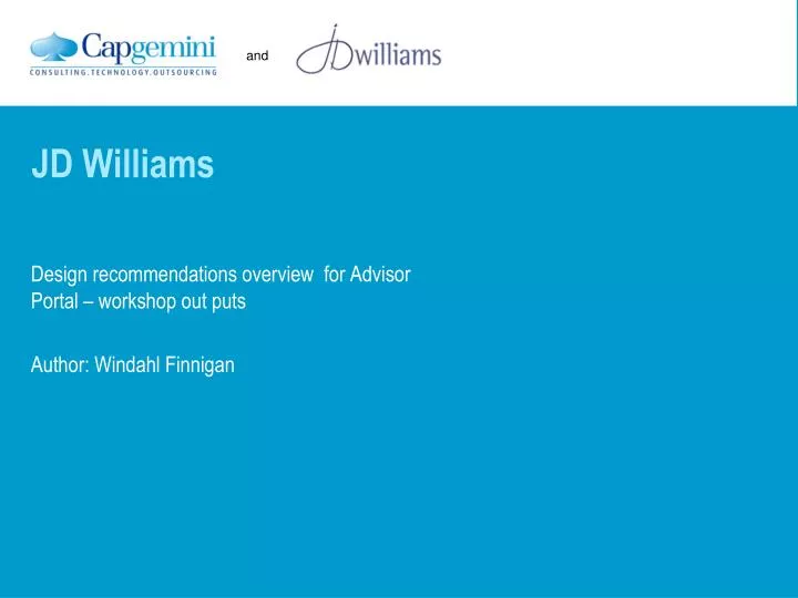
JD Williams. Design recommendations overview for Adviso r P ortal – workshop out puts Author: Windahl Finnigan. From Green Screens to Rich Screens. Branding and navigation. Early concept of the navigation depicting tabs to break the site into 3 main sections Customer advice

E N D
JD Williams Design recommendations overview for Advisor Portal – workshop out puts Author: WindahlFinnigan
Branding and navigation • Early concept of the navigation depicting tabs to break the site into 3 main sections • Customer advice • My JD Williams • Help & Information
Branding and navigation Application level navigation – final version with names Main JD Williams branding colours + grey Colours used to identify sections Customer Services – Resources – Company information My JD Williams – Employee dashboard and details Final icons - supplied Dark blue (Brand colour) used with grey as the application colours Grey used for all functions
Navigation • Buttons on main navigation are large and support users new to a mouse • Active and rollover states the colour is reversed
Design Descriptions • Primary actions in button design • Secondary actions use link style with an icon if needed • Break up actions so there is less chance of the wrong link being chosen – mistakes when too close together • Final price last – closer proximity to action
Design Descriptions • Primary actions in button design • Secondary actions use link style • Use spaces when showing price numbers to make it is easier to read • Use separator lines for additional charges • Make total cost larger • Product links mouse over and show image with link to product
Design Descriptions • Logo in colour • Customer name in JD Blue and bigger to standout • Links to use link style • Optional icons for order build and buy now • Use separator lines • Tabs for low navigation
Error Messages • Error messages are contextual • Use colour – red and an asterisk Contextual error messages In red and near form field with error message at top of page
Interactions • Use buttons • Calls to action for interaction elements • Place instructions next to labels and above functionality • Error messages are to be displayed in red and appear on page – contextually Use close linkson windows – always upper right corner Use instructional text next to labels
Principals of design • Use of mouse overs • Use of screens that open up and grey behind • Using full width of page
Displaying forms • Use drop downs to sort in heading tab and include instructional text • Make links clear • Use faded blue (or grey to separate lines) • Use space around date to make it easier to read • No lines vertically or horizonally If possible include instructions or jargon busters to aid use