Download

1 / 53
570 likes | 954 Views
WRITING TASK ONE. DATA INTERPRETATION. Mohd. Khairul bin Abu Sufi. English Language Division CELPAD International Islamic University Malaysia. IIUM’S EPT REQUIREMENT. OVERALL BAND:. BAND 6. How do I describe data?. Task 1: some tips for describing data in a chart or table

E N D
WRITINGTASK ONE DATA INTERPRETATION
Mohd. Khairul bin Abu Sufi English Language Division CELPAD International Islamic University Malaysia
IIUM’S EPT REQUIREMENT OVERALL BAND:
How do I describe data? Task 1: some tips for describing data in a chart or table When writing Task 1 bear these in mind: • Task Fulfillment – answer the question completely • Coherence – use sequencing words e.g. Firstly, Secondly, Finally • Cohesion – using anaphoric reference e.g. "this", "it", "he", "and", "but" and synonyms • Vocabulary – use a wide range, appropriate and academic • Sentence Structure – be concise but not simplistic
continued • Language Input: • Tenses used to describe charts • Use present tense to describe the chart. • Use past tense to describe things in the chart that have passed. • Use present perfect to describe issues that have started in the past up until today. • Use the future tense for information / prediction after today.
Preparation for Task 1 • Identify the OVERALL trend (if any) • REMEMBER THAT NOT ALL GRAPHS CONTAIN TRENDS • Graph 1 • Graph 2 • Identify the main trends for each mode (if any) • Identify any large increases or decreases. • Group information, if possible!
Trend or no trend? The graph below illustrates the number of Roti Canai eaten for breakfast by Br. Mahmoud , Abdullah and Sukri on four different days last week.
Trend or no trend? The following graph illustrates Sr. Rizky, Yenny and Yani’s shopping expenditure for different personal items during this month’s “Mega Sale Carnival”.
Preparation for Task 1 • Are there any clear and consistent directions? • Does anything seem particularly significant? • Are there any clear relationships between modes or percentages?
Useful Vocabulary • Trend Verbs • Adjectives • Adverbs • Comparatives and Superlatives • Approximations
Trend Verbs • increase • decrease • fluctuate • incline • decline • unstable • grow • rocketed • slump • plunge
Describing the degree of change (value) There was a slight increase in the value of the Ringgit. dramatic sharp huge enormous steep substantial considerable significant marked moderate slight small minimal Describing the speed of change (how fast) There was a steady increase in the value of the Ringgit. rapid quick swift sudden steady gradual slow Adjectives
Describing the degree of change dramatically sharply enormously steeply substantially considerably significantly markedly moderately slightly minimally Describing the speed of change rapidly quickly swiftly suddenly steadily gradually slowly Adverb
A word of caution… • When pairing trend verbs / nouns with either adverbs / adjectives, ensure that the pairing is suitable. • dramatic plateau • sharp slump • plunged slightly • rocketed swiftly • marked fluctuation
bigger larger more expensive worse least better Comparatives and Superlatives
around one third about half more than 100 less than half approximately just under over slightly over Approximations
SENTENCE PATTERN Describing Trends
Sentence Pattern (describing trends) • There + verb + article + adj + noun • Therewasaslight decrease in the number of tourists to Penang. • verb + article + adj + noun • The number of tourists to Penang experiencedaslightdecrease. • verb + adverb • The number of tourists to Penang decreased slightly in 2011. • adverb + verb • The number of tourists to Penang slightly decreased in 2011.
VOCABULARY DESCRIBING INCREASE AND DECREASE (No trend)
fell by halved a quarter a third doubled rose by tripled
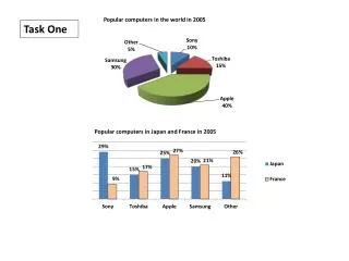
Task 1 • You should spend about 20 minutes on this task.The graph below shows the different modes of commuter transport used in London in 1960, 1980 and 2000. Commuter Transport in London Write a report for a university lecturer describing the information shown. You should write at least 150 words.
Introduction The introductory paragraph states the main purpose of the chart, written in paraphrase using the writer's own words.
Model answer for Introduction INTRODUCTION: The vertical bar graph shows the changing patterns in commuting by train, car, tube or bus for commuters in London in the years 1960, 1980 and 2000. Overall, it can be seen that commuter figures were erratic for all transport types throughout the 3 years.
Analysis 1: train The second paragraph describes the data for the use of trains given in the chart, written in the writer's own words.
Model answer for Analysis 1 BODY: Firstly, the number of people who used trains was somewhat unstable as it ranged from slightly under 20% in 1960 to about 26% in 1980, but then fell back to about 23% in 2000.
Analysis 2: the Tube The third paragraph describes the data for the use of the tube given in the chart, written in the writer's own words.
Model answer for Analysis 2 BODY: Next, the usage of the tube was relatively stable, as it made up a total number of around 23% to around 27% of commuters throughout the three stated years.
Analysis 3: cars and buses The fourth paragraph describes the data for the use of cars and buses given in the chart, written in the writer's own words.
Model answer for Analysis 3 BODY: To continue, the use of cars increased steadily from just over 5% in 1960 reaching almost 40% by 2000, whereas in contrast, the popularity of buses declined since 1960, falling from just under 35% in 1960 to 27% in 1980 and a low of 15% in 2000.
Conclusion The concluding paragraph summarizes the main findings of the chart, written in the writer's own words.
Model answer for Conclusion Conclusion: In conclusion, the graph indicates that the usage of cars, for commuting to work, grew between 1960,1980 and 2000 as well as the corresponding decline in the popularity of buses from being the most popular mode of transport in 1960 to the least popular in 2000.
Answer analysis • The text above given in the model answer consists of 174 (individual) words in a few paragraphs which describe the data in the chart. These paragraphs can be further analyzed as comprising: • Introduction • Figures on the use of trains • Figures on the use of the tube • Figures on the use of cars and buses • Conclusion Body
Common error 1 • Not understanding the data presented • Students do not correctly understand the data in the charts: often they do not carefully read the labels(e.g. student writes ‘250 people were unemployed in Kuala Lumpur in 2010' , when they should write ‘250 thousand people were unemployed in Kuala Lumpur in 2010' )
Common error 2 • Not ‘translating' note form to grammatical English • Students often write the labels or titles directly as they appear in the chart. However, these are usually in ‘note form', so need to be changed into grammatically correct English in your writing.
‘the average life-expectancy of non-smoking in Malaysia was 72'
In the previous chart describing the life expectancy of smokers and non-smokers, one label read ‘Non-Smoking' - meaning ‘non-smoking people '. It would therefore be ungrammatical to say ‘the average life-expectancy of non-smokingin Malaysia was 72' ; we need to change the label to a form such as ‘the average life-expectancy of non-smokersin the Malaysia was 72' .
Common error 3 • Listing and not analysing • In 2008, the budget allocated was RM23m. In 2009, the budget increased to RM24m. In 2010, the allocated budget decreased to RM16m. In 2011, the budget rose to RM25m.
Common error 4 • Fail to provide ‘measurement’ of data • The unemployment rate in the UK rose by 2% between 2008 and 2009, whereas Canada decreased by about 1%. The USA was the highest, at just over 4 %.
Common error 5 • Describing every numberin a chart or graph (unless there are only a few). • A key skill in task 1 is being able to choose the key information and describe or compare it well.
Firstly, x started at 1%. Then it increased to 2 percent. Then it climbed to 3 percent. After that it inclined again to 4.39876 percent.
Common error 6 • Errors in sentence patterns when describing trends • The number of holidays abroad dramatic increases in 2005. • In 2008, the number of foreign holidays reduction to its lowest point. • There was a reduced dramatically in the number of tourist to Penang.
Common error 7 • Grammar • In 2011, there is a decline in the imports of wheat. • In 2020, Malaysia was a well developed country. • There were an increased steadily in the number of tourists to Langkawi island. • Last year, the numbers was declined for about 24.
Do not forget! • EDIT YOUR ESSAY! • Spelling • SUBJECT VERB AGREEMENTS • Tenses • Articles
What you would have done … The main writing skills performed in Task 1 are: • Describing numerical data • Identifying differences and similarities • Comparing and contrasting • Identifying and describing trends
QUESTIONS AND ANSWER Feel free to ask!