Download
1 / 26
330 likes | 619 Views
Displaying Categorical data. Chapter 3. Data table for section.

E N D
Displaying Categorical data Chapter 3
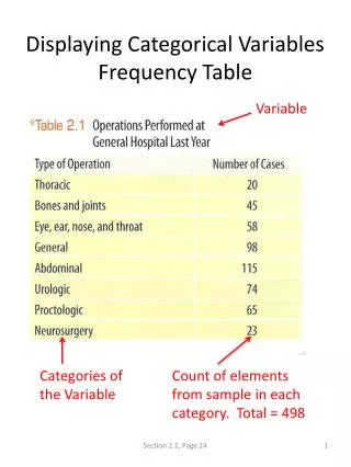
Data table for section • Each case (row) of the data represents a person on the ship Titanic. The variables are whether or not the person Survived (Dead or Alive), the person’s Age (Adult or Child), Sex (Male or Female), and Ticket Class (First, Second, Third, or Crew).
The Three Rules of Data Analysis • The three rules of data analysis won’t be difficult to remember: • Make a picture—things may be revealed that are not obvious in the raw data. These will be things to think about. • Make a picture—important features of and patterns in the data will show up. You may also see things that you did not expect. • Make a picture—the best way to tell others about your data is with a well-chosen picture.
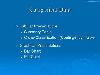
Frequency Tables: Making Piles • We can “pile” the data by counting the number of data values in each category of interest. • We can organize these into a frequency table, which records the totals and the category names.
A relative frequency table is similar, but gives the percentages (instead of counts) for each category. • Both types of tables show how cases are distributed across the categories. • They describe the distribution of a categorical variable because they name the possible categories and tell how frequently each occurs.
What’s Wrong With This Picture? You might think that a good way to show the Titanic data is with this display
The Area Principle • The ship display makes it look like most of the people on the Titanic were crew members, with a few passengers along for the ride. • When we look at each ship, we see the area taken up by the ship, instead of the length of the ship. • The ship display violates the area principle: • The area occupied by a part of the graph should correspond to the magnitude of the value it represents.
Bar Charts • A bar chart displays the distribution of a categorical variable, showing the counts for each category next to each other for easy comparison. • A bar chart stays true to the area principle. • Thus, a better display for the ship data is:
A relative frequencybar chart displays the relative proportion of counts for each category. • A relative frequency bar chart also stays true to the area principle. • Replacing counts with percentages in the ship data:
Pie Charts • When you are interested in parts of the whole, a pie chart might be your display of choice. • Pie charts show the whole group of cases as a circle. • They slice the circle into pieces whose size is proportional to the fraction of the whole in each category.
Contingency Tables • A contingency table allows us to look at two categorical variables together. • It shows how individuals are distributed along each variable, contingent on the value of the other variable. • Example: we can examine the class of ticket and whether a person survived the Titanic:
The margins of the table, both on the right and on the bottom, give totals and the frequency distributions for each of the variables. • Each frequency distribution is called a marginal distribution of its respective variable. • The marginal distribution of Survival is:
Each cell of the table gives the count for a combination of values of the two values. • For example, the second cell in the crew column tells us that 673 crew members died when the Titanic sunk.
Conditional Distributions • A conditional distribution shows the distribution of one variable for just the individuals who satisfy some condition on another variable. • The following is the conditional distribution of ticket Class, conditional on having survived:
The following is the conditional distribution of ticket Class, conditional on having perished:
The conditional distributions tell us that there is a difference in class for those who survived and those who perished. • This is better shown with pie charts of the two distributions • We see that the distribution of Class for the survivors is different from that of the non-survivors.
We see that the distribution of Class for the survivors is different from that of the non-survivors. • This leads us to believe that Class and Survival are associated, that they are not independent. • Look at the conditional distributions of the table • If the distributions are similar, we can say the variables are independent. • If the distributions are different, we can say the variables are dependent.
A segmented bar chart displays the same information as a pie chart, but in the form of bars instead of circles. Each bar is treated as the “whole” and is divided proportionally into segments corresponding o the percentage in each group. Here is the segmented bar chart for ticket Class by Survival status: Segmented Bar Charts
What Can Go Wrong? • Don’t violate the area principle. • While some people might like the pie chart on the left better, it is harder to compare fractions of the whole, which a well-done pie chart does.
Keep it honest—make sure your display shows what it says it shows. • This plot of the percentage of high-school students who engage in specified dangerous behaviors has a problem. Can you see it?
Don’t confuse similar-sounding percentages—pay particular attention to the wording of the context. • Don’t forget to look at the variables separately too—examine the marginal distributions, since it is important to know how many cases are in each category. • Be sure to use enough individuals! • Do not make a report like “We found that 66.67% of the rats improved their performance with training. The other rat died.”
Don’t overstate your case—don’t claim something you can’t. • Don’t use unfair or silly averages—this could lead to Simpson’s Paradox, so be careful when you average one variable across different levels of a second variable.
What have we learned? • We can summarize categorical data by counting the number of cases in each category (expressing these as counts or percents). • We can display the distribution in a bar chart or pie chart. • And, we can examine two-way tables called contingency tables, examining marginal and/or conditional distributions of the variables.