Download
1 / 20
200 likes | 311 Views
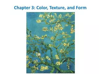
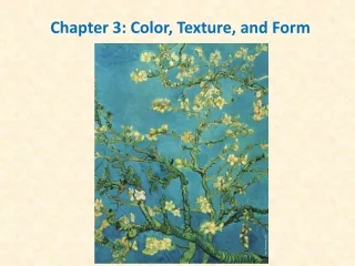
Color and Texture. To understand and apply the design elements Color & Texture. . Color.

E N D
Color and Texture To understand and apply the design elements Color & Texture.
Color • Color is the quality of an object or substance with respect to light reflected by the object, usually determined visually by measurement of hue, saturation, and brightness of the reflected light; saturation or chroma; hue.
Color • Color depends on light because it is made of light. • There must be light for us to see color. • A red shirt will not look red in the dark, where there is no light. • The whiter the light, the more true the colors will be. • A yellow light on a full-color painting will change the appearance of all the colors.
Three components of color • Hue: Is what is commonly known as “color.” Terms such as red, blue-green, and mauve all define the hue of a given color. • Value: The general lightness or darkness of a color. In general, how close to black or white a given color is. • Saturation: The intensity, strength, or level of chroma, of a color. The more gray a color has in it, the less chroma it has.
PRIMARY COLORS Red, yellow and blue • In traditional color theory, these are the 3 pigment colors that can not be mixed or formed by any combination of other colors. All other colors are derived from these 3 hues
SECONDARY COLORS Green, orange and purple • These are the colors formed by mixing the primary colors. • Red + Yellow = orange • Yellow + Blue = green • Red + Blue = purple
Warm Colors • Warm colors are vivid in nature. They are bold and energetic. Warm colors are those that tend to advance in space; therefore, caution needs to be taken so you do not overwhelm your content with eye catching hues. If an element in your design needs to pop out, consider using warm colors to do that.
Cool Colors • Cool colors are soothing in nature. They give an impression of calm and rarely overpower the main content or message of a design. Cool colors tend to recede; therefore, if some element of your design needs to be in the background, give it cool tones.
Color Harmonies • Color harmonies serve to describe the relationships certain colors have to one another, and how they can be combined to create a palette of color. • Complementary: A complementary relationship is a harmony of two colors on the opposite side of the color wheel.
Complementary • Complementary colors used together provide extreme contrast. • When complementary colors are used together the resulting image is difficult to look at for any length of time.
Neutral Color • In color theory, a color that is neither warm nor cool. Neutral colors result from the combination of two complementary colors (e.g., red and green, blue and orange, and yellow and purple). • Black, white, gray, and brown are considered to be "neutral" colors because they are (theoretically) neither warm nor cool colors.
Texture • Texture is defined as the surface characteristics of a material that can be experienced through the sense of touch or the illusion of touch. • Texture refers to the surface quality, both simulated and actual, of artwork.
Tactile Texture • Tactile means touch. • The actual surface texture needs to either be felt, or seen with light raking across its surface to make the texture visible. Painters are most likely to take advantage of this to give their painting's surface a lively look. • Collages can use textured paper and other three-dimensional materials (like string, cardboard, sandpaper, etc.) to make a tactile surface
Visual Texture • Visual texture refers to the illusion of the surface's texture. It is what tactile texture looks like (on a 2D surface). The textures you see in a photograph are visual textures. No matter how rough objects in the photograph look, the surface of the photograph is smooth and flat.
Visual Texture • In visual images, actual textures can be used, such as cloth, boxes, small objects, and natural items. • This billboard in Indianapolis, Indiana, is made of discarded materials normally found in a junkyard.
Texture • Texture can be used to accent an area so that it becomes more dominant than another. • Which box is more dominant? What makes one box stand out from the others?
Color and Texture Assignment • A free-form drawing project that deals with the elements of design – color, line, shape, form and texture. • Very wonderful detailed works of art can be achieved by simple doodling. • Click here for assignment