Download
1 / 60
610 likes | 792 Views
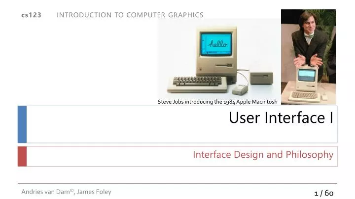
Steve Jobs introducing the 1984 Apple Macintosh. User Interface I. Interface Design and Philosophy. Questions. What is the most common use of computer graphics today? What are we going to use all that ever-increasing compute/graphics power for?!?

E N D
Steve Jobs introducing the 1984 Apple Macintosh User Interface I Interface Design and Philosophy
Questions • What is the most common use of computer graphics today? • What are we going to use all that ever-increasing compute/graphics power for?!? • Most apps now have all the power they need… • What approximate percentage of a modern app’s code is the UI? • What differentiates apps? Platforms? • What lies beyond WIMP GUIs?
Compute Graphics Computing Capacity “Moore’s Law” Human Capacity t t Computer power vs. brain power UI • Use compute power in UI to increase b/w to the brain Courtesy of Bill Buxton
Why Interface Matters… Not just applicable to computer interfaces! “Web sites with large liberal followings like Mother Jones, Slate and The Huffington Post highlighted a video that claimed to show a “Romney-loving“ voting machine in Pennsylvania that was converting Obama votes into votes for Mitt Romney.” http://www.youtube.com/watch?v=QdpGd74DrBM http://www.youtube.com/watch?v=yUdpj3gJofQ
Why Interface Matters… UI should protect against obvious user error
Why Interface Matters… • Sometimes a user interface can be a matter of life and death • Cali, Columbia 757 crash, Dec. 20th 1995; Took the life of CS Prof. Paris Kanellakis and his family, due to an ambiguity in a typed-in command
A Few More Questions • What is the most common complaint about computers? • What are some interfaces you like and dislike? • What are the identifying characteristics of current interface paradigms? • How do technical considerations affect interface considerations and vice-versa? • How could “intelligent” interfaces help or get in the way of users? (NB: Clippy! Is Siri that much better?!?) • Is it possible to accommodate users of all levels with a single interface? • What is your ideal interface? • For general use (operating system / work environment) • For specific applications
Is there an ideal user interface? • None! UIs are a necessary evil • Counterpoint: aesthetics of a good UI, once mastered • Want to communicate and control as we do in and with the real world • Objects • Other participants (real and software agents) • Models for agents: Wodehouse’s Jeeves, • But beware of HAL-9000 • Understand context: physical, personal, social, ... • Infer intent • Knowledge Navigator • Siri on iPhone as embryonic example • Future: brain-machine interfaces, “cogito ergo fac” (braingate, less invasive techniques) • Today: transparent, fluid UI's automaticity
An Extreme • “Microsoft Word” at its worst (pre-”ribbon”)
Improved? • Microsoft Word version 14 from MS Office 2010 At least it’s harder to clutter your screen like in prior versions, and there is no Clippy. And you can make the ribbon disappear…
Tradeoffs in Design • What are the pros and cons of these interface styles? • Command language • Direct manipulation, e.g., WIMP GUI’spoint & click, drag & drop • Swipe, pinch-zoom, finger-paint • Pen for select, gestures, literal input • “Intelligent” interfaces, agents, social interfaces • The effectiveness of an interface is determined by the evaluation of its tradeoffs • The usability of a system too often is inversely related to its functionality • A successful interface designer must know her users and their priorities, the computing environment, and the task domain
User Interface Design Overview • This lecture addresses primarily User-Centered Design for WIMP, i.e. Windows, Icons, Menus and Point-and-click GUI’susing keyboard and mouse/touchpad • This style of interface revolutionized computing and made it accessible to the masses, even toddlers, starting with the Mac in ‘84, based on XEROX PARC’s Alto and Star workstations • Much applies as well to non-WIMP/post WIMP interfaces, e.g., those interfaces using gestures (based on input via pen/stylus, multi-touch, VR data wands, computer vision (e.g., Kinect), …) or speech recognition. Corning Video Outline General observations and overview of user interfaces User interface design methodology and principles Summary of guidelines and main concepts in user interface design Image of Tesla Sedan interior from http://www.motortrend.com/oftheyear/car/1301_2013_motor_trend_car_of_the_year_tesla_model_s/
Purpose of UI Design (1/2) High Level goals of UI • Make easy things easy; make hard things possible • Optimize human factors and ergonomics • Make your interface comfortable and inviting, as well as attractive • Maximize speed of learning • Including the transition from novice to expert user • Maximize speed and ease of use • Minimize error rate • Enhance the User Experience! • Consistency with user’s expectation: “law of least astonishment!” The user interface is the key to productivity • Provide usable, functional, safe, efficient systems for people • Concentrate on user-centered design: • Design for your user, not your hardware • UI now much more important than features • Feature bloat • Remember Pareto’s Principle, 80/20 rule: 20% of features used 80% of time
Purpose of UI Design (2/2) Note: These goals cannot all be fully accommodated in the same interface. We must determine which goals are most important for the user and the purpose of the application.
Brief History of UI - Major Events and Innovations (1/3) • 1963, Ivan Sutherland published the landmark graphics system Sketchpad, which had lots of physical buttons, keys, panning, and zooming. • 1968, Engelbart shows “the Mother of All Demos” of the NLS/Augment hypermedia document system at the Fall Joint Computer Conference. Featured tiled windows, mouse, chord keyboard, command line interface, remote collaborators sharing document editing… • 1970, Engelbart patented the mouse • Apple “borrowed” the mouse from Xerox PARC, who “borrowed” it from Engelbart; we had a display with a mouse in 1970 Above: Sutherland’s Sketchpad Below: Engelbart during the 1968 demo
Brief History of UI - Major events and innovations (2/3) • 1973, Xerox PARC produced the Alto, the first personal workstation. Based on bit-mapped (raster) display, commercial mouse, Ethernet, and client-server architecture. Had world’s first WYSIWYG text editor, Smalltalk (Alan Kay, Adele Goldberg, et. al.), and WIMP GUI’s including window managers and browsers; also Metcalfe’s Ethernet, client-server model • 1972, Alan Kay envisions the Dynabook, for kids • Simulation and graphics-based laptop running Smalltalk • Colleague of Mathematician Seymour Pappert (constructivist learning, Logo) Xerox PARC Alto, image by Kevin Powers
Brief History of UI - Major events and innovations (3/3) • In 1981, Xerox introduced the Star Information System – commercial flop: too expensive, slow, too far ahead of its time • 1984, Apple released the Mac as the first commercial graphics desktop microcomputer, based on Alto and Star • Messy desktop metaphor with overlapping windows • Pull-down menus • Icons & toolbars • Drag-and-drop file manipulation • 1985, Microsoft Windows, considered a Mac imitation with minimal improvements • Apple vs. Microsoft over Windows’ use of WIMP GUI • Foley on behalf of MS, Shneiderman for Apple • Apple lost all claims • 2012, Apple vs. Samsung : Jobs’ “thermonuclear war” against Google and its Android h/w vendors: Jury upholds Apple patents on “bounceback”, H/V scrolling, translucent overlays,…iPhone design features, awards 1.2B$; Nov 21, 2013, Apple awarded 290M$, for a total of about 930M$
Characteristics of UI Design Players in the UI design game • Hardware engineers • Devices for graphics, video, audio, force feedback… • Software engineers • Human Factors (ergonomics) engineers • Graphic designers • Linguists • Perceptual psychologists • Cognitive scientists • Adventuresome sociologists and cultural anthropologists (e.g., Danah Boyd, 2001) • And UI/UX designers • Note that industrial design and UI/UX design are intertwined (e.g., iTouch, iPhone, iPad) The Nature of the Beast Collaborative Iterative Multi-disciplinary
Conceptual level Functional/semantic level Sequencing/syntactical level Binding/lexical level Meaning Look and Feel Form Language Model for Command Line and WIMP UI’s – Abstraction Layers (1/3) A. Meaning of an interface, its semantics • Conceptual level: • Cognitive uses, models, and metaphors; application objects and operations • Functional level: • Each function’s semantics: including pre-post- and error-conditions • B. Form of an interface, its “look and feel” • Interaction sequencing level: • Ordering and interlacing of inputs and outputs, syntax • Binding level: • How input and output units of form are actually created from hardware primitives, lexemes
Language Model for Command Line and WIMP UI’s (2/3) • Example: “Delete this file” by drag-and-drop vs. delete key: itemize the layers… • Defining lexemes is usually easy for small WIMP interfaces, harder for non-WIMP interfaces, especially Virtual Reality (VR) • Creating a user interface for a large application is essentially management of complexity • In IVR applications must also deal with the problems of latency, synchronizing screens, tiles • Command syntax and semantics tend to be more complicated than lexemes • Often helpful to have an Finite State Machine (FSM) to represent a sequencing of lexemes to make a complete command. Huge aggregate FSM for UI as a whole • This design model may seem excessively rigid, but a good UI design is a formal process resulting in a good architecture. Constant tradeoff with rapid prototyping/user testing after mockups, Wizard of Oz prototypes…
Language Model for Command Line and WIMP UI’s (3/3) Finite State Machine example (FSM is simplest in Chomsky hierarchy of automata and their equivalent languages: phrase-structure grammars) • Example: UI FSM for blur operation in Filter
Design Methodology (1/4) Rapid prototype early and often! The overall steps • Analyze • Formalize • Synthesize • Evaluate • Implement • Test Note: steps are not all distinct or sequential (even less so than in software design) For each step in design • Consider multiple alternatives • Choose the one which best matches • User characteristics • Design objectives • Functional requirements
Design Methodology (2/4) Process model • “Waterfall” model, a step-by-step approach, a pipeline; for user interface design, this model is less linear than software engineering waterfall model and more complex because of human element • Model is not a hierarchy: has feedback loops
Design Methodology (3/4) Synthesize Conceptual design Semantic design Dialogue design Syntactic design Lexical design Graphic and other design modalities Documentation design (text docs increasingly skipped – online help? instructional videos?) Analyze • Requirements definition • User(s) definition • Novice, casual user, power user… • Working environment • Office, home, school… Formalize • Define design goals
Design Methodology (4/4) Again, steps are NOT all distinct or sequential! Evaluate Design review Implement Prototyping Implementation Software debugging Test User interface debugging Usability testing/evaluation (gather and analyze statistics – experimental design)
User Definition and Work Environment (1/2) • Intrinsic personality factors: • Attitude toward computers • Secure/insecure • Bold/timid • Adaptable/rigid • Motivated/apathetic • Demographics • Age • Education • Cultural characteristics • Disabilities
User Definition and Work Environment (2/2) • “Work” environment • Frequency of computer use • Time allotted to learn system • Mental workload or overload • Stress level • Executive/management vs. clerical/data entry vs. casual use • Ambient conditions: supermarket vs. shop floor vs. traveling salesperson vs. white-collar office vs. home • Knowledge • Previous computer experience • Skill level (novice, intermediate, expert) • Education level/background • Reading ability • Typing and other interaction ability • has changed dramatically since smartphones, tablets/pads
Conceptual Design Identify real (or magical) world models and metaphors • Examples: • 2D messy desktop, point-and-click, drag-and-drop • Color pickers and paintbrushes in art programs • Timeline editor for movie making • IVR 3D virtual world: reach out and touch (e.g. using wand or laser pointer type device) • Use metaphors only if and when it is appropriate: they constrain and break too easily (e.g., 2D desktop, 3D rooms) Identify key concepts in application: • Types of objects • Relations between objects • Attributes of objects • Actions on objects, relations, attributes
Functional/Semantic Design Completely design units of meaning between user and computer, but not form • List what information is used for each operation on each object • Results, errors, edge conditions From user to computer • Detailed definition of commands for operating on objects and on attributes of objects From computer to user • Selection of what information needs to be presented to the user Identify problems that can occur and engineer them out when possible • Analyze and try to predict possible user actions Structure semantics to ease learning • Remember the Pareto principle mentioned on slide 13, • 80/20 rule, 20% of the features will be used by the user 80% of the time • Follow “law of least astonishment:” consistency /predictability is vital
Dialogue Design (1/2) Precursor to syntactic and lexical design • An overview of both syntactic and lexical bindings Some dialogue styles • Question and answer • Form fill in • Command/Scripting language • Menu selection (fixed, pop-up, radial, etc…) • Direct manipulation • Gestural specification • Natural language (subset)
Dialogue Design Example • This graphic is from Microsoft’s Call flow design in their Speech Application SDK • In this example, the user's task is to schedule a meeting with a number of attendees. The call flow steps through all the dialogs that are necessary to gather the primary information needed to schedule the meeting. At the end of that subtask, the application confirms the individual details before checking the schedule for conflicts. If there is a conflict, the application asks which of the variables the user wants to revise—the date, start time, duration or subject. Text and Image from http://msdn.microsoft.com/en-us/library/ms991088.aspx
Dialogue Design (2/2) Issues in dialogue design • Prospective user and workspace • Factory floor, business office, plane, car… • Initiative: Who has control? • Training requirements • Learning time • To accomplish trivial tasks • To become proficient • Speed of use • For novice • For expert/”power user”
Direct Manipulation (1/2) An industry standard and the heart of WIMP interfaces • Direct Manipulation interfaces provide visual metaphors for commands, e.g., drag-and-drop But is direct manipulation WIMP really better? • “Now, the abortion that happened after PARC was the misunderstanding of the user interface that we did for children, which was the overlapping window interface which we made as naïve as absolutely we possibly could to the point of not having any work flow ideas in it and that was taken over uncritically out into the outside world…. I characterize what we have today as a wonderful bike with training wheels on that nobody knows they are on so nobody is trying to take them off. I just feel like we’re way, way behind where we could have been if it weren’t for the way commercialization turned out.” • Alan Kay, a chief researcher at Xerox PARC during the 70’s, inventor of Smalltalk with its window manager, the Dynabook vision…50th Anniversary symposium for Vannevar Bush’ “As We May Think” in the Atlantic Monthly – the vision of an associative memory “Memex,” anticipating today’s WWWhttp://www.cs.brown.edu/memex/Bush_Symposium_Panels.html • Multi-point iPhone/iPad, and “touch first” Windows 8 w/ Metro permit even more direct “direct manipulation”! (next lecture on post-WIMP “Natural” UI’s)
Direct Manipulation (2/2) Pros • Novices can learn the system relatively quickly • Less time required of user to learn command syntax • Visually appealing and enjoyable • Easier to retain command set Cons • Some action commands seem awkward or impossible, e.g., how do you execute a “rm -f n*” in a visual file manager? Is dragging your disk to the trash really intuitive? Emacs users are amazingly efficient…fixed menus on large screens don’t work… • In some cases, consumes more system resources • Visually impaired or disabled may have more difficulty with the interface • accessibility design, “universal design” • Ben Shneiderman’s view: direct manipulation empowers users, autonomous agents do not
Syntactic Design From computer to user When computer tells user something Positioning and appearance of information Prefix, infix, postfix Order of commands and arguments can lead to excessive use of modes (e.g., input vs. edit mode) Minimize modes! Design of how lexemes are arranged Placement (this is a graphical UI!) Sequencing From user to computer Sequence of commands and parameter specification Where commands and parameters are specified
Modes A state in which just a subset of user-interaction tasks can be performed Harmful mode • Lasts for a period of time • Not be visible to the user (transparent) • Annoying examples: insert mode, dialogs that force OK’s Useful mode (typically temporary) • Narrows the choices of what to do next • Enables better context information (e.g., help) • Provide feedback • Include obvious and fast means for exiting • The mode is apparent at the locus of attention Good examples • Window managers • “Button-down-dynamic feedback-button-up” interaction techniques often use temporary modes (drag & drop) • Muscle tension makes mode apparent
Lexical Design Bindings • Bind hardware capabilities to primitives (lexemes) of input and output languages • Usually done by window system • Define how primitives (lexemes) combine to form tokens • Tokens combined by syntax From user to computer • Input devices and interaction techniques From computer to user • Output primitives and attributes • May include sound and haptic “display”
Lexical Consistency Coding consistent with common usage (for a given culture) • Red = bad, green = good • Left = less, right = more • Dual coding always best Readable text • Consistent abbreviation rule • Equal length, or first set of unambiguous characters • Mnemonic names instead of cryptic codes Devices used same way in all phases of interaction • Delete key is always the same • Function key meanings are consistent throughout application • Menu command placement is consistent
Graphic Design (1/7) Be aware of contextual and cultural baggage Visual clarity --- Gestalt Laws for perception/layout Gestalt principle: the human eye sees the whole (the gestalt) before seeing detail, the whole is greater than the sum of the parts Rule of similarity Rule of proximity Rule of common fate Rule of good continuation … see more online if interested Minimize Eye movements Hand movements Visual “noise” (non-informative decoration) Visual codings Difficult to design intuitively obvious visual symbols – icons are notoriously hard E.g., restrooms, Olympic sports
Graphic Design (2/7) Visual Consistency • Differences in appearance imply differences in functionality or information content • Principle of Similarity, human perception tends to see stimuli that physically resemble each other as part of the same object Layout principles • Place related controls and information together • Minimizes physical and cognitive distance between widget and application objects (e.g., pop-up menus) • Principle of Proximity , human perception tends to group stimuli that are close together as part of the same object • Grids (e.g., “Swiss grids”) and proportion of elements in your interface An example of a Swiss Grid layout from http://www.graphics.com/article-old/better-design-swiss-grid-system
Graphic Design: Affordances to Allow Disclosing/Discovering • Affordance: perceived or actual properties of an object, primarily those that determine just how object could be used. A chair affords (“is for”) support and therefore “affords” sitting. Doorknobs invite turning, sliders sliding, etc.. • Icons are not self-disclosing; neither are sliders unless marked with values/scales. Use DUAL CODING!!!! (mouse-over or label icons/buttons) • Making modes “show” themselves is especially tricky • Pen, touch and “in air” gestures don’t have any discoverability…bigger initial learning curve; tool tips and Andrew Bragdon’s “gesture bar”1, like a tool bar but shows animation of each gesture and lets you practice 1 Bragdon et al. “GestureBar: Improving the Approachability of Gesture-Based Interfaces”
Graphic Design (3/7) What are the strengths and weaknesses of this interface?
Radial menu image courtesy of Emanuel Zgraggen See the PanoramicData website for more information Graphic Design (4/7) • Radial/Pie Menus http://en.wikipedia.org/wiki/Pie_menu • Pop up menus that use muscle memory, which is more orientated towards direction than vertical distance (like in the menu on the previous slide) • Research has been done on the advantages of people remembering the “mark” they make on a radial menu to do something • Kurtenbach, G. & Buxton, W. “User learning and performance with marking menus”Proceedings of CHI '94, 258-264 • This menu can also be hierarchic, for an increased performance boost • Kurtenbach, G. & Buxton, W. “The limits of expert performance using hierarchic marking menus”Proceedings of InterCHI '93, 482-487. Radial Win 8 example from http://circledock.wikidot.com/
Graphic Design (5/7) Why is the graphic design of these user interfaces poor?
Graphic Design (6/7) • Print Settings view from Epson’s iPrint app for the iPhone: • No BACK button to navigate back! Stuck in settings forever. • The gray areas resemble buttons, even though they are not. • Too much empty space, unpolished look and feel.
Graphic Design (7/7) • Bad design is not limited to computer interfaces • http://www.baddesigns.com/examples.html Can you tell how fast are you going in this car? Ever tried to use one of these? Entire UI post on them here
Hall of Shame What’s the problem again? Some never get old… Windows 7 add printer window, cannot resize to show more or search for the printer model you want to add!
Documentation Design (does anyone still use doc?) Several types • Guided tour • “Cheat sheet” • Tutorial video and manual • Reference manual • FAQ • Interactive help (how well does it actually work?!?) • Andrew Bragdon’s “gesture bar” (slide 41), a tool bar that animates simple pen/touch gestures Should be available on-line • Context-sensitive • Hypermedia • e.g., Links from reference manual to tutorial to show functionality in context Doing documentation well is hard – plan it from the outset
Design Review Evaluate • Against design objectives and guidelines • Observation, questionnaires, timed tasks… • With measured metrics, such as mouse movements/action counts, time/tasks, error rate, etc. • The time to acquire a target is a function of the distance to and size of the target. • Easy to define metrics for canonical tasks; (e.g., select or track an object) • More difficult to define metrics for less mechanical tasks such as visualization which are context-sensitive and require gaining insight Review user interface design before implementing • Using prototype • Using detailed, formal design • Example of TAG design document is covered on the next three slides Analogous to structural walk-through • Walk-through scenarios examine: • what user does • what user sees • what user must know