Download

1 / 5
50 likes | 161 Views
Magazine Analysis: Be-Mag Skate magazine. By Adam Dent. Use of text.

E N D
Magazine Analysis: Be-Mag Skate magazine By Adam Dent
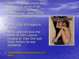
Use of text The masthead is written in large, bold font, using the colour black as it contrasts to the white background. It has also been embedded into the image layer so that it looks like part of the picture. This effect makes the cover look more unique and interesting. Similarly, the standard column inch has been made original on this cover by writing the title of articles on the wall featured in the main photo. This is an interesting hook to persuade readers to buy the magazine. The caption of the image (Dominik Wagner hits Cali) has been written on the up-right pole below Wagner himself. This is an effective call-out to make people want to read the main article. There is a scroll going down the left hand side of the page, this shows the famous skaters who are featured in the rest of the magazine.
Use of Images The photograph used for the main image has been shot using a fish-eye lens or attachment, this is clear to see because of the distorted lines and the curve of the poles/rails. This effect shows how most photographs related to skaters are shot, serving to make the target audience purchase this magazine. The photo also has a very high contrast and slightly lower saturation, which makes each object stand out (especially the skater). The whole photograph bleeds right to the edge of the page but the subject (the skater) is fully inside the borders of the cover.
Colours and Font Choice The image incorporates mainly blacks and whites which makes the photo look very desaturated, but for the blue of the sky in the top corner. The majority of the text has been written in black so it is clear to see against the white of the wall. The font is very ‘blocky’ so it is easy to read with no curls or loops. The photograph has been shot so that the skater is totally against the white of the sky using a low-angle. This has the effect of making him stand out as his clothes etc. contrast to the white of the sky.
Is it Successful? I think that this magazine cover successfully attracts its target audience of teenagers and above who have an interest in aggressive inline skating. The image on the cover shows clearly what to expect in the rest of the magazine and is a very interesting and effective photograph, which will draw in viewers. The graphic effect of having writing on the wall, shows clearly what the target audience can expect from reading on, and is presented in a very unique and interesting way.