Download
1 / 15
160 likes | 339 Views
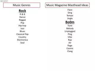
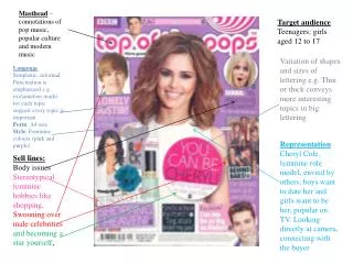
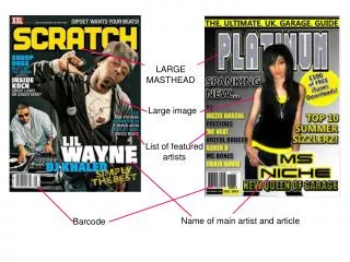
banner. masthead. slogan. Catch phrases. advertisement. Bar code. website. masthead. Page numbers. Page numbers. pictures. titles. advertisement. Name of the artist. picture. Interview Question and Answer. Quotes by the artist. Page number. The name of the interviewer.

E N D
banner masthead slogan Catch phrases advertisement Bar code website
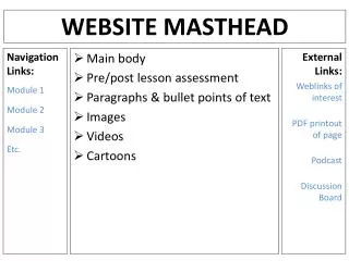
masthead Page numbers Page numbers pictures titles advertisement
Name of the artist picture Interview Question and Answer Quotes by the artist Page number The name of the interviewer
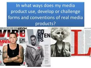
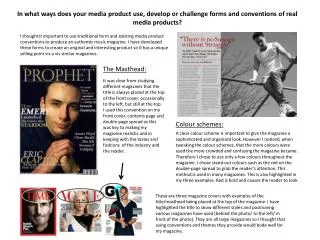
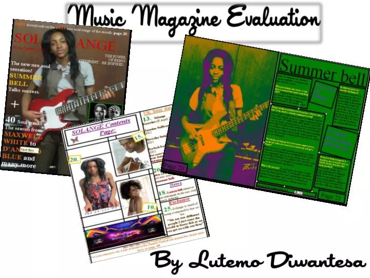
In what ways does your media product use, develop, change or challenge forms and conventions of a real magazines? • My media product was a music magazine, my genre I choose to do was neo soul. When deciding to do neo soul I researched the different types of concepts that a neo soul magazine would cover in order to make my final product like wise this was important because it determined the actual appearance of my magazine. so my audience could see evident comparisons between other professional neo soul magazines and my magazine. Throughout my magazine my color-scheme consisted of three main colors these were; red, yellow, white. I chose to use these particular colors as I wanted to convey the different colors neo soul artists represent and to highlight the mainstream readership of the magazine and also to be able to attract my readers attention. • Elements I used from existing texts would be the use of a masthead, headlines, taglines, plugs and pull quotes. All these elements are used in most magazines. However what makes my magazine different to a normal magazine is the shots of my pictures I feel the different types of shot and my models facial expression makes my image stand out which makes the image was more eye catching. Whereas usually the images have a duller background and make the artists to stand out.
When thinking of fonts to have in a magazine I had to make sure my font was in bold and stranded out on the page this was important because I wanted my magazine to attract the reader to the specified article. However, as most magazine use Serif font I decided to challenge my self by being different by using times new roman fonts for all of the Mastheads and subheadings I felt I made a good decision as I feel times new roman is a very bold font which accompanied my color of masthead nicely which was red. My other pages e.g. contents page and double page spread feature article are all coherent of the color scheme. All of my images are Medium close-ups (which is a common convention of neo soul magazines), except for my front cover image which is a long-shot I felt it was important to have a long shot for my front cover as I wanted to show the guitar which I felt also represented neo soul music. And I wanted to draw attention to my artists outfit and how it fit into the neo soul convention.
How does your media product represent particular social groups? • I feel My media magazine represented different social groups through text, and pictures and referred to artists like; Maxwell, Erika Badu and Jill scoot. All of these artists are neo soul artists who are all common within the later adolescence/adulthood age I felt it was important to understand not everyone will read my magazine therefore I feel making a age range for the people who will read my magazine was important as it was specific and therefore it helped me to meet my target audience needs, I also feel because I emphasised on the different types of neo soul artists both female and male it helped to make my magazine diverse and not just for one sex which is good as I feel it helped my magazine to be consumed by both sex’s. • Furthermore, the whole idea of a neo soul music magazine I feel is reaching out to those people who are different in society and feel its hard to fit in as I feel neo soul is a un common of genre as it is very different through this I also hope many people such as set trendier’s will be inspired and understand it is not a bad thing to be different in society.
What kind of media institution might distribute your media product band why? • The distribution of any magazine is totally based on the genre therefore I feel the genre is very important and as my magazine is a neo soul magazine, there is not really a broad market that will be content in distributing my magazine as my genre is a very hidden genre that not much people know about however some may include word magazine, also my magazine promotes a sense of fun, and passion towards music therefore, I feel that institutions like urban music channels e.g. MTV Base as neo soul is a combination of blues and RnB, music stores include HMV, and common newsagents and urban clothes stores will be contented to distribute my magazine.
Who would be your target audience? • The target audience of my magazine are males and females from later adolescence to later adult hood I choose this age range as I felt this age is were teenagers or adolescences are able to find them self in order for them to be what makes the as a adult. I wanted a unisex audience as I felt it is necessary for both males and females to express there uniqueness in society today I made sure this was also expressed in my magazine by putting both females and male pictures on my front cover I Also did this by the colour schemes, the colour scheme and layout of the magazine was unisex even though there were a few more female pictures than there was of male pictures • the magazine is mainly for people who like neo soul music I feel this music magazine is for those who are into neo soul music as neo soul music is a particular genre of music which is difficult to get used to, neo soul is a soothing music which is normally slow however not necessarily as different neo soul artist can bring there own vibe on to the tracks to deform from the norm which I feel is important because that is what makes each neo soul track different from each other which in a sense is like my target audience as I believe they are all different in there own way like my genre of music neo soul.
I feel my genre will help to inspire my target audience both men and woman into being unique in society by reading my magazine. In my magazine I used a girl as my main model I did this so I was able to target both males and females I feel using a female model helped to attract more males because my model was very pretty which helped the male audience to interact with my magazine I also feel using a female model was good as it also helped more females to purchase my magazine I think this is because she was inspiring to young woman or woman in general which is important as I felt this helped to boost the woman's self concept and self esteem .
How did you attract/ address your audience? • I attracted my audience by the offers I offered them on the magazine i.e. free down loads or chances to win tour tickets also To attract my audience I made sure I used colourful and distinctive colours such as red I used red for my main masthead on my final front cover I also put this font in bold to emphasis on the importants of my masthead the font I used is called ‘times new roman’. I thought this would be good for my magazine as it is a simple and formal font however that is what makes it even more wonderful because it was so simple it allowed me to play around with the font, also I feel the font represented my genre and this will let my audience know the type of genre my magazine is based for. I feel I made the right decision of choosing red as I feel it helped for my magazine to be noticed in shops also I feel because red is distinctive colour it will help my audience to remember it so next time they can remember it and purchase it again I also used red as my main masthead as I wanted to tell my audience just home much the new singer song writer has dominance over her new carrier other colours that I used were white I used white because I feel it helped to bring purity which I felt showed the freshness in my model as she is a new and up an coming artist.
I made the colour scheme yellow, red and white, orange and a hint of purple and black. I chose these colours as I feel it represents all the different colours and characters they are in neo soul I feel those colours together stand out and make my magazine eye catching which is important for the readers reading it. • However for my double page spread I changed the colour scheme and made it green with yellow . I did this because I feel using the same colours through out my front page all the way to my contents page would have bored my audience therefore I have decided to change to colours when considering new colours I had to have the same mind set when I was thinking of colours for my front cover which meant I had to chose colours which were eye catching and still are attractive to look at and are also not bias i.e. not just for boys or not just for girls this was important because my magazine is a multi sex magazine and for me not to meet my expectations would mean i have disappointed both my male audience and female audience my story was based on the girl who was on my front cover and contents page I used a girl for my neo soul magazine as I was inspired by Janelle moané who is also a neo soul artist.
What have you learnt about technologies from the process of constructing your magazine? The technologies that I have used throughout my magazine have mainly been Photoshop as well as publisher, I used Photoshop to mainly edit my work once it was checked onto publisher I learnt how to change the brightness and contrast of my images with the brightness I learnt how behind them and then used the contrast to darken their features. and also how to change it into black and white also I learnt how to remove the background in order to change it into other colour. Over all This programmes that I used was incredibly useful as I made my images look how I wanted them to look using both my imagination and research. At the beginning using Photoshop it was very difficult I felt this was the case because I hade never used Photoshop before however once I got into the magazine process I found it a lot easier to build my magazine to its best potential using Photoshop was quick and effective However I mainly used the ‘curved’ tool which helped change the lighting and darkness of my magazine.
What do you think you have to learnt between creating that and creating your music magazine how did it help? Looking back on my preliminary task, I feel I have learnt a lot I also feel I have improved drastically from my prelimary task I feel this is because when doing my prelimary task I used less tools to improve my magazine to a great standard therefore the out come was not great rather than my main task which I was a lot focused on as I knew what I had to do in order for it to be to a great standard I also feel my prelimary task was not as great as my main task because My preliminary task was rushed and not very good and didn’t really show what I wanted in my magazine whereas I think that my finished product does. during my prelimary task I did not do enough research into how a magazine should look like or what my target audience wanted I feel it is very important to know your target audiences aim and objectives so as the person creating it you are able to know what demands to meet or improve after all the magazine will be purchased by your target audience. I feel I have learnt a lot not just on photo shop but on publisher too , as I now know how to make my magazine look appealing and yet professional to my targeted audience, I know what not to use and what to use when using Photoshop and publisher, I also know how to properly use Photoshop and use a lot of tools to change the colour of my images, to make boxes and change fonts etc.
I also feel My audience feedback was good as it helped to improve and make my music magazine to a great standards I feel it is also important to get the publics opinion because its important to know what people really want to see in a new, fresh music magazine as after all they are the ones who purchase the magazines and if you are not meeting there demands this is what causes magazines to un successful . In the process of producing my music magazine and working with different computed programs such as publisher, Photoshop, excel, and word I have learnt that there is a program suited for all purposes e.g. Microsoft publisher is good for a range of different things like flyers, brochures, creating web sites etc and other programmes such as photo shop is a good programme for a photography. In conclusion I have managed to create a front cover, contents page and double page spread which I feel do represented my genre of music magazine.