Download
1 / 3
30 likes | 117 Views
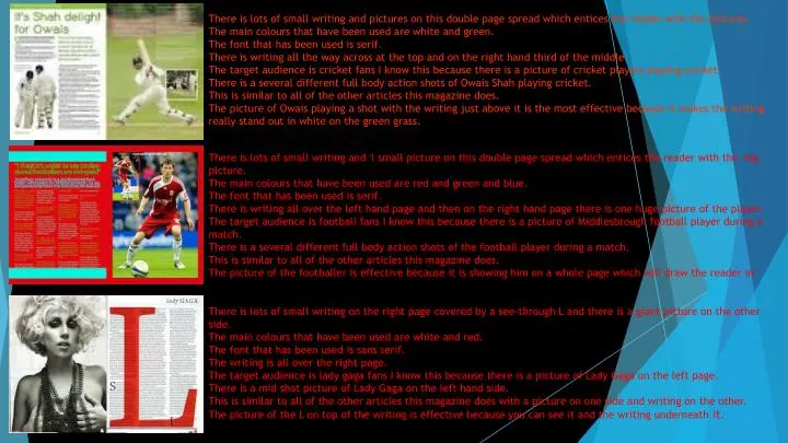
There is lots of small writing and pictures on this double page spread which entices the reader with the pictures. The main colours that have been used are white and green. The font that has been used is serif.

E N D
There is lots of small writing and pictures on this double page spread which entices the reader with the pictures. The main colours that have been used are white and green. The font that has been used is serif. There is writing all the way across at the top and on the right hand third of the middle. The target audience is cricket fans I know this because there is a picture of cricket players playing cricket. There is a several different full body action shots of Owais Shah playing cricket. This is similar to all of the other articles this magazine does. The picture of Owais playing a shot with the writing just above it is the most effective because it makes the writing really stand out in white on the green grass. There is lots of small writing and 1 small picture on this double page spread which entices the reader with the big picture. The main colours that have been used are red and green and blue. The font that has been used is serif. There is writing all over the left hand page and then on the right hand page there is one huge picture of the player. The target audience is football fans I know this because there is a picture of Middlesbrough football player during a match. There is a several different full body action shots of the football player during a match. This is similar to all of the other articles this magazine does. The picture of the footballer is effective because it is showing him on a whole page which will draw the reader in. There is lots of small writing on the right page covered by a see-through L and there is a giant picture on the other side. The main colours that have been used are white and red. The font that has been used is sans serif. The writing is all over the right page. The target audience is lady gaga fans I know this because there is a picture of Lady Gaga on the left page. There is a mid shot picture of Lady Gaga on the left hand side. This is similar to all of the other articles this magazine does with a picture on one side and writing on the other. The picture of the L on top of the writing is effective because you can see it and the writing underneath it.
There is not a lot of small writing on this double page spread but there is a picture of a musician. The main colours that have been used are white, black and yellow. The font that has been used is sans serif. There is writing at the bottom on the right page. The target audience is rapping fans I know this because there is a picture of a famous rapper on the front. There is a close up shot of the musician on the right page. This is pretty much identical to all of the other articles of this type that this magazine does. The picture of the rapper is smoking which may increase the range of people that read their magazine. There is lots of small writing on this double page spread and then different pictures spread all over the page The main colours that have been used are white and green and purple, the colours of Portugal. The font that has been used is serif. There is writing on the top left on both pages and on the bottom right of the right page . The target audience is Portugal and football fans I know this because there is a picture of Cristiano Ronaldo and the Portugal squad. There is full body shot of the team then mid shots of Ronaldo. This is similar to all of the other articles this magazine does. The picture Ronaldo crying is effective because it shows the world he really does care for his country. There is lots of small writing and pictures on this double page spread and a couple of different pictures. The main colours that have been used are white and black with a small amount of red. The font that has been used is serif. There is writing across the bottom and on the top lefthand of the right page. The target audience is ice hockey fans I know this because there is a picture of an ice hockey team and players. There is a several different full body action shots of the hockey players and one close up. This is similar to all of the other articles this magazine does. The picture of the net minder in an action shot because it shows a really good shot and it will draw the reader in.
There is lots of small captions underneath and next to the pictures. The main colours that have been used are white and yellow. The font that has been used is sans serif. There is writing on the left hand third of the left page and the rest are captions for the pictures on the right hand page. The target audience is women interested in gossip and fashion I know this because all of the articles are about girly things. There is a several different mid body and close up shots. This is similar to all of the other articles this magazine does. The picture of the woman on the left is effective because they have made her look completely different to what they normally do with make up. There is lots of small writing 2 really big pictures on this double page spread. The main colours that have been used are blue and grey. The font that has been used is serif and it is bold. There is writing all over the right hand side on the right page there is one huge picture of a football player. The target audience is males who want to gain muscles I know this because there is a picture of a muscle product under a male playing football. There is a one full body action shots of the football. This is similar to all of the other articles this magazine does. The picture of the footballer is effective because it is showing him on a whole page which will draw the reader in. There is lots of small writing on the left hand third of the left page and the right hand third on the right page with a huge picture in the middle. The main colours that have been used are white, orange, pink and black. The font that has been used is serif. There is writing all over the left hand page and then on the right hand page and on the right hand page. The target audience is cricket fans I know this because there is a picture of Jacques Kallis scoring a century. There is on mid body shot of the player during a match. This is similar to all of the other articles this magazine does. The picture of the cricketer is effective because it is showing him scoring a century so it shows he is good and this will make people want to read it.