Download
1 / 54
550 likes | 581 Views
Infographics. Step 1: Outline the goals of your infographic. Before you begin to think about design, layout, charts, or aesthetics, you need to think hard about the goals of your infographic. Why are you making this infographic?

E N D
Step 1:Outline the goals of your infographic • Before you begin to think about design, layout, charts, or aesthetics, you need to think hard about the goals of your infographic. Why are you making this infographic? • When I say goals, I mean clear, concrete, achievable communication goals.
Step 2: Collect data for your infographic • You’ll need some data. • If you have your own data, great–you can move on to step three! If not, don’t worry. There’s a ton of public data available to you.
Step 3: Visualize the data in your infographic • Your next step should be to decide how to present that data visually. • First, for each piece of data you want to visualize and determine whether the primary goal will be to:
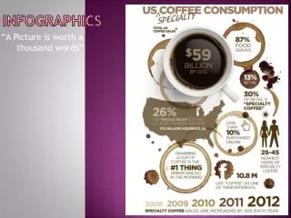
InformYou want to convey an important message or data point that doesn’t require much context to understand. Make a numerical stat. stand out with large, bold, colorful text: Highlight a percentage or rate with a donut chart or a pictograph: Demand extra attention by pairing icons with text:
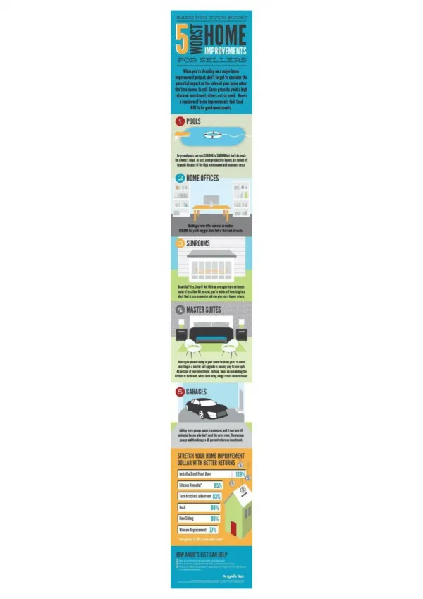
CompareYou want to show similarities or differences among values or parts of a whole. A comparison infographic will help draw parallels between multiple pieces of data. Use a bar chart, column chart, bubble chart, or bubble cloud to compare independent values. Use a stacked bar chart or stacked column chart to compare categories and parts of a whole. Use a pie chart, donut chart, pictograph, or tree map to compare parts of a whole. Use a stacked area chart to compare trends over time.
CHANGE You want to show trends over time or space. Use a line chart or an area chart to show changes that are continuous over time. Use a timeline to show discrete events in time. Use a map series to show data that changes over both space and time. Use a choropleth map to show spatial data.
OrganizeYou want to show groups, patterns, rank or order. Use a list to show rank or order when you want to provide extra information about each element. Use simple boxes or borders to show organized groups. Use a flowchart to show order in a process. Otherwise, show rank or order with a bar chart, column chart, bubble chart, or pyramid chart. Use a table to show rank or order when you want readers to be able to look up specific values.
RelationshipYou want to reveal more complex relationships among things. Use a multi-series plot when you want to compare multiple sets of related data.
ExploreYou want the reader to explore the data and discover insights for themselves. There’s no magic bullet for exploration. The visualization style will really depend on the specifics of your data.
Step 4: Layout the elements of your infographic design Whatever layout you use, spacing your elements at regular intervals will create a satisfying sense of structure and balance.
Use a grid layout to add structure and balance to your infographic It will give your elements some essential order and, keeping in mind that we naturally read from left to right and top to bottom, it can be used to direct your reader’s gaze from element to element.
Use a centered, single-column layout for content with a linear flow.
Use a centered, single-column layout for content with a linear flow.
Consider using a multi-section layout when reading order is less important.
Have a list or a process? Find a centered, single-column infographic template to ensure each step is read in order.
Want to contrast two charts? Find a two-column infographic template.
Have 3 equally important stats? Find a three-column infographic template.
Have tons of data? Find a minimal infographic template with 4 or 5 sections.
Step 5: Add style to your infographic design Now comes the fun part–manipulating design elements to add some flair and make sure your infographic is aesthetically pleasing and clear.
How to pick fonts for your infographic • Try to keep it simple. The text that’s there should be absolutely necessary to understand the major concepts and supplement the visuals. Choose a readable font. • Amp up the size and style of your main header, section headers, and data highlights so that the gist of your infographic is immediately apparent:
How to use repetition, consistency, and alignment in your infographic • Next, add some extra graphic elements to give your compositions some rhythm and visual interest. • An easy way to pull your composition together is to repeat basic shapes to reinforce the underlying grid.
add icons to reinforce important concepts in the text. Keep icon color, style, and size consistent.
How to use negative space in your infographic design • Leave space on either side of your subject, and you should leave space around each main element grouping in your infographic. • Place margins around the edges of the infographic.
Leave gaps between unrelated elements making it easier to immediately understand which elements are grouped together:
How to pick colors when you make an infographic While color is a powerful communication tool, a truly great design should communicate effectively in black and white. Thinkofcolorlikeanaddedbonus–a way that you can help your reader understand your content.