Download
1 / 18
180 likes | 349 Views
Plotting in Excel. JKA & KY. Or click on Chart icon in the toolbar. Select chart type, Standard or Custom. Plotting in Excel - Charts. Select Insert → Chart. Column Chart.

E N D
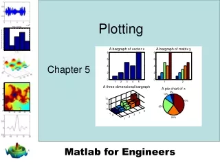
Plotting in Excel JKA & KY Engineering 10
Or click on Chart icon in the toolbar Select chart type, Standard or Custom Plotting in Excel - Charts Select Insert→ Chart Engineering 10
Column Chart • Definition: A chart that consists of multiple columns (vertical bars), and the height of each column represents the quantity associated with the corresponding category. • There are seven options under the Chart sub-type. • Use this type of chart for visual comparison of the quantities associated with different categories Engineering 10
Column Chart - Example • Select “Column” under “Chart Type” (Standard) and click on “Next”. Data range is the Cells containing your data. The data should include category names and corresponding quantities, in two columns. • Enter the cell addresses directly into the “Data range” box. Or, first click on the small red arrow at the extreme right of the “Data range” box, then highlight the data, and then click on the small red arrow again. For the question of “Series in:”, select “Columns”, because the categories and the corresponding quantities are organized in two separate columns. Click on “Next”. • Under the “Titles” tab, enter a proper title, for example, “#s Students 07”;the Category (X) Axis could be “Grades”; the Value (Y) Axis could be “# Students”.Under “Data Labels” or other tabs, enter definitions or select preferences about the chart, if any. Engineering 10
Multi-Column Chart - Example Multiple Column Charts, for Comparison, # Students in Different Grades FOR 2 YEARS Engineering 10
Example Grade # Students 07 Frosh 4000 Sophomore 4000 Junior 7000 Senior 7000 Graduate 8000 Pie Chart • Definition: A graph in the shape of a circle divided into sectors, whose areas correspond to the proportions of the quantities. • Application: Visual representation of relative magnitudes of a given set of quantities Engineering 10
Music preferences in young adults ages 14 - 19 Music Type # Students in Sample (500) Rap 250 Alternative 125 Rock & Roll 65 Country 50 Classical 10 Pie Chart • Select “Pie” under “Chart Type”, and click on “Next”. Data Range is the Cells containing your data. The data should include category names and corresponding quantities. • Enter the cell addresses directly into the “Data range” box. Or, first click on the small red arrow at the extreme right of the “Data range” box, then highlight the data, and then click on the small red arrow again. For the question of “Series in:”, select “Columns”, because the categories and the corresponding quantities are organized in two separate columns. Click on “Next”. • Under the “Titles” tab, enter a proper title, etc. (In the example below, the title could be “Music Preference in Young Adult Ages 14-19”.) Under the “Data Labels” tab, check “Category Name” so that, in the chart legend, the different category names are color. Also check “Percentage” if you want percentages to appear by the corresponding pie sectors. Engineering 10
XY Plots XY plots are two dimensional graphs. Scientifically, it is a plot of independent variable (X) against a dependent variable (Y). The plot is used to obtain a functional relationship between two variables There are five options in Chart sub-type menu. The first option, where only points are plotted, is the most common type used in engineering and science fields. A curve is fitted to the plotted points to obtain the function describing the relationship between the two variable. Engineering 10
Test result Strain Stress 0 0 0.00035 90.45091 0.0012 259.9445 0.00204 308.022 0.0033 333.2831 0.00498 355.2847 0.02032 435.1422 0.06096 507.6659 0.127 525.5931 0.1778 507.6659 0.23876 479.1454 XY Plots - Examples Engineering 10
XY Plots • Click on “Insert”, and select “Chart”. • Select “XY (Scatter)” under “Chart Type”, and click on “Next”. Data Range is the Cells containing your data. • Enter the cell addresses directly into the “Data range” box. Or, first click on the small red arrow at the extreme right of the “Data range”, then highlight the data, and then click on the small red arrow again. For the question of “Series in:”, select “Columns”, because the X values and the Y values are organized in two separate columns. Click on “Next”. • Under the “Titles” tab, enter a proper title, a label for the X axis and a label for the Y axis. • Click on “Next”, and then click on “Finish”. Engineering 10
Fitting a Curve to Data Points (XY) Given the plot of test results, the question is what would be your test score if you studied for 2.5 hours, no data is available for 2.5 hours. In order to answer the question, you have to find the function relating the test score to the number of hours spent studying. Engineering 10
There are six option to select from, start with your best guess and check the fit. The best fit is indicated by how close the correlation factor, R2,is to unity, the closer to 1 the better the fit. Fitting a Curve to Data Points (XY) Right click on any data point and select AddTrendline from the menu. Engineering 10
Fitting a Curve to Data Points (XY) From the option menu, check the two options to display the equation and to display the R2 value. Engineering 10
4th order polynomial 6th order polynomial, the best fit Substitute x = 2.5 in the equation to find y (hours spent studying or read the y value form the graph. y = .2361(2.5)5 – 4.4722(2.5)4 +31.764(2.5)3 – 107.53(2.5)2 + 185(2.5) – 60 y = 75.11 Fitting a Curve to Data Points (XY) Engineering 10
Select Histogram Select Data Analysis from the Tools menu Histogram Histogram shows the frequency of data items in successive numerical intervals of equal size (Bar chart representing a frequency distribution). Engineering 10
Histogram Analyze Data • Click on “Tools”, and select “Data Analysis”. • Under “Analysis Tools”, select “Histogram” and click on “OK”. • Specify “Input Range” (cells containing the data) • Specify “Bin Range” (cells containing upper bounds of the • consecutive intervals partitioning the domain). If you omit • this range, then Excel will automatically create bin range. • Select options if desirable. • Click on “OK” to create an intermediate two-column data • table as input to histogram plotting. Plot the Result • Plot the intermediate two-column table as a Column Chart Engineering 10
Selected intervals Histogram - Example Test scores Engineering 10
Histogram - Example Engineering 10