Download
1 / 9
90 likes | 96 Views
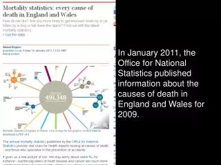
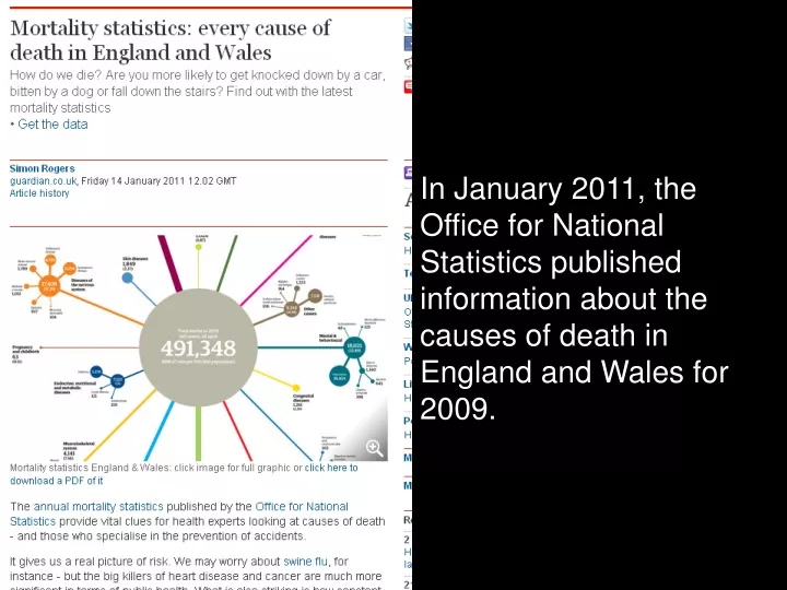
In January 2011, the Office for National Statistics published information about the causes of death in England and Wales for 2009. The information has been summarised in this infographic by The Guardian newspaper. Look at this section of the graphic….

E N D
In January 2011, the Office for National Statistics published information about the causes of death in England and Wales for 2009.
The information has been summarised in this infographic by The Guardian newspaper. Look at this section of the graphic…
Do you agree or disagree with the statement: 922 people died as occupants in cars, while 431 died on a motorcycle, so travelling by car is about twice as dangerous as travelling on a motorbike.
The data can be downloaded as a spreadsheet. One section of the spreadsheet shows that in 2007, 23 people died in ‘Air and space transport accidents’, in 2008 the figure was 21 and, in 2009, it rose to 40 people. If a 2009 newspaper headline read “Air travel twice as dangerous in 2009 than in previous two years” would this be a fair statement?
Look at the spreadsheet giving data for ‘accidents and external causes’. What type of graphic would help to show this? Design a graphic to represent this data.
It’s in the News!Mortality Statistics Teacher Notes
Mortality Statistics Introduction: Each year the Office for National Statistics publishes a set of data showing the causes of death for the previous year. In January 2011 the data for 2009 was released (a spreadsheet of the data is also available). This data was represented by The Guardian as an infographic showing the most frequent causes out of the 491 348 registered deaths in 2009. The data shows some interesting statistics which might challenge our intuitive understanding of, and the way that the media presents, the dangers facing us (for example, 645 people died from ‘alcohol’ while 149 died from ‘swine flu’). This resource uses the infographic as a context for students to explore the way that data is presented and interpreted. This context addresses issues that may be upsetting for some students (exploring fatalities due to motorcycle, car and air travel) and it is a good idea to check that students are comfortable with this before starting with the resource. Content objectives: This context provides the opportunity for teachers and students to explore a number of objectives. Some that may be addressed are: • interpret graphs and diagrams and make inferences to support or cast doubt on initial conjectures • review interpretations and results of a statistical enquiry on the basis of discussions; communicate these interpretations and results using selected tables, graphs and diagrams • select, construct and modify, on paper and using ICT, suitable graphical representations to progress an enquiry and identify key features present in the data. Process objectives: These will depend on the amount of freedom you allow your class with the activity. It might be worth considering how you’re going to deliver the activity and highlighting the processes that this will allow on the diagram below:
Activity: This activity uses the Office for National Statistics mortality statistics alongside an infographic from The Guardian newspaper to explore perceptions of risk and the way that it’s presented in the media. There are two short activities and one longer activity. The first activity uses The Guardian’s infographic and asks students whether they agree of disagree with the statement “922 people died as occupants in cars, while 431 died on a motorcycle, so travelling by car is about twice as dangerous as travelling on a motorbike”. The second activity also uses the infographic and asks whether a hypothetical newspaper headline “Air travel twice as dangerous in 2009 than in previous two years” would be fair, based on the data. The way in which students work on these statements is up to you. Initial paired discussion may lead to whole class discussion or to a piece of writing explaining and justifying their point of view. These activities are set up to create conversation and to draw out misconceptions about risk and probability. The third activity asks students to focus on just one part of the data set – that involving ‘accidents and external causes’ - and asks them to represent this data in an infographic. This resource might be used to complement the Bowland Case Study How risky is life?. Differentiation: To make the task easier you could: • use just one of the discussion activities • focus on only one part of the data set • ask students only for an informal, verbal justification of their opinion • explain how you’d like them to represent the data in their infographic (bar height, circle area etc.) and ask them to draw it. To make the task more complex you could consider: • asking the students to offer a written justification of their opinion • allowing students the opportunity to design from scratch their infographic with no scaffolding. Working in groups: This activity lends itself to paired discussion work and small group work and, by encouraging students to work collaboratively, it is likely that you will allow them access to more of the key processes than if they were to work individually. Assessment: You may wish to consider how you will assess the task and how you will record your assessment. This could include developing the assessment criteria with your class. You might choose to focus on the content objectives or on the process objectives. You might decide that this activity lends itself to comment only marking or to student self-assessment. If you use the APP model of assessment then you might use this activity to help you in building a picture of your students’ understanding. Assessment criteria to focus on might be: • interpret graphs and diagrams, including pie charts, and draw conclusions (handling data level 5) • communicate interpretations and results of a statistical survey using selected tables, graphs and diagrams in support (handling data level 6) • examine critically the results of a statistical enquiry, and justify the choice of representation in written presentation (handling data level 7). Probing questions: These might include: • What surprises you by being more frequent than you would expect? Less frequent? Why? • How do you think The Guardian has determined how large each circle should be?
The first two slides introduce the data and infographic. You will need: The PowerPoint and handouts of the infographic and the data set for ‘accidents and external causes’. There are five slides:: The third slide asks students whether they agree or disagree with the statement “922 people died as occupants in cars, while 431 died on a motorcycle, so travelling by car is about twice as dangerous as travelling on a motorbike”. The fourth slide asks whether a hypothetical newspaper headline “Air travel twice as dangerous in 2009 than in previous two years” would be fair, based on the data. The final slide asks students to design their own infographic for a small part of the data.