Download
1 / 72
720 likes | 979 Views
COLOR. THE PAINTER’S ELEMENT. SPECTRUM. Color is a property of white light. When light rays are bent by a prism or raindrop, the white light separates into the visible spectrum. COLOR WHEEL. Artists rotate the spectrum into a color wheel.

E N D
COLOR THE PAINTER’S ELEMENT
SPECTRUM Color is a property of white light. When light rays are bent by a prism or raindrop, the white light separates into the visible spectrum.
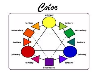
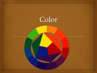
COLOR WHEEL • Artists rotate the spectrum into a color wheel. • The color wheel allows artists to see the relationships between colors. • They use it to plan how to mix specific colors. • They also use it to plan color schemes for their paintings.
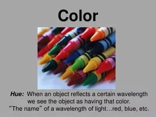
HUE The name of a color from the spectrum: GREEN ORANGE YELLOW RED BLUE VIOLET
PRIMARY COLORS • These three colors are primary. • They cannot be mixed from other colors; they must be bought. • They can, however, be used to mix all other colors, but white and black.
SECONDARY COLORS Secondary colors are made by mixing equal amounts of two primary colors. The secondaries are located between the two primaries used to make themon the color wheel.
INTERMEDIATE COLORS On the color wheel, there are more colors located between the primaries and secondaries. These colors are called Intermediates or Tertiaries. They are made by mixing a primary and one of the secondaries made from it. The Intermediate is located between the two colors used to make it.
VALUE IN COLOR • Value is the property of light and dark with the in-between tones. • Tints are light values of a color. • Shades are dark values of a color. • Tints in watercolor are created by adding water. • Tints in other paints are made by mixing color to white. • It takes little color to change white. • Shades in all paints are made by mixing black to color. • It takes little black to change color.
INTENSITY • Intensity of color refers to the brightness (saturation) or dullness of a color. • Color intensities are changed by adding the complementary, or opposite, color. • Complementary colors are located across the center of the color wheel from a color. • Green is the complement of red. • Violet is the complement of yellow. • Orange is the complement of blue. • Colors in nature are dull colors.
COLOR SCHEMES • Artists select limited groups of colors, or color schemes, to create emotional impact. • These colors schemes include: monochromatic, complementary, analogous, triadic, warm and cool.
MONOCHROMATIC • Monochromatic colors are those of the one hue, and its tints, shades, and dullnesses. • Mono = one in Greek. • Chroma = color in Greek.
COMPLEMENTARY • Colors which are located across the color wheel from one another are complementary. • These colors seem to vibrate and are extremely vibrant when placed next to each other. • When mixed, these colors dull each other. • Their contrast creates excitement and tension.
ANALOGOUS • Analogous colors are a group of colors located side-by-side on the color wheel. • An analogous color scheme includes one or two primaries, one or two secondaries, and two or more intermediates. • Analogous works are peaceful and happy.
COLOR TRIADS • Color triads are colors equidistant on the color wheel. • They are found easily by placing an equilateral triangle over the wheel. The colors touched by the corners of the triangle are triadic. • They have high contrast and create excitement.
WARM COLORS • Colors which remind us of fire, the sun and deserts are called warm colors. • These colors are analogous and sit on the color wheel from red-violet to yellow, and include reds, oranges and yellows. • They are exciting colors that seem to come toward the viewer.
COOL COLORS • Cool colors remind us of mountains, sky, water and ice. • They seem to move away from the viewer and are calm. • They sit on the color wheel from yellow-green to violet, and include blues, greens and violets.
NEUTRALS • The final group of colors, we will consider are called neutrals. • They do not favor any of the hues more than another. • Blacks, grays, whites, and browns are neutral.
ACCENTUATE FOR INTEREST • Often, artists will add small amounts of a color not part of the main color scheme. • This is to add interest to the image. • This painting is mostly triadic with small spots of green for interest.
Color is the most direct element of art for creating emotion. • It has immediate impact. • It can be disturbing and scary….
or relaxing and peaceful. • The lack of contrast in this image along with its sunny yellow colors makes it a quiet, happy painting.
Van Gogh was noted for creating intensely emotional paintings through his use of color and line.
COLOR APPLICATION • Van Gogh’s swirling brushstrokes exaggerate the color messages of his works. • Even though this is harmonious and peaceful in overall blue tone, hints of his depressed mental state are apparent in the touches of green.