Download
1 / 18
180 likes | 367 Views
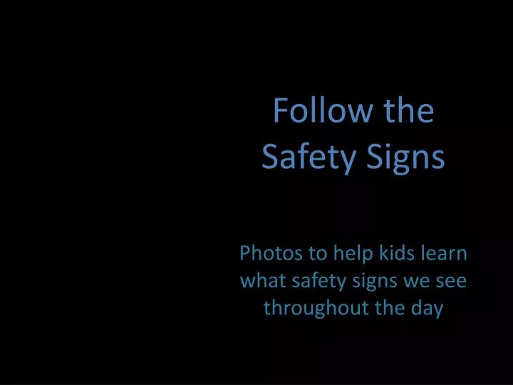
Follow the Safety Signs. Photos to help kids learn what safety signs we see throughout the day. Digital Photo Slideshow using Picasa. By Brianna Frederick EdEl 2200- Section 003. Children’s Cross w alk Ahead.

E N D
Follow the Safety Signs Photos to help kids learn what safety signs we see throughout the day
Digital Photo Slideshow using Picasa • By Brianna Frederick • EdEl 2200- Section 003
Children’s Crosswalk Ahead In this photo, I rotated and croppedthe photo so you could see the image more in depth. I decided to high light it as well so it would appear brighter. I used a soft focus and then focal black and white to retain the color of the sign so children will know what to look for when they see signs like these. I used a shadow to darken the branches.
Yield sign • Cropped • Fill light • Shadows • Boarder • Saturation • Rotate
Cross walk In this photo I used I’m feeling lucky and that brightened the photo. I decided to invert the colors and I really liked how it turned out. I used vignette color to darken the edges. Once again I rotated the photo and put text in.
One way • Crop, rotate, straighten, and sharpen were some of the first things I did to this photo. I decided to use the boost tool and wanted a more direct color so I increased the color temperature.
Speed limit I really like how this photo turned out. I first straightened and crop cropped the photo. I used the retouch tool to get rid of the sticker on the pole. I used the gradual tint and that is how I got the blue color. To lighten the picture I used the glow tool.
Stop, Look, and listen • Crop • Straighten • Auto color • Saturation • Museum matte • Rotate
Do not enter Once again I cropped the photo to get a closer look at the sign. To brighten the photo I used the, I’m feeling lucky button and straightened the photo as well. I wanted this photo to stand out a little so I used the HDR-ish and the Neon edit buttons. This is another one of my favorites.
Railroad crossing • I’m feeling lucky • Sharpen • Soft focus • 1960s • Rotate
Railroad: Watch before you proceed One of the first things I did was crop and straighten the photo. I used auto contrast and I liked how it looked but I wanted something a little different. I decided to focus on the sign more then the colors in the background so I used focal B&W. I like how it looks now.
Private property • Straighten • Crop • Highlight • Invert colors • HDR-ish
Stop light I couldn’t decide what I wanted to do with this photo so I decided to try theI’m feeling lucky tool. After doing that I decided to sharpen the photo put a boarder on and have a focal zoom on one of the stop lights.
Stop on Cross Light • Crop • Auto contrast • Shadows • Focal B &W • Graduated tint • rotate
Buckle up, it’s the law This was another photo that I liked the end result. I cropped and straightened it first. I then decided to highlight and sharpen the photo to enhance the sign itself. I used the auto contrast after doing that and put a slight shadow on it as well.
Children at play • Crop • Straighten • I’m feeling lucky • Sharpen • Lomo-ish
Neighborhood watch With this photo, I cropped and straightened it first. I decided to use the auto color and auto contrast tools. I decided I wanted to use some of the other effects and used a tool calledOrton-ish which makes the photo a little blurry but still readable. I really liked how it turned out.