Download
1 / 21
210 likes | 311 Views
Describing Data: Graphical Methods. So far we have been concerned with moving from asking a research question to collecting good quality empirical data From now on we'll be concerned with how to make sense of our data.

E N D
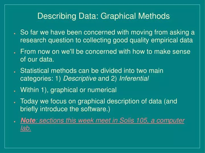
Describing Data: Graphical Methods • So far we have been concerned with moving from asking a research question to collecting good quality empirical data • From now on we'll be concerned with how to make sense of our data. • Statistical methods can be divided into two main categories: 1) Descriptive and 2) Inferential • Within 1), graphical or numerical • Today we focus on graphical description of data (and briefly introduce the software.) • Note: sections this week meet in Solis 105, a computer lab.
Distribution • Tells what values a variable takes and how often it takes these values • We want to know, at the minimum, some key characteristics of a distribution, such as central tendency, spread, and general shape • A distribution can be expressed by a table (e.g., frequency table), graph (e.g. histogram), or function (e.g. density function)
Graphing Distributions, etc. • Categorical Variables (nominal or ordinal) • Places an individual into one of several groups or categories • Display distribution with a bar graph or a pie chart • Quantitative (Numerical) • Takes numerical values for which arithmetic operations such as adding and averaging make sense • Display distribution with a histogram or a stem plot (for small dataset) • Examine trend over time with a line graph • Explore relationships with a scatter plot (later)
Histogram(Vertical axis could also be % or relative frequency)
Outliers • Extreme values, far from the rest of the data. • May occur due to error in recording, or measuring • Observational unit may be fundamentally different. • Outliers need be taken care of before conducting further statistical analysis e.g. If someone in the class is a retired person returning to college, his age would be an outlier (but his weight probably not)
Making Good Graphs • Use titles/captions, labels (and legends if necessary) to help deliver what the graph intends to show. Make sure the meaning of variables and their measurement units are clear. Be careful with the scales used. • Make the data stand out. Avoid distracting grids, artwork, etc. • Pay attention to what the eyes perceive. Avoid pictograms and tacky effects.
Introduction to Stata • Like any statistical package, has utilities for: • Data input/output • Results saving/printing • Data processing (variable transformation, sampling, sorting/ranking, etc.) • Statistical analysis (summary stats, hypothesis tests, regression models, etc.) • Graphics (bar plots, pie charts, histograms. Stem plots, line plots, scatter plots, etc.) • Illustrate using sample data: gss2002.dta • use http://dss.ucsd.edu/~lazeng/ps30/gss2002.dta • List, desc, sum, codebook, histogram, tab.. • Sections this week (meet in Solis 105) will explore more.