Download
1 / 57
570 likes | 648 Views
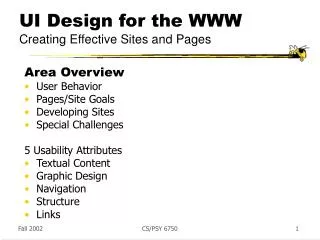
UI Design for the WWW. Creating Effective Sites and Pages. Dilbert’s Design for the Web. User Behaviors: Browse, Search. Search - Seeking to find a particular item, fact or piece of information. -> Buying products, doing research, downloading software, ... Promote ease and speed

E N D
UI Design for the WWW Creating Effective Sites and Pages
User Behaviors: Browse, Search • Search - Seeking to find a particular item, fact or piece of information. • -> Buying products, doing research, downloading software, ... • Promote ease and speed • Browsing - Scanning for “interesting” item, fact or piece of information. • -> Surfing, doing research, ... • Without a goal, attractiveness trumps ease & speed
Page/Site Goals • Convey image or impression • Meet people • Raise money/donations • Entertain an audience • Promote myself • Teach people about a topic • Get famous • Tell a story • Convey information/access employees, shareholders, customers colleagues, public • Sell products • Advertise/market service • Recruit • Announce, survey • Nurture communities
Developing a Site 1. Identify objectives 2. Generate content - typically a topics list 3. Logically organize content - clusters 4. Provide structure to clusters 5. Transform content to pages with graphic design 6. Test and iterate So what else is new????
Identify Objectives • Develop brief statements for the following questions: • What is the purpose or goal of the site? • Who is your intended audience? • Web site sometimes used to describe an administrative organization, not to give the user what they want :-(
Generate a Topics List Raw brainstorming of just anything College of IT, e.g.: awards unique points table of contents index contact information map buildings academic units graduates alumni research classes people faculty students administrators equipment directions programs degrees mission undergraduates Put each on index card or post-it note
Organize Content Group items into categories People Faculty Students Undergraduates Graduates Staff Academics Courses Undergraduate Graduate Degrees ... Put notecards into piles
Provide Structure Sketch out the high-level organization of the categories College People Research Academics Faculty Students Staff Degrees Courses Undergrads Grads
Departments Computer Science SIS Institutes Charlotte Visualization Center … Research Labs Bioinformatics … Information Programs News Events Undergraduate Admissions Graduate Admissions Contacts Student Laptop Program Dean’s List Bioinformatics Intitiative Faculty/Staff Faculty Listing Staff Listing Research Areas Search Computer Science Undergraduate Program Master’s Program Ph.D. Program Graduate Certificate Software and Info. Systems B.A. SIS Master’s in IT Ph.D. in IT Certificate Programs Research Projects Current Index on COIT Home Page
Transform Content Start transitioning to pages, text, images, interaction, etc. Use sketches lists storyboards drawings outlines Will help you organize yourthoughts and plan
Special Design Challenge • On WWW, you don’t know your user’s platform and capabilities • Screen size - from PDA to huge • Connection speed - from dial-up to really fast • Plug-ins • What else????
Web Design Dimensions/Tensions Tension Between Opposites Design Structure Artist Aesthetics Gallery Scientist Organization Library
Why Web Site Design Matters • Tests of time to complete shopping tasks at several major on-line stores - number of clicks varied from 8 to 50; high abandonment rate on poor sites • Jakob Nielsen review of comparative tests on web sites - average 68% difference in task completion times • Nielsen finds 135% improvement from redesign effort • see http://www.useit.com/alertbox/20040119.html
Web SiteUsability Problems • What problems do YOU have on the web?… • … • … • …
Five Usability Issues • Text content • Graphic design • Navigation • Structure • Links • Others????
Text Content • Attention spans are short on the web - users want instant gratification, and reading is 25% slower on screen than on paper • So… • People tend to skim web pages, just read headers, highlights, selected paragraphs • Therefore • Tune your writing style to this reality • J. Nielsen column on writing for WWW • http://www.useit.com/alertbox/9710a.html • www.useit.com/alertbox/9703b.html
Inverse Pyramid Writing This is the short blurb describing the article This is some nonsensical text This is some nonsensical text This is some nonsensical text To see how well this thing w This is some nonsensical text This is some nonsensical text This is some nonsensical text This is some nonsensical text This is some nonsensical text To see how well this thing works This is some nonsensical text This is some nonsensical text This is some nonsensical text Does this work at all? I don’t know. I am in love with XXX To see how well this thing works This is some nonsensical text This is some nonsensical text This is some nonsensical text This is some nonsensical text This is some nonsensical text Does this work at all? I don’t know. This is some nonsensical text This is some the dog is barking nonsensical text This is some nonsensical text Does this work at all? I don’t know. What is love? What is the good life? What is, and is not? That which is, is. The world is all that exists. Nothing unreal exists, metaphysics law #1. This is some the the the the nonsensical text This is some nonsensical text Does this work at all? I don’t know. This is Is there a god? Are we a quantum accident? Will we ever know? Are there questions that should never be asked? What is the nature of goodness? Why are we so mean to each other? How can we be so cruel to one another? This is some nonsensical text This is some nonsensical text This is some nonsensical text To see how well this thing works This is some nonsensical text This is some nonsensical text This is some nonsensical text This is some nonsensical text This is some nonsensical text To see how well this thing works This is some nonsensical text This is some nonsensical text This is some nonsensical text This is some nonsensical text This is some nonsensical text This is some nonsensical What is good in life, he asks? That is a question we may never have an answer to. is some nonsensical text This is some nonsensical text This is some Most important info Title Short Blurbs Summaries Overviews Teasers . . . Less important info Background Information Supporting Details Long Quotes INVERSE PYRAMID WRITING STYLE James Landy, U Washington
Journalists Use Inverted Pyramid from www.nytimes.com James Landy, U Washington
ZDNet Uses Inverted Pyramid • Start with a good concise title • Reflect the content • Continue with the most important points • Use hypertext to split-up information • People often won’t scroll or read • Use less text • 50% less than you would offline • Use a simple writing style • Simple sentences -- no hype or advertising • Use EMBEDDED LINKS to help visitors find more information • Use bullets and numbered lists • Supports skimming James Landy, U Washington
Using Bullets James Landy, U Washington
Graphic Design • All the graphic design considerations apply here, too • Consistency • Visual structure reinforces logical structure • Color • Typography
Images & Download Speed • Avoid anything slow • Text-only version for slow-speed connections • Completely different design for PDAs • User expectations differ for • Gratuitous decorative images • Banners and backgrounds • Desired content • Map, picture of new grandchild • As networks get faster, ground rules change!
Navigation • Often the most critical element • Often the weakest part of a web site • Problems due to • Users don’t have domain knowledge • Site structures don’t meet expectations
www.amazon.com Navigation • Give user understanding of information space structure • Table of Contents (Site Map) • Search, Index, Breadcrumbs • Navigation bar - tabs or similar www.washingtonpost.com
Alternative to Breadcrumbs • Site map showing current page • Called “Context + Focus”
Structure • Connectivity - distance between page pairs, averaged over all pairs • Branching factor - how many out-links • Long scrollable pages vs linked shorter pages • Number of links (clicks) to get to a goal page - major cause of users abandoning a site
Sample Structures Home Page web ornetwork First Page sequence Home Page hierarchy
Grandstand Sports Message Boards Sports Chat Rooms Sports Flash Sports Libraries Fantasy Leagues Inconsistent Structure • Multiple paths from 4 pages • No way back from Sports Flash
Entry (aka Tunnel) Page(s) • Typically a flashy graphic or animation with single link to home page • To lure/entice viewer in Content Pages Entry Page Site Map Home Page FAQ Credits Exit Page
Entry Pages • Controversial • Would be OK for a sculptor’s site, • Not OK for news or shopping site • Always provide “Skip this introduction” link to get past the hype
Home Page • Most important page at your site • Critical for image • Entices viewer to look at more • Give viewer a good idea of what can be found at the site • Make sure vital content is “above the fold” • Place real content on home page • How much graphics do you use? • If links are in images, have parallel text labels near page bottom
Home Page Design Has Evolved • From graphics-rich with few links – mostly to top-level pages of major subsections • To link-rich pages that give access to real content in one click, plus have some content
Home Page Evolution Georgia Tech College of Computing Ancient home page Old home page Currenthome page
Structure of Pages - Templates • Layout consistency important • Graphics, banners, grid, breadcrumbs, navigation aids, search box • Design just once, use for all pages • Design tools support this - Dreamweaver etc
Evaluating Templates - “Greeking” • Have people guess what the areas are - • See: www.useit.com/alertbox/980517.html
Topology Abolish linear thinking, that is, dependence on prior pages Search engines can send user straight to any page ==> Each page should be able to stand on its own ReturnGo back Link all pages to the home page
Links • Success of link depends on • How well user can predict where link will lead • How well user can differentiate one link from other nearby ones • Useful content at other end of link
Link Style • Short, terse sound bite Prices • Long textual explanations maybe even with trailing (non-link) clarification Listing of car prices - Current suggested prices • Link provides expectation of where it goes Be our guest • What does that do?
Link Wording • Beware the famous “here” Click here to learn about my BMW Z3 vs. I drive fast in my BMW Z3 • When a link will take someone a good distance, use word “jump” For more on iguanas, jump to Fred’s iguana page. • Say explicitly where link is • Check out the tax calculator by Money Magazine.
Multimedia Links Tell what it is and how big it is Flight of the Valkyries Click may get surprise Bell jingling (.au file, 700,00 bytes) <IMG SRC=“/icons/sound.gif” ALT=“[SOUND]”> <A HREF=“bell.au”> Bell jingling (.au file, 700,000 bytes)</A> Bell jingling (Quicktime movie, 3 meg) <IMG SRC=“/icons/movie.gif” ALT=“[MOVIE]”> <A HREF=“bell.qt”> Bell jingling (Quicktime movie, 3 meg) </A> Cool if cursor changed form accordingto what kind of link it’s over
Link Issues • Embedded Links - Links set in surrounding text. They can be harder for user to pick and use. • Wrapped Links - Confusing - 3 or 4 items?? Janus Twenty Investment Company of America Royce Premier • Too many on a page can be confusing and take too long to parse • Problem with Image links - Don’t change color to indicate prior traversal
Link Issues • Within-page links • Can be confusing • Is this the same page or a differnet page? • Use shorter pages to avoid scrolling
Good Links James Landy, U Washington
Site: • Table of contents / Site map • Short descriptions of what’s there • Index (if big enough) • Search What else?? Page: • Navigation bar • Organization • Last updated • Problem report • E-mail contact The “Killer Site”Has
Top Ten Web Design Mistakes of 2005 • Legibility Problems • Non-Standard Links • Flash • Content That’s Not Written for the Web • Bad Search • Browser Incompatibility • Cumbersome Forms • No Contact Information or Other Company Info • Frozen Layouts with Fixed Page Widths • Inadequate Photo Enlargment • Also – Pop ups Jacob Nielson http://www.useit.com/alertbox/designmistakes.html
Bad Design Bugaboos All capitals text Scrolling sideways Teeny, tiny text size, especially in italics Dead links Telling the user how to set the browser Poor contrast in text-to-background color Large typeface (one without impact and contrast) Animations that don’t stop Things that look like buttons but aren’t “Under construction” notices Neglecting ALT tags for images Not denoting image sizes Do-nothing home page Changing color for the heck of it Lack of mail to/feedback throughout site Sites requiring advanced browser or plug in Blink tags