Download
1 / 4
40 likes | 46 Views
Read the short guide and know more about some essential ideas to make a stylish website. This guide has a detailed report of the top 10 tips for professional web design.<br>

E N D
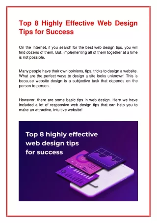
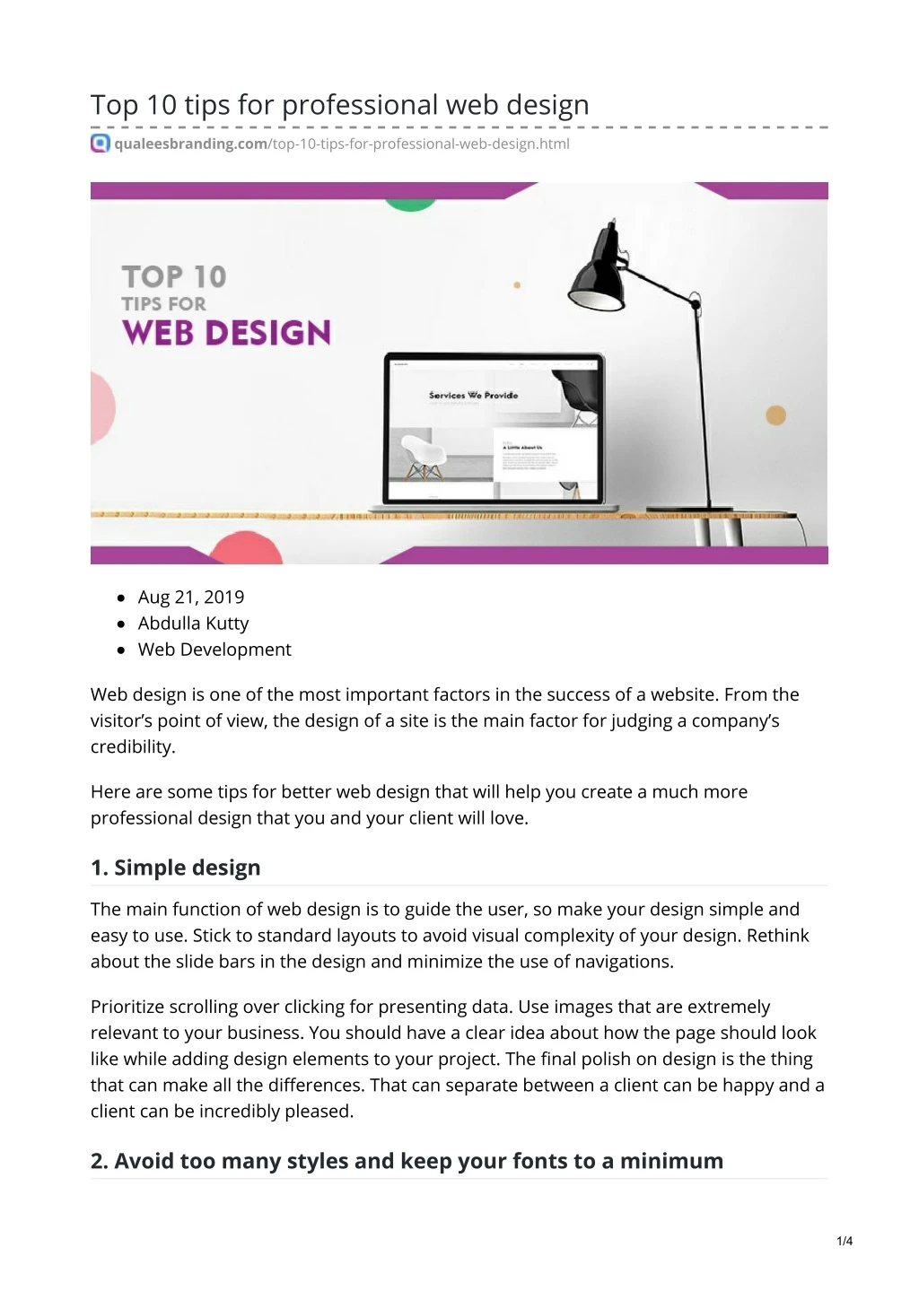
Top 10 tips for professional web design qualeesbranding.com/top-10-tips-for-professional-web-design.html Aug 21, 2019 Abdulla Kutty Web Development Web design is one of the most important factors in the success of a website. From the visitor’s point of view, the design of a site is the main factor for judging a company’s credibility. Here are some tips for better web design that will help you create a much more professional design that you and your client will love. 1. Simple design The main function of web design is to guide the user, so make your design simple and easy to use. Stick to standard layouts to avoid visual complexity of your design. Rethink about the slide bars in the design and minimize the use of navigations. Prioritize scrolling over clicking for presenting data. Use images that are extremely relevant to your business. You should have a clear idea about how the page should look like while adding design elements to your project. The final polish on design is the thing that can make all the differences. That can separate between a client can be happy and a client can be incredibly pleased. 2. Avoid too many styles and keep your fonts to a minimum 1/4
Providing a simple and clean style will help maintain a professional appearance to your web design. This is one of the key areas that easy to use extensive choices available. Try to keep your styles to a maximum three throughout your entire content, this will help differentiate key aspects of your content. Like one for heading, one for content and third if necessary for highlighting important information on the page but the consistency of color consistency of font style and font size altogether can make your design a better look. 3. Split information messages in narrow columns When you are presenting information in narrow columns, try to avoid using too many words, just cut into key messages. It is difficult for the end-users to read whole those texts and spends a lot of time over there. Strip it down into key information so that you can give a much better chance for end-user to reading what you are putting over there. It makes much easier and much cleaner from both designers and users point of view. 4. The absolute priority for loading speed While designing keep in mind that the site speed has an absolute priority. If your site speed is low, the visitor will not stay around. While designing you should carefully select the elements in the design, which affects the speed of website like images, audio clips, video clips and animations. The way the website build has a major role in loading speed of the webpage. 5. White space and Spacing White space creates a natural sense of separation on your design . It has a major role in web design’s structure. White space between each element should be checked to feel like everything look like one and have a natural flow. Never underestimate the power of white space as it allows the content elements to breath, it provides more attention to your headings and important messages and guiding through the actual content of your page. Spacing appropriately can help shows natural page structure and conveying the sense of importance to your design. Inconsistent spacing in your different sections makes everything just looks like a little bit disjointed. If you take your time to ensure that you add that structure you can see consistent spacing gives a visual hierarchy and a little bit chance to shine through. White space gives you set our content space to breathe and then consistent spacing make sure everything looks nice evenly balanced. 6. Clear overlays While superimposing text over a background image its make sure that you use good contrast colors and overlay. While placing a text over an image make sure that text does not cover up the image and vice versa, that will end up with very difficult to read. Keep 2/4
the overlays clear and simple to make your message stand out with the benefit of the background image. 7. Concise titles Provide a natural visual structure with font sizes for titles which are more important, less important and equally important. Don’t be confused with content of title with too small or too large sizes . The more important heading should be larger than less important area. Use the right font to show the hierarchy of content, the visual hierarchy can be emphasized by using the right font at the right location. Use clear titles with proper size and length as they can convey the message on the title and additional information on content below the title .so keep those titles short in length as they can display the message in the quickest and easiest fashion. 8. Relevant images and themes Use the most relevant images for the design, as the images with visual clues can make your design more noticeable. Use genuine and real people images in your pictures, just say no to stock photos .Do attention to select the images which suit your themes. The theme should be most efficient to display the unique brand message. 9. Colors Come up with great color combination avoid different colors for different headings and different sections. Choose a few key colors for your design that help conveys a clear visual message. If you need to introduce more colors, use complementary colors, which is prominent to the primary color, but use them sparingly. Nowadays there are so many free resources available online to create perfect color schemes for your project like adobe color cc. Using a suitable color palette will definitely help keep consistency and professional element across your entire design. 10. Simple Menu Create a menu that is not overloaded with links. Menu options should be simple, useful and well structured to give users an easy experience. The menu options should be designed to highlight important information on that page. Use proper navigation to visitors to find what they are searching for. More choices take makes more time for decisions, so clearly differentiate your sub-options with a strong and clear brand message. 3/4
Qualess branding is a digital marketing service provider located in Calicut, Provides top quality and result oriented branding and perception-based digital marketing services which include a Search engine optimization(SEO),Search engine Marketing(SEM),Social media marketing (SMM),Web development, Web design, Branding, and many more. We believe innovation is our key and brilliant selection of new strategies will definitely refine success in digital marketing. 4/4