Download
1 / 105
1.05k likes | 1.06k Views
Statistics Regression. https://www.123rf.com/photo_6622261_statistics-and-analysis-of-data-as-background.html. Correlation. A relationship can be seen by graphing the independent and dependent variables in a scatter graph. Correlation. A linear relationship is very common. Correlation.

E N D
Statistics Regression https://www.123rf.com/photo_6622261_statistics-and-analysis-of-data-as-background.html
Correlation A relationship can be seen by graphing the independent and dependent variables in a scatter graph
Correlation A linear relationship is very common
Correlation When we calculated a correlation coefficient, we said it was a measure of the closeness to a linear relationship between the two variables
Line of Best Fit That means, we could find the formula for a line that would be the best fit for the two variables
Line of Best Fit We “fit” a line to the data
Line of Best Fit Real-world data rarely lands exactly on a straight line
Line of Best Fit But we fit the “best” line to the data
Line of Best Fit When you graph two variables on an x-y plot, you can fit a line through the data called a “trendline”
Line of Best Fit This trendline is a “line of best fit” to the data
Line of Best Fit The “line of best fit” is created by minimizing the total distance of all the points to the line (deviations)
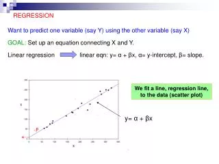
Regression The line of best fit is called the “regression” line
Regression Because it is a line, it has an equation: y = b + mx m = slope b = y-intercept
Regression The slope “m” and the correlation coefficient “r” will both have the same sign
Regression R2 tells how closely the regression line “fits” the data – “goodness of fit”
Regression As you can imagine, the calculations for correlation and the regression line are scary scared-pic.jpg
Regression Hooray for Excel!
Regression Francis Galton
Regression in Excel Edwin Hubble gathered and analyzed data from astronomical objects He used regression to show that the universe is expanding http://www.thefamouspeople.com/profiles/images/edwin-powell-hubble-1.jpg
Regression in Excel Let’s take a look!
Regression in Excel What do we do first?
Regression in Excel What do we do first? GRAPH THE DATA!
Regression in Excel Does it look like a straight line would fit the data well?
Regression in Excel Now we’re going to go to: Data Data Analysis Regression
Regression in Excel They want “y” first (I HATE this…)
Regression in Excel Let’s use “distance” for “x” and “velocity” for “y”
Regression in Excel Eeek! What’s all this????
Regression in Excel Here’s the RSQ. What is the %?
Regression in Excel For the trend line, you need:
Regression in Excel This (believe it or not) is the equation of the line of best fit!
Regression in Excel Line of best fit: y = mx + b
Regression in Excel Our equation is: Vel = 505.8409 xDist+ -48.3429
Regression in Excel Highlight and copy:
Regression in Excel Paste on the “Hubble” page
Regression in Excel Add a new column heading: Trend
We’re going to calculate our line:
Oops! That doesn’t look right!
The reference cells are changing for each row We need to make those constant
Go back to the first entry Add a $ before the row numbers you want to keep constant
Now, copy it down!
Much better!
Regression in Excel Create a new graph:
Regression in Excel Make it purty! To make the trend line a line: change Marker Options to “none” change line color to “solid line”