Download
1 / 26
260 likes | 461 Views
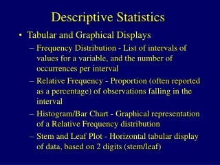
Descriptive Statistics, Part Two. Farrokh Alemi, Ph.D. Kashif Haqqi, M.D. Objectives Frequency distribution Categorical Ungrouped Grouped. Histogram Cumulative frequency Pie chart Bar chart. Table of Content. Objectives.

E N D
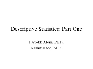
Descriptive Statistics, Part Two Farrokh Alemi, Ph.D. Kashif Haqqi, M.D.
Objectives Frequency distribution Categorical Ungrouped Grouped Histogram Cumulative frequency Pie chart Bar chart Table of Content
Objectives • Given a set of nominal or ordinal data, interpret its frequency distribution, pie chart, and bar chart. • Given a set of numerical data, interpret its frequency distribution, cumulative frequency distribution, and histogram. • Given a set of numerical data, interpret the meaning of its range, variance, standard deviation, and coefficient of variation. Return to Table of Contents
Organizing Data • Data when collected in original form is called “raw data”. • For example:
Frequency Distribution • The researches organizes the raw data by using frequency distribution. • The frequency is the number of values in a specific class of data. • A frequency distribution is the organizing of raw data in table form, using classes and frequencies. Return to Table of Contents
Frequency Distribution Cont. • For the first data set, a frequency distribution is shown as follow:
Types of Frequency Distribution • There are three basic types of frequency distribution: • Categorical • Ungrouped • Grouped Return to Table of Contents
Categorical Frequency Distribution • The categorical frequency distribution is used for data that can be placed in specific categories, such as nominal or ordinal data. • For example, data such as political affiliations, religion affiliations, or major field of study would use categorical frequency distribution. Return to Table of Contents
Example • The blood type of different students:
Ungrouped Frequency Distribution • When the range of data is small, the data must be grouped into classes that are not more than one unit in width. Return to Table of Contents
Example • The range in the example is R=highest value – lowest value : 11 – 4 = 7 • Since the range is small classes consisting of single data value can be used.
Grouped Frequency Distribution • When the range of the data is large, the data must be grouped into classes that are more than one unit in width. Return to Table of Contents
Example Cont. • In this distribution, the values 1 and 3 of the first class are called “class limits”. • 1 is the “lower class limit” and 3 is the “upper class limit.”
Histogram • The histogram is a graph that displays the data by using vertical bars of various heights to represent the frequencies. Return to Table of Contents
Histogram in Excel (Steps) • Open the tools menu, choose the data analysis command and chose histogram from the analysis tools list box. • Input range: enter the reference for the range of cells containing the data. • Bin range: enter the reference of cells containing the values that separate the intervals, including the labels. (They must be in ascending order).
Steps Continued • Labels: check this box to indicate that labels have been included in the references for the input range and bin range. • Out put range: enter the reference for the cell you want out put to appear. • Chart output: check this option to obtain a histogram chart in addition to the frequency distribution table on the worksheet.
Create a histogram for the following data:5, 6, 4, 7, 5, 9, 11, 12, 4, 5, 6, 7, 9, 19 Do this in Excel
Cumulative Frequency • The cumulative frequency is the sum of the frequencies accumulated up to the upper boundary of a class in the distribution. • They are used to visually represent how many values are below a certain upper class boundary. Return to Table of Contents
Pie Chart • A pie chart is a circle that is divided into sections according to the percentage of frequencies in each category of the distribution. Return to Table of Contents
Bar Chart • A bar chart is a broader concept than histogram. • A bar chart may be used to display concepts other than frequency of an observations. For example, a bar chart may display the average exam results. • Histogram is a bar chart of frequency distribution. Return to start